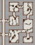
What makes a good map good?

Hiya!

I agree with @3catcircus about the "clean black and white"...although a "clean coloured version" can be almost as easy to read....but those are almost non-existent, as most/many people think that making everything "blurry and blended, with lots of dots around the edges" is a good thing.

Harn has some amazingly clean maps; both their indoor b/w ones, and their outdoor colour ones. Simple colour scheme, mostly 'flat' colours, no shading, and simple symbolism (re: squiggly lines for farm/garden furrows, for example). I'm also partial to the maps from Warhammer (1st edition) in the main rule book. Black and white, with more of a 'hand drawn' vibe to them than the Harn ones (Powers & Perils also has this sort of map style).

Another issue with color is color blindness. Not just the common red/green. My son has blue/yellow color blindness and can't see blue on white. At all.
 

log in or register to remove this ad

Theo R Cwithin

I cast "Baconstorm!"
Lots of good advice and resources, thanks!
Especially interesting are the concerns with color. I had always assumed color is superior, but it seems b/w with concise symbology may be the best way to go.
 

Theo R Cwithin

I cast "Baconstorm!"
One thing in particular has also tripped me up me recently: multi-level rooms. I suppose isometric views sort of accomplish this. Is that sufficient?

For example, in one dungeon there's high aviarium spanning four levels. In principle, an encounter here could take up the whole space, which includes interior/exterior windows and balconies up high, some tall trees, a suspended "watermote" serving as a sort of upside-down fountain, plus whatever lurks on the ground. Not to mention the room for flying.

It's straightforward enough to represent all that in classic "blue-print" style, with the aviary shown in cross-section as a big empty hole on each level; plus a sideview.

But for the purposes of an encounter, how does one effectively convey that, either for players over a VTT or for another GM reading it? Any decent examples out there representing verticality, especially in tactically interesting or moderately complex spaces?

Good question. I've been wondering the same thing since the last couple of encounters we have done have included flying beasties.


Theo R Cwithin

I cast "Baconstorm!"
Again, the Harnworld mapping style has got you covered... They have specific symbols to overlay to show am outline where other levels are, including a level just for the roof.
I've downloaded a doc called "Harn Map Keys", I'll definitely take a look at this and maps that use it. Thanks for the recommendation.

For anyone else interested, there's a Harn World Bundle available for free at dtrpg that contains that Map Keys doc, a few maps, and other goodies.


reltastic

Villager
The most recent dungeon I designed is a very simple one. It's part of a series of vaults, designed by your typical mad wizard and full of crazy magic puzzles to solve. All of that is fine, but the main thing for me, which has already been mentioned above, is the non linear nature of it.

It's one long hallway with a door at the end, and two doors on either side. The hallway itself has a puzzle to figure out, and then the four doors each have one behind them, which can be done in any order. Or not at all.

But behind the door at the end is another room, with four big threats (in this case fire elementals) that are each powerful in their own right. Fighting all four would be a deadly encounter. But for each puzzle they solve on the way they get to remove an elemental from the final room. Meaning it could be anything from a near-certain tpk to literally no challenge at all, save jumping over a small (5 ft) chasm.

I want it to be fun, simple, easy to run, and easy for the players to keep track of everything. It can all fit on a single chessex megamat, so they can see everything at once, and the layout has a sort of weird sense to it, even if the puzzles themselves don't.
 

Bilharzia

Fish Priest
For good examples of how not to do maps, check out pretty much any module for DCCRPG.

Make your maps as bland as possible to cater to an audience that wants uniform and drearily functional art in their rpgs.
There's nothing wrong with DCC maps, they are perfectly readable and convey more than a typical rpg map does with a lot of character and atmosphere.

C3NeATb.jpg
 

I see no reason why a modern map can not be full color, be detailed, and be clear. Sure, it might depend upon a room description to add comprehension to somethings, but for the most part it stands alone while still being interesting and useful.

Take this map for an example;
Quag Waren.jpg
It's not monochrome. It's clear where the walls are, which way the doors open and even what most of the 'stuff' is. The only thing that comes to me as needing a room description are the hanging curtains. But once you understand this map shows shadows it seems pretty clear.

Thoughts?
 

Remove ads

Top