You are using an out of date browser. It may not display this or other websites correctly.
You should upgrade or use an alternative browser.
You should upgrade or use an alternative browser.
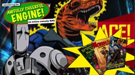
Which image is better?
- Thread starter Morrus
- Start date
Tun Kai Poh
Hero
Give a visual focus on the main book first, otherwise things could look cluttered.
hawkeyefan
Legend
I’d say 5 but I’m not crazy about the layout in the image shown.
Nytmare
David Jose
The first one makes it look like a bad photoshop job of making the T Rex hold the book in its mouth.
Between the two, I prefer the second one, but it would be better if all the books had the same orientation.
The cover art of the robot and...dino cop(?) itself is good, is there a reason not to just use it as it is?
Between the two, I prefer the second one, but it would be better if all the books had the same orientation.
The cover art of the robot and...dino cop(?) itself is good, is there a reason not to just use it as it is?
Attachments
harunmushod
Explorer
For sure, one looks better, but from a practical point of view, it’s more likely that the first picture someone sees will attract interest if it shows a setting that that viewer is interested in. That is more likely with the five.
Similar Threads
- Replies
- 98
- Views
- 14K
- Replies
- 44
- Views
- 16K
- Replies
- 9
- Views
- 11K
- Replies
- 22
- Views
- 11K
- Replies
- 16
- Views
- 3K
Recent & Upcoming Releases
-
June 16 2026 -
June 16 2026 -
September 16 2026 
Arcana Unleashed(Dungeons & Dragons)
Rulebook featuring "high magic" options, including a host of new spells.
Replies (250) -
September 16 2026 -
October 1 2026 -
October 6 2026 -
January 1 2027 -
January 1 2027


