You are using an out of date browser. It may not display this or other websites correctly.
You should upgrade or use an alternative browser.
You should upgrade or use an alternative browser.
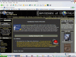
Work Continues on New Front Page Theme
- Thread starter Michael Morris
- Start date
Michael Morris
First Post
Crothian said:What's wrong with the current one? I don't think it needs changed.
edit:bad t....
The current set up is, well, kinda cluttered and wastes a lot of space, especially at the top. It isn't as well seperated off. Put them side by side and this becomes clear.
As for the globe, The main impetus for changing it is that I don't have the original globe used in creating the image. Not having the original creates tons of graphic editting problems which I've discussed with Russ, though he's yet to make a final ruling.
Sir Osis of Liver
Explorer
It looks ok, except the bright yellow lines all over the place, are well too bright. If the color on those were toned done a bit it's be wicked cool.
AGGEMAM
First Post
I like the main links being at the very top but there is no need to reapeat them on the left side.
Also somehow get that original globe.
And as Sir O said toning down the yellow lines a bit would make it more reader friendly, in fact toning down the yellow colour used as a whole.
Also somehow get that original globe.
And as Sir O said toning down the yellow lines a bit would make it more reader friendly, in fact toning down the yellow colour used as a whole.
Last edited:
Michael Morris
First Post
Michael Morris
First Post
AGGEMAM said:I like the main links being at the very top but there is no need to reapeat them on the left side.
Actually there is. Until the new theme is set as the default removing a link from one theme would remove it from both themes.
Also somehow get that original globe.
I searched for 7 hours one night for it and couldn't find it. If you find it let me know.
And as Sir O said toning down the yellow lines a bit would make it more reader friendly, in fact toning down the yellow colour used as a whole.
The yellow bars seperate each area from each other. Removing them would make the page feel squished.
Michael Morris
First Post
AGGEMAM said:And as you're going for the rounded corner dividing line style, you should look into making all the yellow bordered boxes with rounded corners too.
Nah, the 56.6 users probably wouldn't like the extra bandwidth that would take (about 100K). Neither would the server for that matter.
Similar Threads
- Replies
- 6
- Views
- 764
- Replies
- 17
- Views
- 2K
- Replies
- 17
- Views
- 1K
- Replies
- 51
- Views
- 3K

