You are using an out of date browser. It may not display this or other websites correctly.
You should upgrade or use an alternative browser.
You should upgrade or use an alternative browser.
The incredible shrinking stat block!
- Thread starter Quickleaf
- Start date
Quickleaf
Legend
I use InDesign. It's definitely not more compact, but since I use an iPad, it's not a big deal; I can easily move around the file, zoom in, zoom out, etc.

Ah, good old InDesign. I learned Photoshop but last year did a project layout in InDesign since it's what the rest of the team was using, very intuitive software at least at first glance.
Cheers to the iPad! Great work.
Recidivism
First Post
A big problem with encoding any information using color is that few people (in my experience) use color printouts. Anything that color is used for should also be conveyed through wording (or otherwise) if it's going to be useful to me during a game.
Quickleaf
Legend
I would find your stat blocks easier to read if they followed WotC's convention of name, then number/info, rather then number/info before name.
Speaking for myself, if I'm looking at a stat-block for something, such as AC, my eyes seek out the label AC then move to the right (given that most reading I do goes from left to right). Using your blocks, I'd constantly be mistaking the Fortitude defence for the AC.
Good catch. You know I didn't even realize I'd done that! I think it must be an exposure to Asian languages that makes me left-right/right-left flexible. It definitely has nothing to do with my eyes jumping around when I read. Or with a soccer coach who used to yell at us "the other left!"
A big problem with encoding any information using color is that few people (in my experience) use color printouts. Anything that color is used for should also be conveyed through wording (or otherwise) if it's going to be useful to me during a game.
Solid points. I'm going to post a couple varieties of stat blocks soon, but I've really tried to build in redundancy in how information is displayed: color, style, boldness, placement, and icons should all work together to minimize the need for pinpoint accurate verbage (which inevitably gets misinterpreted or isn't actually as pinpoint as it first seemed).
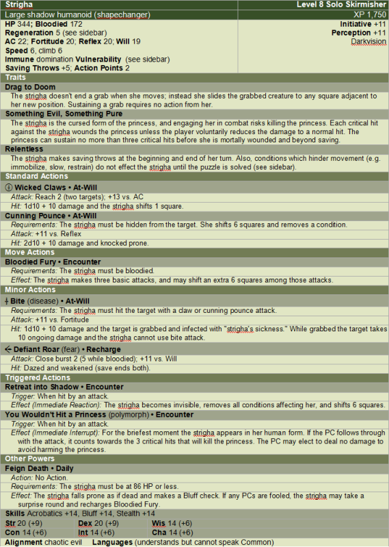
EDIT: Here's the homebrew solo stat block I'm tackling, and should have done tonight. Rather than post more of WotC content I figured I'd be on the safe side, and I'll come back to the kobold minion, roper, and frost giant later.

It's a beast of a stat block, probably one of the larger ones in the game shy of the "campaign enders" like Lolth or Orcus. What makes it interesting is that there are lots of different kinds of powers/traits and plenty of triggers/conditions.
Last edited:
vagabundo
Adventurer
It is an interesting thread. I think you are on to something with the change in background for the numbers. I think it needs more consistency with the placement
And DMmagic, those block look amazing, but I found them a a little hard to follow(could be the font), but I think it is a great idea to use a little more colour in the blocks to draw the eye and some of the visual flourishes made them more pleasant to look at; less boring.
And DMmagic, those block look amazing, but I found them a a little hard to follow(could be the font), but I think it is a great idea to use a little more colour in the blocks to draw the eye and some of the visual flourishes made them more pleasant to look at; less boring.
Infiniti2000
First Post
Well, there are a few oddities and/or seeming errors in it, so I'm not sure if you want constructive criticism of the custom monster or not. But, it will be difficult to review the revised shortened stat block without doing so.It's a beast of a stat block, probably one of the larger ones in the game shy of the "campaign enders" like Lolth or Orcus. What makes it interesting is that there are lots of different kinds of powers/traits and plenty of triggers/conditions.
Quickleaf
Legend
Sure, critique away.Well, there are a few oddities and/or seeming errors in it, so I'm not sure if you want constructive criticism of the custom monster or not. But, it will be difficult to review the revised shortened stat block without doing so.
And if you have a suggestion for an official complex solo monster stat block to shrinkify that would be good too.
Similar Threads
D&D 5E (2014)
Radically shrinking stat blocks
- Replies
- 114
- Views
- 22K
- Replies
- 43
- Views
- 2K
- Replies
- 16
- Views
- 2K
- Replies
- 1
- Views
- 2K
Recent & Upcoming Releases
-
June 16 2026 -
June 16 2026 -
September 16 2026 
Arcana Unleashed(Dungeons & Dragons)
Rulebook featuring "high magic" options, including a host of new spells.
Replies (250) -
September 16 2026 -
October 1 2026 -
October 6 2026 -
January 1 2027 -
January 1 2027


