• The VOIDRUNNER'S CODEX is coming! Explore new worlds, fight oppressive empires, fend off fearsome aliens, and wield deadly psionics with this comprehensive boxed set expansion for 5E and A5E!

Dragon’s-Eye View 3/28/2012... now with ENW poll!

So the armour you prefer in your DnD art is...

  • MANGA

    Votes: 6 3.6%
  • FANTASTIC REALISM

    Votes: 68 41.2%
  • PHOTOREALISM

    Votes: 74 44.8%
  • Other not represented

    Votes: 17 10.3%

S

Sunseeker

Guest
The problem isn't nudity or indeed "sexual subjects." The problem is when art that doesn't call for it unnecessarily focuses on the T&A. That is what I call childish.

If the art can handle it maturely, it's fine. A semi-good example is the races page from the 3.5 PHB. A bad example is the front cover of the 4e PHB (Wayne Reynolds, surprise surprise).

Yeah, Wayne Reynolds...this guy is clearly capable of drawing real people in real poses in outfits and settings that look...well...realistic. Why he doesn't exercise any of that talent for his fantasy work just makes me want to wage a personal crusade against his future employment at any gaming company.

To be fair, we're going to get some art that childishly focuses on T&A no matter what. That's not a battle I'm interested in fighting. To what degree it focuses on it and how much of it exists is a battle we can actually win.
 

log in or register to remove this ad

Klaus

First Post
Personally, this is one of my favorite Wayne Reynolds images:

89526.jpg

War Waever, from Heroes of Battle.

In fact, this is what I'd love to see wizards wear while adventuring. Loose, yet padded garments, cloak, wand, maybe a buckler for the added defense (imagine a buckler that lets you cast Shield!), and lots of components, potions and doodads.

And this is Fantastic Realism, btw.
 

I'm A Banana

Potassium-Rich
shidaku said:
Wayne Reynolds...this guy is clearly capable of drawing real people in real poses in outfits and settings that look...well...realistic. Why he doesn't exercise any of that talent for his fantasy work just makes me want to wage a personal crusade against his future employment at any gaming company.

Part of me wonders how much the covers of things like the PHB are driven by marketing decisions, rather than design considerations. Not that they can't often be the same thing, just that it's kind of the same reason the Mass Effect 3 media all star the buzz-cut hyper-masculine Caucasian dude, even though you can create your own character who may not look anything like that. If thirteen year old boys see a big shiny book with a hooker and a spiky dragon man, that may be somehow demographically appealing in a way that, say, 3e's more "it looks like an old book!" style was not. Art (especially cover art) made for "who do we want to buy this?" considerations rather than "what do we want this to say?" considerations tends to be pretty bad because of that.

Again, the two can often be in synch, but the 4e PHB cover (and, indeed, some of the other 4e design choices) seems to have a disconnect with that.
 

S

Sunseeker

Guest
Part of me wonders how much the covers of things like the PHB are driven by marketing decisions, rather than design considerations. Not that they can't often be the same thing, just that it's kind of the same reason the Mass Effect 3 media all star the buzz-cut hyper-masculine Caucasian dude, even though you can create your own character who may not look anything like that. If thirteen year old boys see a big shiny book with a hooker and a spiky dragon man, that may be somehow demographically appealing in a way that, say, 3e's more "it looks like an old book!" style was not. Art (especially cover art) made for "who do we want to buy this?" considerations rather than "what do we want this to say?" considerations tends to be pretty bad because of that.
I think it's sort of the "judge a book by it's cover" crowd vs the "don't judge a book by it's cover" crowd. I definately agree that 4e was aimed much more at visual gamers than previous editions, and that's likely the reason for the change to a more visual-oriented cover as opposed to the "ooo I'm a mysterious tome!" design(which was neat, but some covers were insanely busy and I hated looking at them).

Again, the two can often be in synch, but the 4e PHB cover (and, indeed, some of the other 4e design choices) seems to have a disconnect with that.
Honestly this is pretty common in any edition, some covers are hit and miss, like the PHB1 cover.
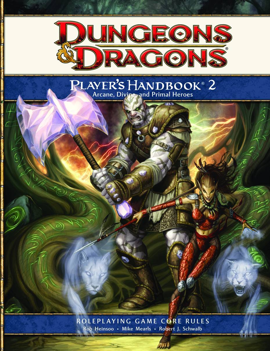
The PHB2 cover
4E+PHB+2.jpeg

Still pulls off the "muscle man and hot chick" imagery, but she is not even slightly as much only for T&A as the PHB1 cover.
The PHB3 cover follows the same pattern of maintaining the "slim and dangerous chick and the big muscle-man brute" imagery, but again, we've still moved away from the shamless T&A of the PHB1.
player%E2%80%99s-handbook-3-glam.jpg


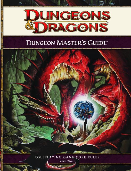
The Dungeon Master's Guide's 1&2 both feature good 'ol Wayne again, though the first is of a dragon(something he can actually draw well).
Dungeon_Masters_Guide_540x706.jpg


Of course, apparently Wayne can't keep his fingers off the T&A button, so we get a rehash of the "I'm posing for no other reason than to show off my lady lumps!"
dd4edmg2.jpg

At this point I'm beginning to see a pattern and the patten appears to be employing Wayne Reynolds.
Even if we jump outside of D&D to Wizard's golden goose MTG: we find that Wayne can apparently attach a very obvious pair of breasts to even the most armored characters he can imagine.
MTG-Tariel-Reckoner-of-Souls.jpg

Why this chick who apparently needed more armor and spikes than a spiked-armor factory wanted to have her breasts hang out is a mystery only Wayne can answer.

I mean the list goes on, but over and over and over again the recurring problem seems to be less that Wizards is trying out a new marketing strategy, most of their imagery is pretty good in grabbing your attention and aiming for that fantasy shtick, but the T&A appears again and again in only Wayne Reynolds' art. This problem is rehashed in just about everything he's done for Pathfinder as well.
 
Last edited:

Klaus

First Post
I'll have to defend Wayne. He's done a LOT of work that don't include T&A (just look at the War Weaver I posted above). That his art *has* T&A doesn't mean it's *only* T&A. His Pathfinder Sorcerer may have T&A, but his Cleric and Paladin don't (well, the *do* have T&A, but they're hidden away).


GX.Sigma

Adventurer
Personally, this is one of my favorite Wayne Reynolds images:

89526.jpg
Funny how the best looking Wayne Reynolds image is the one that has the least of the Wayne Reynolds style: few intense angles, only slightly high-contrast (rather than oppressively high-contrast), and only slightly exaggerated physiology with no focus on sex appeal.

Wait, not funny, what's that other word?

It's not that he's incapable of making good pieces, it's just that his trademark style is... well, you know.
 

hamstertamer

First Post
Yeah, unfortunately T&A is apart of the way a woman expresses her identity as a woman. A super-woman of course would express themselves in a manner that was super-sexy, well, because they are a super-woman. Women are far more concerned with their body, in the way they reveal themselves provocatively, and have the desire to influence society and men around them. They themselves are quite willing to expose themselves and love the attention. If you are unable to get out of the basement and see the world just look at pics of women and how they dress at comic-cons. It's apart of their biology.

Criticizing an artist for reflecting this is misguided. Women love being "sex objects", it's a lie to say they don't.


Remove ads

Top