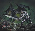
New Player's Handbook Cover Art!


log in or register to remove this ad

Remathilis said:
phb.jpg
I'll print this image (I'll modify with the correct words) and paste over that boring cover of the 4E PHB when I get it.

I'll show it on the forums when I'm done.
 

Wormwood said:
I guess.

I don;t like the green dragon cover because that's really all you see: a green dragon.

The Player's book is about the players---they should be the focus.
And there's where you're wrong.

The Player's Handbook is for all players, the DM included. It has all the basic rules for the game, from character creation to spells to combat. It has all the rules for visibility, carrying capacity and general exploration. You might be able to play without the DMG or MM, but you'd definitely not be able to play without a PHB.

IMNSHO, the PHB cover has to absolutely encapsulate the entire essence of the game. Nevermind that it's D&D. Any product that is the cornerstone of an entire line has to be representative of the line's identity.

The Green Dragon Fight does that.


RangerWickett said:
Quoting this to show my support. This cover image would be much cooler. I was quite surprised by the point that D&D's never actually had both a dungeon and a dragon on the cover of the PHB before.

Well, the player's book from the red box D&D set had a KICKASS picture of a dude fighting a dragon, as I recall. At least, it was kickass when I was eight.

Edit:

Yep, still kick ass.

dd-bbox.jpg


helium3 said:
Yep, still kick ass.
It does.

Old covers were so cool because they were just simple. Hey, come on, it's D&D, let's put some hero fighting a big monster, preferred a dragon. That's the essense of the game right?

I can only have the feeling that nowadays they are trying to get away from the obvious. "A party fighting a monster, again? Nah. That's old. Let's make something different, something new, let's create whole new concept."
Well, there is the new, and it sucks.
 

DJCupboard said:
I'm not an artist or an art critic, but I've always been peeved by his one forward facing foot, his one oversized forearm in front of the body, and his inward pointing teeth on anyone grimacing.

These are elements of his style that distract me when I'm looking at a lot of his work because they're so hard to ignore. In addition he often has the rear foot off the ground in a half-step that looks awkward because the character doesn't seem to have any momentum and looks like it's hopping.

I don't want to get too down on Wayne's style though because he has definitely done some pieces I really like.

Here are a couple of examples of Wayne's work that are a lot more dynamic and get me wondering what the story is behind the picture. I guess if he's just working based on the direction WotC are giving him there's not much he can do about it.
 

Attachments

  • 13.jpg
    13.jpg
    54.7 KB · Views: 126
  • 2.jpg
    2.jpg
    103 KB · Views: 126
  • PlayersGuide02.jpg
    PlayersGuide02.jpg
    69.3 KB · Views: 131

ainatan said:
It does.

Old covers were so cool because they were just simple. Hey, come on, it's D&D, let's put some hero fighting a big monster, preferred a dragon. That's the essense of the game right?

I can only have the feeling that nowadays they are trying to get away from the obvious. "A party fighting a monster, again? Nah. That's old. Let's make something different, something new, let's create whole new concept."
Well, there is the new, and it sucks.

I agree with all of the above, except the "sucks" part. I think all of the new art is kick-ass, I just think the "party fighting the dragon" should be on the soon-to-be #1-selling core rule book of the game. It's funny to think that my first boxed set (the blue box) probably nursed this instinct just like the red box did for the previous poster... Even new players reading "Dungeons & Dragons" would expect a dragon in the cover art (even if it is a d*ck-nosed dragon.)
 

Remove ads

Top