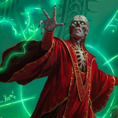
New Player's Handbook Cover Art!

adamx20 said:
You could fix that by adding some damaged armor and damaged dragon to the picture.
The dragon occupies 5/8 of the picture, while the largest human figure fits snugly in 1/8.

I don't see how a couple of dings are going to help fix that.

Again, this is just a matter of priorities---we differ on them. I'm cool with that.
 

log in or register to remove this ad

Aside from WAR's impossible contrast art style, the covers they keep putting up for the PHB books looks like Splat Book art.

The first one would be great for "The Complete Tiefling" and the current one would be good for "Complete Guide to Swords and Sorcery."

None of them say "Welcome to the D&D World."


One thing I personally would really like to see is having each book look more unique. So have the D&D symbol small and out of the way. While having the Book Title larger and different font.

The art also be different, so have different artist or a collection of artist do full-page pieces of art.

Essentially do stuff like the WoD covers, since I find they are the most eye-catching as well as eye-pleasing and it is soooo much easier to identify book from book:

For example, both these books are part of the Covenant Books for Vampire but they are both quite distinct and different:

Invictus Clan

Circle of The Crone Cover (sorry about the small size)
 

Ruin Explorer said:
I mean, if D&D continues to attempt to appeal to a college-age crowd, it's utterly inevitable that it'll move away from the tastes of older players. Hell, I'm only 29, and it's moved away from mine, with these unattractive, stocky figures (every human male appears to be on steroids in 4E, no matter their profession).

I'm college-age, and I play with a college group, and that cover artwork doesn't appeal to us either. On the other hand, we're atypical enough that using us as a focus group for a mass-market add campain would be kinda dumb (On the other other hand, though, you have to wonder just how typical your typical DnD player is going to be).

Leaving that aside, though, the core artwork should still be about more than two people posing in a cave. I personally might have gone for an image of a group exploring a cave.
 

Doug McCrae said:
The PHB focuses on the PCs so the cover should reflect that.

That's where I differ. To me the PHB focus on the core rules of the game (even more central and important than the DMG and the MM). It is the one single book each player will need access to but it does not focus on the PCs.

The PHB has the combat rules, equipment lists, spell lists, feat/ability lists and apparently now it has magic items as well. The PCs aren't going to be the only ones using that stuff.


The Character Record Sheets; now there is a product that focuses on the PCs.

So why is that the item that has the cover dominated by the dragon?
 

Fallen Seraph said:
Essentially do stuff like the WoD covers, since I find they are the most eye-catching as well as eye-pleasing and it is soooo much easier to identify book from book:
Mage-cover. Changeling-cover. And from the d20-side: Arcana Unearthed.

These three are still the best covers ever for me.

Cheers, LT.
 

Nothing intellectual about this picture! It's pure male sex id.

The female figure has a lot of exposed skin, and the covering she does have on accentuates what it's covering, i.e. the push-up halter top. She is dressed as a sexual object, albeit a kewl and powerful one.

But also look at the male figure. Although he is not much taller than the female, he is hulking and looks physically dominant. He wields a huge sword. He also does not have a human face, or specifically a handsome human face. This means that the male viewer doesn't have to see him as a rival for the woman; instead he can identify completely with the male figure's physical dominance and implied relationship with the woman.

I'm sure the Hasbro advertising execs are quite happy with it.
 

Remove ads

Top