D&D 5E Toward a new D&D aesthetics

What is your feeling about the changes in aesthetics of D&D illustrations?

  • I really enjoy those changes. The illustrations resemble well my ideal setting!

  • I'm ok with those changes, even if my ideal setting has a different aesthetics.

  • I'm uncertain about those changes

  • I'm not ok with those changes because it impairs my immersion in the game.

  • I hate those changes, I do not recognize D&D anymore

  • The art doesn't really matter to me either way. I don't buy/play the game for the art.

  • Change in aesthetics? Where? What?


Results are only viewable after voting.
Status
Not open for further replies.

log in or register to remove this ad


Recent 5e art is more similar to early 5e art than it is similar to art from other editions. This is intentional: they want to keep a largely similar art style throughout all books from the edition. The art itself (from any 5e product) strikes me as very saturated and very fully realized, with less left to reader's imagination. One thing I do not like is not so much the art but the graphic design style of the books as a whole: the way they do borders on images, the back splashes of color, and the way the text is formatted and laid out. The young adventurer's guides don't have all that, and I noticed I liked even the same art a lot more when it was isolated on the page without all those design flourishes.

What I react poorly to in the OP, and some of the comments, and the discussion overall, is the claim that there was a singular Classic style and a singular Modern style. This often strikes me as implicitly reactionary, in which the classic style is better for any number of reasons. We see these kinds of claims with mechanics as well (for example that racial ASI worked in one particular way for all of dnd history, and only now has there been a change).

Not that there aren't differences among the editions in the style of game or overall aesthetics--there most certainly are. But as a fan of older editions of the game and of the OSR, I take issue with these claims mostly because they are simply inaccurate a lot of the time. What people happen to identify as "Classic" is just what they grew up, and the claims that there has been just one shift or that older editions played or looked a certain way don't hold up when you actually go back and revisit those texts. Another part of my is annoyed with those arguments because without experimentation you just get people doing the same thing over and over. (On that note, I wouldn't say that 5 is experimenting; I'd actually like to see new art and layout styles, allowing for more individuality and variance. I'm more referring to all the amazing artistic creativity that's happening in indie osr and "artpunk" type games.)


Voadam

Legend
Can you post any examples of Disneyfication, or art being "non offensive to everyone" or "age neutral?"

I doubt this is a modern trend, but I'd like to see what makes you think it is!

If you are sincere in this question...well, it's the sorites paradox. Everyone agrees a single grain of sand isn't a heap, and most will agree that adding a single grain of sand doesn't change whether something is or isn't a heap. Conclusion: heaps are guaranteed (even zero grains is a heap!) and impossible (even a nigh-infinite quantity of sand is not a heap).

But if you want some kind of actual answer--recognizing that by definition this is purely a matter of interpretation so no one is obligated to agree with my specific answer--then I would say you need at least three, preferably more, and they need to be relatively close to one another in time. E.g., if your three examples were one image from the 5e PHB, one image from exactly halfway between then and now, and one image from JTTRC, I would be pretty skeptical still. But if it were, say, looking at all the covers for 5e hardbacks in chronological order, that would at least make it significantly harder to debate on the basis of "too little evidence," and would thus tend to bring in debates about whether the proffered examples actually demonstrate the claimed pattern (IOW, the numbers argument would cease and a much more subjective "is this what Beancounter claims it is?" argument would likely come up).

A significant part of the problem, though, is that the claim is difficult to demonstrate solely through positive evidence, because it is a mixed positive and negative claim. It's not just, "This is a new style," it is "this is a new style, and the old(er) style(s) is/(are) being disproportionately displaced by it." First half is positive (it claims a new style has appeared), second half is negative (it claims the old style is disappearing). A claim of that nature, as established by evidence rather than feeling, would basically require you to conduct a survey across the past several years (at least) to demonstrate that there was a consistent style, and that it's being consistently replaced with some other, different style now. Also, note the "disproportionate" thing--you could be right that this new style is taking up some of the room, but that could simply be that it is a new style now represented among the variety of old styles, only "reducing" them because there is a finite amount of art that can be put onto books.
Three from recent WotC seems easy enough. I don't have any of these but quick image searches from the titles of recent ones that come to mind.

1648151403299.png
1648151426869.png
1648151439864.png


The first two are what I have seen for the upcoming Radiant Citadel and the third is Witchlight.
These seem indicative to me of a lighter direction for D&D art.

Call of the Netherdeep is another recent one:

1648152343316.png


1648152374793.png


I don't have a comprehensive 5e collection but the 5e art I have been seeing in promotions and such recently do feel like a trend to the lighter and more kid friendly.
 

Jer

Legend
Supporter
Yeah, I think majority of the D&D audience just isn't hungering for a Book of Vile Darkness right now. It's not that it would be offensive, I just don't think it's what people are buying these days. It's not the "trend," as we've been talking about.
To be fair - IIRC the original one didn't sell great and neither did the 4e movie tie-in version.


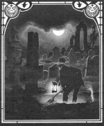
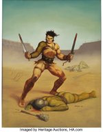
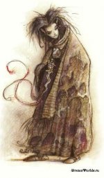
One thing that I miss - and that I'm well aware will not return - is different D&D settings having different art direction. Particularly Brom directly contributing to Dark Sun and DiTerlezzi directly contributing to Planescape, but I'd personally put Stephen Fabian's work on Ravenloft in the same bucket. Having the art in "Van Richten's Guide to Ravenloft" be the same style as the PHB was kind of a letdown for me, even though I did like a lot of the pieces in that book. Really drove home the point that these were radically different worlds:
 

Attachments

  • d6cdaf8f198e07fad5a4c7836c186d43.jpg
    d6cdaf8f198e07fad5a4c7836c186d43.jpg
    54.8 KB · Views: 49
  • lf.jpeg
    lf.jpeg
    52.6 KB · Views: 63
  • d1369feb7508d266aa01b003145a946b.jpg
    d1369feb7508d266aa01b003145a946b.jpg
    50.6 KB · Views: 56

BookTenTiger

He / Him
One thing that I miss - and that I'm well aware will not return - is different D&D settings having different art direction. Particularly Brom directly contributing to Dark Sun and DiTerlezzi directly contributing to Planescape, but I'd personally put Stephen Fabian's work on Ravenloft in the same bucket. Really drove home the point that these were radically different worlds:
Yeah, I would love to see more variety with the styles of art WotC publishes.
 

Status
Not open for further replies.
Remove ads

Top