Howdy Hussar!
")
Hussar said:
Upper-Krust - I can get behind most of that. Certainly the recycled art thing. I understand the reasoning for it, but, I too find it jarring.
It really annoys.
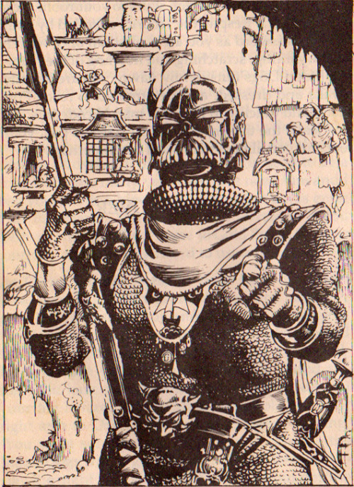
And, yeah, I don't mind if not every image is full color. There's nothing wrong with inks or black and white.
Not only is there nothing wrong with b&w art, the contrast would be really pronounced.
Also, I would love to see some humour back in the art. Put a few funny pictures in. Heck, I don't even mind a few cartoons once in a while. D&D is fun. Let's get back with a bit of whimsy. At least it would break up the constant, and honestly, very similar looking, pose pictures we tend to get.
Agreed. Too many pieces are functional, so very few are entertaining.
In this way the 1st Edition art was so much more interesting. Even in the monster manual you had pictures of adventuring parties in action...*spins chair and grabs 1E monster manual off the bookshelf*
9. Vignettes: Lets check out the 1E Monster Manual.
Page #1: Has a group of Knights attacking a Bulette.
Page #7: Two adventurers against a swarm of gant ants?
Page #9: Giant stag beetle chasing a chicken while someone hides behind a tree.
Page #12: A bugbear smacking an adventurer over the head
Page #34: Dragon watching its eggs hatch.
Page #37: Air elemental lifting two adventurers into the air.
Page #38: Wizard summoning a fire elemental.
Page #40: Big spread of Wood Elf families welcoming their loved ones home.
Page #42: Someone trying to outswim a Giant Gar. Also another piece where an adventurer has just ruptured a Gas Spore.
Page #48: Flesh Golem smacking an adventurer on the back. Also another piece where an Iron Golem has grabbed an adventurer.
Page #51: Giraffe chasing two adventurers.
Page #52: Battle scene between Hobgoblins and Knights.
Page #56: Jackelwere having just slain an adventurer.
Page #57: Coatl fighting(?) with a Dragon Horse.
Page #58: FULL PAGE SPREAD - Kobolds surrounding an Adventuring Party
Page #60: Leprechauns messing about with the book's graphic design.
Page #62: Lizardman fighting a Knight.
Page #64: Adventurers encounter a Giant Lynx - accompanying text is "Whaddya mean we gotta talk to this lynx, the last monster we talked to ate half the party!
Page #69: Humans guarding wagons.
Page #70: Mind Flayer blasting some adventurers, also another piece with a Rogue being attacked by a Mimic.
Page #73: A Neo-Otyugh attacks some adventurers.
Page #78: Adventurer swallowed by a Giant Pike.
Page #80: Purple Worm being attacked by two adventurers, also another piece where a Wizard is studying a Quasit.
Page #81: Rhino barrelling into two adventurers.
Page #82: Rot grubs burrowing into a shocked adventurer's arm.
Page #85: Giant Scorpion grabs an adventurer.
Page #86: Two Sea Lions attack a Shark.
Page #87: Adventurer runs from a Giant Slug.
Page #88: A giant snake encircles a Ship.
Page #90: FULL PAGE SPREAD - A Giant spider lurks above a party of adventurers.
Page #93: A swarm of Stirges attack an adventurer.
Page #94: An adventurer stands before a seated Titan.
Page #95: A Giant Toad swallows an adventurer, also another piece of a Trapper curling around an adventurer.
Page #96: A Treant grabs an adventurer, also another piece where a Triton rides a Hippocampus.
Page #97: A Troglodyte versus a Knight.
Page #99: Giant Wasp about to sting an adventurer.
Page #100: Water Weird leaping out ofa fountain towards an adventurer.
Page #102: Wizard lightning bolting a Xorn.
Page #103: Yeti versus two adventurers.
Page #104: FULL PAGE SPREAD - Adventurers opening a Treasure chest.
Page #110: FULL PAGE SPREAD - Lone adventurer facing off against a Giant Centipede, Naga, Gargoyle and Bugbear.
47 total by my count. Just to clarify that doesn't count the lone monster illustrations.
Lets see if the 4E Monster Manual had any Vignettes:
Page #4-5: CHAPTER INTRO PIECE - Adventurers being attacked by a host of monsters.
Page #38: Bulette erupting out of the ground having knocked over an adventurer.
Page #232: Shambling Mound engulfs an adventurer.
Page #251: Treant grabs an adventurer.
I remember one of my favorite art bits was in the Unearthed Arcana (1e) where they had a pic of an open spell book with lots of arcane symbols. Cool. But, if you looked a bit closer, there were messages written among the symbols - things like "Help, I'm trapped!" and whatnot. Very fun.


 , because I don't currently have the skills, and some jerk sold my books