Liquide
DEX: 4
From a honest doodler to another (in the sense of critisicm that is a good thing).
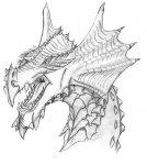
The things I have a hard time to picture are:
Apart from these two above I like it, and I also see that you have the same problem as myself when it comes to backgrounds") (e.g. we try to cover them up in themselves so we don't have to work on them to much).
(e.g. we try to cover them up in themselves so we don't have to work on them to much).
Oh and paint on my fair lady, you're a truly getting closer to your dragon you want to be able to draw for each picture you make (and I want the same honest reply from you when I post my lady red dragon a bit later [still meddling with some shadows and detail] )
The things I have a hard time to picture are:
- Depth: All the shadow kind of blend togather so even though I know how the orignial picture looks like (which was a good step forward in progession I might add) I cannot see the depth of the picture. Try use shadows a bit less and only where it is most needed. Such as below the wings to give the illusion of depth and 3d
- Detail: Dont' hide all that wonderful detail you had in this B/W doodle, try use less chunks of colors/shades so it blends togather the originals details and shadows instead of covering them in this fashion. The brightred you have chosen works well though, try combineit with a fiery orange for more detail o come out (and try replace a lot of the dark shadows with a dark crimson color instead)
Apart from these two above I like it, and I also see that you have the same problem as myself when it comes to backgrounds
(e.g. we try to cover them up in themselves so we don't have to work on them to much).Oh and paint on my fair lady, you're a truly getting closer to your dragon you want to be able to draw for each picture you make (and I want the same honest reply from you when I post my lady red dragon a bit later [still meddling with some shadows and detail] )

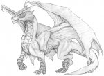
 Just kidding. She is a beaut! Are you going to try to color her? An exceptional dragon like her needs exceptional color and background! Then again, she's pretty perfect just like that..
")