
JEez Liquide these are awesome.
I think the second one (maybe?) you posted has a tail that looks a little pooey. (Edit: just remembered the real word - formless... like it's lumpy or something) They're all awesome though.
I'm almost done wtih my next one, it's a composite shot so it's taking a while. This is a great thread!
I also like Malessa's, it's so grimey!
Last edited:

")
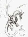
") the first dragon is nice and dynamic, I always like movement in pictures.
the first dragon is nice and dynamic, I always like movement in pictures.
 )
)


