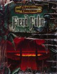
Morrus Well, that was fun Staff member Mar 9, 2003 #1 WotC's Julia Martin has kindly sent along the final cover for the Fiend Folio: Attachments folio.jpg 72.5 KB · Views: 13,579
Tarrasque Wrangler First Post Mar 9, 2003 #5 Snoogins. That said, I hope it's more FIENDS, and less CRAPPY MONSTERS FROM CHAINMAIL. There were a few in MM2, and that was a few too much.
Snoogins. That said, I hope it's more FIENDS, and less CRAPPY MONSTERS FROM CHAINMAIL. There were a few in MM2, and that was a few too much.
A Aloïsius First Post Mar 9, 2003 #6 YMMV but... I'm realy afraid about the 3.5 cover, now... I don't like this "doom" (the videogame) look. The MM2 was hideous, this one is worst. The FR line is really better.
YMMV but... I'm realy afraid about the 3.5 cover, now... I don't like this "doom" (the videogame) look. The MM2 was hideous, this one is worst. The FR line is really better.
J Jeph Explorer Mar 9, 2003 #8 I like the viscous goo dripping down the sides of the image. A nice touch.
John Crichton First Post Mar 9, 2003 #9 Call me weird, but I really dig the font use and design in the title.
hellbender First Post Mar 9, 2003 #10 Re: YMMV but... Aloïsius said: I'm realy afraid about the 3.5 cover, now... I don't like this "doom" (the videogame) look. The MM2 was hideous, this one is worst. The FR line is really better. Click to expand... I agree with you on this cover. Did WotC fire their graphic designers with all their other talent? They could have slapped the original Fiend Folio cover back on and it would have looked classier. hellbender
Re: YMMV but... Aloïsius said: I'm realy afraid about the 3.5 cover, now... I don't like this "doom" (the videogame) look. The MM2 was hideous, this one is worst. The FR line is really better. Click to expand... I agree with you on this cover. Did WotC fire their graphic designers with all their other talent? They could have slapped the original Fiend Folio cover back on and it would have looked classier. hellbender

")
")
