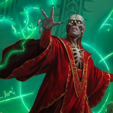
How do you feel about 3e's art style?

What are your opinions of 3rd Edition's artwork?

  • 3e artwork rocks! Easily the best out of any D&D edition.

    Votes: 59 15.6%
  • I generally like the artwork in the 3e books.

    Votes: 182 48.1%
  • I'm neither for nor against 3e artwork.

    Votes: 43 11.4%
  • I dislike most of the 3e artwork I've seen.

    Votes: 60 15.9%
  • 3e artwork sucks! The artwork in previous editions was clearly superior.

    Votes: 34 9.0%

I agree that the Cavalry Charger and the Paladin-averting-breath-weapon full pagers weren't up to par. Specially in a book that had WAR's Phalanx vs. Horde image.

As for the winter wolf:

- How does a creature without opposable thumbs pierce its ear?
- Just like everybody else: they ask someone to do it!

;)
 

log in or register to remove this ad

it's a definite departure from 2E/late 1E artwork, which is a definite departure from early 1E artwork and older. there are things i like about it, and those i don't. wayne reynolds is excellent at rendering monsters in new ways, and while i like his stuff a lot better than some of the older edition artists, there are plenty of old-schoolers i like better.
 

Bran Blackbyrd said:
Maybe the newcomers here need bootcamp instead of a friendly greeting.

csl_101a_hartman_pic.jpg


"And when you post on ENWorld, you will not discuss politics or religion. Do you get me, maggot?!"
 
Last edited:


Good art? Bad art? ...

I think people here are missing an important point here.

While all editions have had their shining star artists, I must point out that technical accuracy is only one feature of good art.

The most important thing is that a piece of artwork should leave the viewer with a feeling of excitement, adventure or curiosity.

It should cause your imagination to start asking "What happens next in this scene?", "Who are these people (or monsters)?".

Too often D&D artwork is good in its color and technical accuracy, but sucks in its theme and emotional content.

Take the 3.5e PH for instance: The pics of the individual character classes show no expression of character style or emotion. They just stand there...(and more often than not are holding a missile weapon in one hand and a melee weapon in another....Duh! you gotta drop one to use the other!).

Lets face it, how exciting would a pic of Spiderman be if he was just leaning against a lightpost? People want to see him in action...doin' spidey things like swinging from a web or climbing a wall. The same goes for D&D characters.

I must give the points for this category to the 1st ed PH. Trampier's pic of a thief waylaying a traveller (p.37) or D. Sutherland's "A Paladin in Hell" pic. evoke more of a sense of adventure and wonder than Kruck the barbarian doing hip thrusts (pg 25 3.5 PH) or Mialee the elf having a bad hair day (pg. 36).
It seems that there were attepts at better artwork later in the book (PH 3.5) but (IMHO) it fell flat.
Some other Wizards products did manage to pull off some interesting art (Sword & Fist for example).

My real point here is that it takes more than just pretty colors to make good adventure art.... It takes imagination.
 

Type2demon said:
I think people here are missing an important point here.

While all editions have had their shining star artists, I must point out that technical accuracy is only one feature of good art.

The most important thing is that a piece of artwork should leave the viewer with a feeling of excitement, adventure or curiosity.

It should cause your imagination to start asking "What happens next in this scene?", "Who are these people (or monsters)?".

Too often D&D artwork is good in its color and technical accuracy, but sucks in its theme and emotional content.

Take the 3.5e PH for instance: The pics of the individual character classes show no expression of character style or emotion. They just stand there...(and more often than not are holding a missile weapon in one hand and a melee weapon in another....Duh! you gotta drop one to use the other!).

Lets face it, how exciting would a pic of Spiderman be if he was just leaning against a lightpost? People want to see him in action...doin' spidey things like swinging from a web or climbing a wall. The same goes for D&D characters.

I must give the points for this category to the 1st ed PH. Trampier's pic of a thief waylaying a traveller (p.37) or D. Sutherland's "A Paladin in Hell" pic. evoke more of a sense of adventure and wonder than Kruck the barbarian doing hip thrusts (pg 25 3.5 PH) or Mialee the elf having a bad hair day (pg. 36).
It seems that there were attepts at better artwork later in the book (PH 3.5) but (IMHO) it fell flat.
Some other Wizards products did manage to pull off some interesting art (Sword & Fist for example).

My real point here is that it takes more than just pretty colors to make good adventure art.... It takes imagination.

:claps hands:

Bravo! :D
 

Type2demon said:
<Excellent post>
To echo JeffB: bravo!

I would also like to recommend an article in Imazine #37, a free web-zine, which examines the failings of modern RPG art. Here are a few choice bits:

Take the artwork in 3rd edition D&D Player’s Handbook – please. An illustration by Todd Lockwood is reproduced above. It’s a picture of a dwarf with an axe, a shield, a bow and a :):):):)load of armour. This dwarf is given a name, ‘Tordek,’ but it’s unclear why he’s different from the thousands we’ve seen elsewhere, from Lord of the Rings calendars to DragonLance paperback covers. He’s a generic short, stocky guy with a beard. So what? Wizards of the Coast spent thousands to give us a Player’s Handbook with full-colour illustrations of Tordek and his fun-loving friends, but it’s unclear what, if anything, we’re supposed to get from them. Todd Lockwood obviously knows how to paint the human figure. His draftsmanship compares favourably to an old tsr artist like Darlene Pakul, who drew that notorious bat-winged succubus in the first Dungeon Master’s Guide. But Darlene’s plump, cowering demoness titillated thousands of teenage boys. ‘Tordek’ will never titillate anyone. You could replace his portrait with a photo of a tractor or a piece of cabbage and no one would notice the difference.
...
Some of the earliest art in roleplaying games was more inventive in this respect. Consider Erol Otus for example, an old favourite of mine. His work
was crude, sometimes even revolting, and I would never claim that he was
consciously attempting to ‘transcend naturalism.’ He probably couldn’t have
penned a ‘realistic’ work if he wanted to, his technique was far too primitive.
Still, I find that many Otus drawings catch my attention, and stick in my
mind far longer than other early rolegame artists do. His style evokes the exotic and the macabre in a way that few other artists can match.

Ultimately, one thing which irritates me is this: obviously, the 3e art team was shooting for a departure from the blandness ubiquitous in the 2e era (sans DiTerlizzi and Brom), and trying to be new and original... Except the end result doesn't really break away from the established "fantasy look", only "spices it up" with extra bits which look out of place and seem tacked on.

Erol Otus, on the other hand, really presented something new, despite the fact that he would be found guilty of many "crimes" the 3e team is charged with - non-functional equipment, strange poses, weird clothing and - look at that! - spikes. There is one substantial difference: Otus was and still is a good artist, as he can take these elements and make something magical and "out of place" with them... That's Fantasy art with a capital F. I doubt anyone in the 3e team could do that. Come to think of it, and breaking away from the art discussion, this is probably one of the most important reasons I ceased DMing 3e. Because the designers can't do it either. They just don't call a world of make believe "millieu" anymore. Millieu... That, my friends, is Fantasy. ;)
 

Type2demon said:
Take the 3.5e PH for instance: The pics of the individual character classes show no expression of character style or emotion. They just stand there...(and more often than not are holding a missile weapon in one hand and a melee weapon in another....Duh! you gotta drop one to use the other!).

Krusk: Holding an axe, and that's it.
Gimble: Holding a crossbow in one hand and tossing a dagger with the other, but both can be used one-handed.
Jozan: Holding a mace. That is all.
Vedania: Has a scimitar and shield. Wrong again.
Tordek: Shield and axe. Sorry.
Regdar: Longbow and a greatsword, so you're actually right about one.
Ember: Staff and a sling, there's two you got right.
Alhandra: Holding a longsword.
Soveiless: Dual-weilding a short sword and longsword.
Lidda: Has a dagger and what appears to be a lockpick.
Hennet: Has a spear.
Mialee: Has a shortbow and a staff.
Nebin: Has a club.
Devis: Holding a rapier.
Naull: Has a staff.
Kerwyn: Dual-wielding what looks like a rapier and a longsword.

So out of 16 character portraits in the PHB, exactly three of them are as you described: Regdar, Ember, and Mialee. To me, that hardly qualifies as "more often than not."

Lets face it, how exciting would a pic of Spiderman be if he was just leaning against a lightpost? People want to see him in action...doin' spidey things like swinging from a web or climbing a wall. The same goes for D&D characters.

I must give the points for this category to the 1st ed PH. Trampier's pic of a thief waylaying a traveller (p.37) or D. Sutherland's "A Paladin in Hell" pic. evoke more of a sense of adventure and wonder than Kruck the barbarian doing hip thrusts (pg 25 3.5 PH) or Mialee the elf having a bad hair day (pg. 36).
It seems that there were attepts at better artwork later in the book (PH 3.5) but (IMHO) it fell flat.
Some other Wizards products did manage to pull off some interesting art (Sword & Fist for example).

I disagree that art needs to have action happening in it to be interesting. For example, Keith Parkinson's Horseman Near Lake picture that appeared on the cover of the original Forgotten Realms Box Set is one of the most memorable pieces of D&D artwork of all time. Conversely, there are a lot of "action pics" in the old books that really suck.

My real point here is that it takes more than just pretty colors to make good adventure art.... It takes imagination.

To each his own. I find the characters in the 3e Core Rulebooks to be more imaginative than previous edition characters who looked like generic medieval knights or Gandalf-ripoff wizards with long beards and robes.

Melan said:
Ultimately, one thing which irritates me is this: obviously, the 3e art team was shooting for a departure from the blandness ubiquitous in the 2e era (sans DiTerlizzi and Brom), and trying to be new and original... Except the end result doesn't really break away from the established "fantasy look", only "spices it up" with extra bits which look out of place and seem tacked on.

They weren't trying to get away from a fantasy look. They were trying to get away from the medieval European look which had been done to death in previous editions.

Erol Otus, on the other hand, really presented something new, despite the fact that he would be found guilty of many "crimes" the 3e team is charged with - non-functional equipment, strange poses, weird clothing and - look at that! - spikes. There is one substantial difference: Otus was and still is a good artist, as he can take these elements and make something magical and "out of place" with them... That's Fantasy art with a capital F. I doubt anyone in the 3e team could do that. Come to think of it, and breaking away from the art discussion, this is probably one of the most important reasons I ceased DMing 3e. Because the designers can't do it either. They just don't call a world of make believe "millieu" anymore. Millieu... That, my friends, is Fantasy.

I respectfully disagree. A while after 3e came out, I went back and looked through a bunch of older edition books, and I was surprised at just how wretched most of the artwork was, including pieces by Erol Otus. It was then that I realized that nostalgia was the reason I had been so forgiving towards much of the old artwork.
 
Last edited:


Type2demon said:
I think people here are missing an important point here.

While all editions have had their shining star artists, I must point out that technical accuracy is only one feature of good art.

The most important thing is that a piece of artwork should leave the viewer with a feeling of excitement, adventure or curiosity.

It should cause your imagination to start asking "What happens next in this scene?", "Who are these people (or monsters)?".

Too often D&D artwork is good in its color and technical accuracy, but sucks in its theme and emotional content.
... .

On a somewhat related theme here are some thoughts from Monte Cook on the lack of "dynamism" in many current d20-related covers:

http://www.montecook.com/arch_lineos116.html
 

Remove ads

Top