New Player's Handbook Cover Art!

Personally, I dislike Wayne Reynold's style. He can't do faces, and he makes feet look deformed no matter what. His illustrations for the "Warrior Monks" book for Osprey publishing don't even make the people look human, for example. *shudder*

Luckily, I gave up on liking the art for any D&D product when "let's make everyone a punk" "let's paint it brown or sickly violet" 3e came out. I'd prefer a return to the old days for aesthetic reasons, but failing that, I'm not going to allow the art to influence my book purchase, anyway, either for or against.
 

log in or register to remove this ad


Amphimir Míriel said:
I am not a graphic designer (I work with several of them, though, being a journalist), but it seems to me that the reason the core rulebooks have the white background is because it provides a stark contrast against the logo.

And of course, visibility in a store's bookshelf full of fantasy covers is what they need to sell books to first time buyers...
Yes, but there's stark contrast and then there's STARK contrast...

I like JVisgaitis' version of the logo space much better, and think it provides adequate contrast:

4ephbredux.jpg
 

It looks a little better to me, though it's hard to tell since it's so small. I'm glad they're keeping with the Crystal image in the DMG at least.
 

The only problem I have with the green dragon painting is that you have a green dragon, with a sort of orange tinted background, and then the blue border for the trade dress on the cover.

Those particular colors just don't go together well for me. I like the new cover art better.

The colors more appropriately match the trade dress, IMO. However, I agree that the adventurers in a dungeon and fighting a dragon is a more iconic scene.

If the dragon was black, or red, instead of green, it would work better for me.


Dragonblade said:
The only problem I have with the green dragon painting is that you have a green dragon, with a sort of orange tinted background, and then the blue border for the trade dress on the cover.

Those particular colors just don't go together well for me. I like the new cover art better.

The colors more appropriately match the trade dress, IMO. However, I agree that the adventurers in a dungeon and fighting a dragon is a more iconic scene.

If the dragon was black, or red, instead of green, it would work better for me.
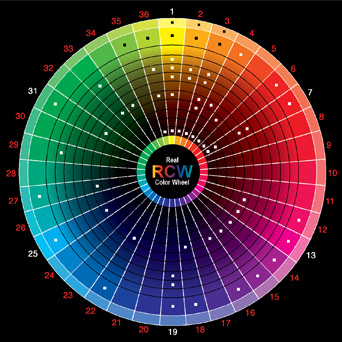
Actually, those colors work quite well together.

Real_Color_Wheel_475.jpg


You're supposed to use contrasting colors, and with all the red and orange in the background, green and blue are the contrasting colors that WAR should be using. Anything else would probably look muddy and indistinct.

Granted, ideally maybe a blue dragon would have worked even better, but 1) he's already done that for the mini's game boxed set (see below) and 2) it would merge and muddy up with the blue in the trade dress title box.

Moot point, anyway, at least for the PHB. That image is for the character sheets package or something like that, isn't it?

e.jpg
 

Bah, the dragonborn’s tail hasn’t grown back yet.

This is better than the previous one, but not awesome either. I think I’m just not a big fan of WAR.
I like his cinematic compositions and dynamic poses but somehow, his characters all look like they are made of crumpled, shredded sheet metal.
And even when they’re not grimacing, I find their faces cold and unattractive.
I can’t tell if it’s the sharp features, the glaring eyes or the faces proportions, but they remind me of barn owls.

Count another vote against the white background.
I liked the 3e faux-binder idea. The first books with all the eyes and gems were really tasteless but the later splatbooks with framed images were a good compromise.

Cyronax said:
Maybe the elf likewise felt that the humans should take this one. Perhaps 4e is about humans finally coming into their own?
I am sure she was meant to be a Halfling.

The green dragon fight would have been a better choice, maybe with less garish colors.
And please saw that horn off the dragon’s nose.
 

Remove ads

Top