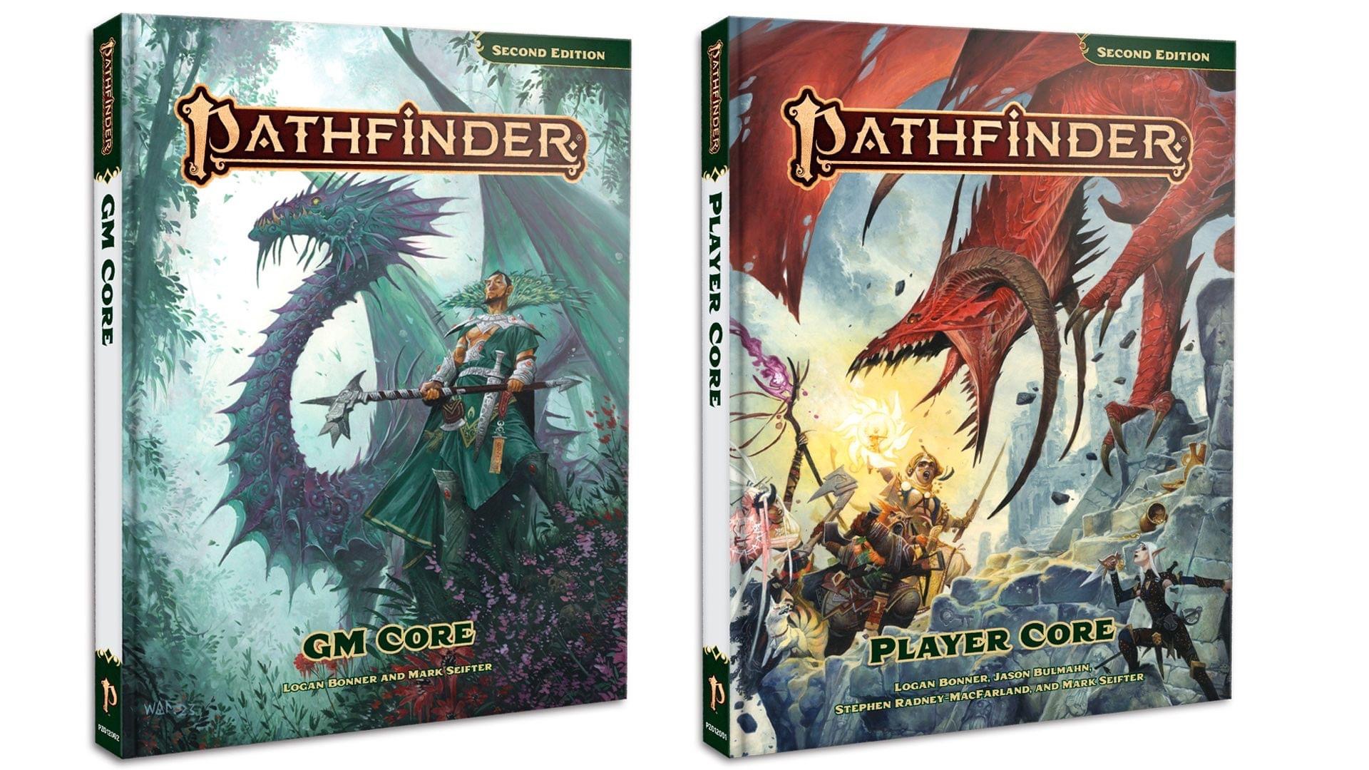
At Paizocon today, Paizo revealed the final color covers of two of the upcoming remastered core rulebooks.

You are using an out of date browser. It may not display this or other websites correctly.
You should upgrade or use an alternative browser.
You should upgrade or use an alternative browser.
Pathfinder 2E Paizo Shares Color Covers Of Pathfinder Remaster
- Category Pathfinder
- Thread starter Morrus
- Start date
GM and Player Core hardcover art by Wayne Reynolds

Morrus is the owner of EN World and EN Publishing, creator of the ENnies, creator of the What's OLD is NEW (WOIN), Simply6, and Awfully Cheerful Engine game systems, publisher of Level Up: Advanced 5th Edition, and co-host of the weekly Morrus' Unofficial Tabletop RPG Talk podcast. He has been a game publisher and RPG community administrator for over 20 years, and has been reporting on TTRPG and D&D news for over two decades.
Jolly Ruby
Privateer
The colours in these covers looks better than previous covers, I feel the muddied tones from 1e and original 2e didn't stand the test of time. By the way, the Wayne Reynolds' style that I always liked is sleek in these covers, I love it.
Growing Brains
Explorer
Green & white is an improvement but who is the axe wielding lizardman on the cover of players core 1?
fluffybunbunkittens
Hero
The GM book's color scheme really is pleasant and relaxing.
Whizbang Dustyboots
Gnometown Hero
I hope they explain that everyone but the rogue bunching up in front of a red dragon is not-great tactics.The player core cover is great, I'm not knocked out by the GM core cover.
payn
Glory to Marik
That would be a player favorite I call cone formation.I hope they explain that everyone but the rogue bunching up in front of a red dragon is not-great tactics.
Ghost2020
Hero
Agreed. The original 2nd ed cover had very odd drawings for the dwarf ranger and elf rogue as well.I actually loathe that "red dragon" head. The horns look weird to me, and I am not thrilled by how its mouth opens either. Most of the other things about it, other than maybe Harsk's face, look good though.
Last edited:
Apparently it's a non OGL dragon - "diabolical" I think they call it.I actually loathe that "red dragon" head. The horns look weird to me, and I am not thrilled by how its mouth opens either. Most of the other things about it, other than maybe Harsk's face, look good though.
Ah yes, I forgot PF2 is remaking their dragons to shed that element of the OGL. The classic chromatic and metallics are being replaced with two each for each of the four source of magic (arcane, divine, occult, and primal) for a total of eight new dragons. (This is assuming I read this somewhere and didn’t just dream it.)Apparently it's a non OGL dragon - "diabolical" I think they call it.
Similar Threads
- Replies
- 15
- Views
- 10K
- Replies
- 3
- Views
- 2K
- Replies
- 24
- Views
- 15K
- Replies
- 34
- Views
- 10K
Recent & Upcoming Releases
-
June 16 2026 -
June 16 2026 -
September 16 2026 
Arcana Unleashed(Dungeons & Dragons)
Rulebook featuring "high magic" options, including a host of new spells.
Replies (250) -
September 16 2026 -
October 1 2026 -
October 6 2026 -
January 1 2027 -
January 1 2027
Related Articles
-
Pathfinder 2E Pathfinder Treasure Vaults (Remaster) Updates A Ton Of Magic Gear
- Started by Morrus
- Replies: 15
-
Pathfinder 2E New Pathfinder 2E 'Asian Themed' Humble Bundle just started up
- Started by Kichwas
- Replies: 3
-
Pathfinder Announces New Lost Omens Book, Plus Remastered Version of Treasure Vault
- Started by Christian Hoffer
- Replies: 24
-
Pathfinder 2E Launches Playtest for Daredevil and Slayer Classes
- Started by Christian Hoffer
- Replies: 34
-
Paizo Accidentally Reveals Pathfinder: Feybound Book
- Started by Christian Hoffer
- Replies: 21
Recent & Upcoming Releases
-
June 16 2026 -
June 16 2026 -
September 16 2026 
Arcana Unleashed(Dungeons & Dragons)
Rulebook featuring "high magic" options, including a host of new spells.
Replies (250) -
September 16 2026 -
October 1 2026 -
October 6 2026 -
January 1 2027 -
January 1 2027


