PHB, MM, DMG covers

JVisgaitis said:
Man, I respect you as an artist, but it has never been more apparent to me how at the other ends of the spectrum our tastes are.
Fair enough. The new logo just hit me in the brain with memories of prior editions, and I love the dragonwing+dragontail ampersand.

But we can talk more, just PM me! :)
 

log in or register to remove this ad


JVisgaitis said:
So what does everyone think of the new logo? Personally, I'm not a fan. It looks like a good start, but looks kinda cheesy to me for some reason. As to the covers, I like WAR's work and the covers look good, but I don't like the way the typography looks and is done and I especially don't like the band of white that the D&D logo sits on. I hope these get tweaked as the release gets closer. Thank the gods we lose the whole books that look like books thing.
I like the logo. The white band placement, I'm not so sure. I guess I think the logo should be able to float above the art without the need of the white band to anchor it.

As for the art, while I like WAR, these are far from his best work (PHB specially). And if these are the core books of the new edition, they HAVE to be someone's best work.

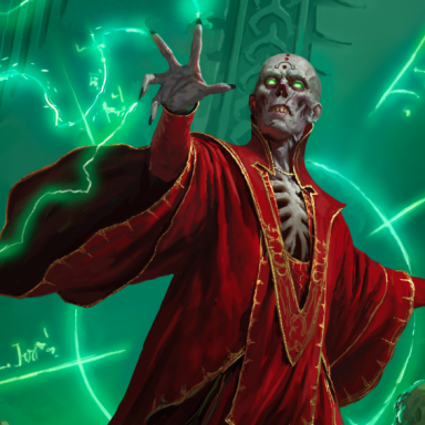
What I'd have done? Comissioned three pieces of art that, when placed side by side, form a giant scene. PHB has 4 heroes attacking... MM has 2 other heroes engaging five different monsters (orcs, beholders, zombies), who are defending... the archmage in the DMG cover, who's stading before his huge dragon cohort.
 

JVisgaitis said:
So what does everyone think of the new logo? QUOTE]

I don't like it too much.

It is too big and there is way too much white, this clashes with the rest of the cover.

otherwise, it looks OK.
 

I like the new logo. For me, it was the old 3e logo that was starting to look cheesy and out of place, at least on anything that didn't have a dark brown or blue backing. The new logo looks much better on its own than the old one did, though it might class with colours the old one worked well with (the aforementioned brown).

I like the look of the covers for the most part, though not so much the second character in the back on the PHB. Orcus looks good, but I kind of question why they chose him as the new spokesdemon of the MM. Also, when the hell are we going to see a cover with a dragon that doesn't feature a red dragon? There are 9 other colours to choose from!
 

I like the design of the logo, but the color choice could be tweaked.

I love the full-cover artwork instead of the pseudobook thing.

I like like dynamic action in the artwork, or something that conveys a story or a sense of wonder (remember that giant spider about to attack in the 1E MM, and the one PC "off camera" with just his hand pointing at it while most of the party is oblivious?)

I dislike "poses."

I'm heartily sick of WAR's work, and wish 4E had a different look.
 

Klaus said:
As for the art, while I like WAR, these are far from his best work (PHB specially). And if these are the core books of the new edition, they HAVE to be someone's best work.

Yeah, I agree with you. I like the art, but it certainly isn't what I would have gone with. I think they look good and for art that has to appeal to a wide audience I think its a solid choice. Of those the PHB is certainly the weakest when it should be the best. Why they went with 2 characters when it should be a party of adventurers I don't know.

I like WAR as well, but all of his stuff looks the same and has the same vibe. The same lighting, the same colors, the same dynamics. That and I don't feel anything from his pictures. Its pretty to look at and technically very well sound, but that's about it.

If I was commissioning the covers I would have done wraparounds and I would have picked an artist who could do some really dynamic and dramatic lighting like Raven Mimura. I would have done something more along the lines of what Komarck did for us, but I would have had more action in there and made the characters bigger.


I'm perfectly happy with the look of the new logo. I just hope they take down that "Whooomph!" sound that plays every time you go to the D&D homepage.
 

I love the new look. It is old school without being tacky old school. While I loved the 3.0 faux book covers, they get old and boring to look at while these covers present an exciting image. I can NOT wait for these to come out and maybe, hopefully, we can get soft covers back as well.
 

Remove ads

Top