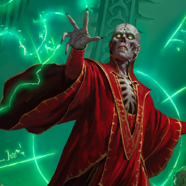
PHB, MM, DMG covers

I have to ask.

Why is it all right for a ginormous lizard to have wings (requiring two additional limbs), but not to have a spike on its nose?

It boggles to see the number of people complaining about the freakin' nose spike.
 

log in or register to remove this ad

Fifth Element said:
It boggles to see the number of people complaining about the freakin' nose spike.

Nerd Rage is Serious Business!

edit: However, in all honesty I don't think I can deal with Eight. More. Months. of negativity and snark.

The WotC boards are bad enough.
 
Last edited:


John Drake said:
WotC should have just gone a little deeper into the coffers and got an artist of real high caliber like Larry Elmore
I doubt Elmore commands premium prices anymore. On the other hand, Wizards of the Coast probably paid between $5,000 and $10,000 to Todd Lockwood for the cover art of Draconomicon. I don't think they can be accused of being too cheap regarding cover art.


Fifth Element said:
I have to ask.

Why is it all right for a ginormous lizard to have wings (requiring two additional limbs), but not to have a spike on its nose?

It boggles to see the number of people complaining about the freakin' nose spike.
Can't speak for anyone else, but MY problem is with THAT nose spike.

As it is done (and it is done in the same way in the sketch by Lars Grant-West in the Design & Development article on Dragons at WotC's site), the spike clashes with the rest of the body design. it doesn't look like it belongs in the beast, like the artist was unsure of how to do the dragon's snout. A good design "clicks", and this one doesn't.

At least, IMNSHO.


Though it's not a dealbreaker or anything like that for me, I strongly dislike this cover art. I was a fan of 3e/3.5e tome covers. I also liked the PHBII style of cover design. But I strongly dislike Wayne Reynolds' work with only a few exceptions.

Haven
 

I think the artwork is fine but not WAR's best work. I would have preferred an action scene incorporating both heroes and villains.

I'm also not fond of the white band at the top. It's there to just provide contrast to the title and ends up taking away from the artwork.

The covers are fine but not as good as they could be.


Remove ads

Top