Redesigning and re-branding EN World

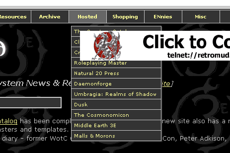
This will probably only matter to about three people, but in Opera on the page with the menus at the top, every time the banner ad changes, the page reloads. This makes the page unusable under Opera.

This doesn't happen with the side-menu version though.
 

log in or register to remove this ad


use tabs

my opinions:

Drop down menus on web pages are horrible no matter where you put them. Keep sidebars on the left if you must use them so that text can freely flow with browser width. The page is too dark. Dark text on light backgrounds would be beter.

I suggest you use tabs, like amazon.com, or apple.com. They are simple and effective. That's why those places use them.

I suggest you read a book on web design. Try Steve Krug's _Don't Make Me Think_. See http://www.sensible.com/buythebook.html

I'll summarize this wonderful book: Use tabs.

Good luck with the redesign.
 

Me likes the looks of the test, Morrus. The drop-down or side menus are nice; you've kept the current color scheme which I like quite a bit, and it's not too radically different. That comicbook resources website is an eyesore. Techically very nice...but yeuch!

for the love of god, though... NO LIGHT BACKGROUND!!! I absolutely hate reading things off of the computer, and the current colors are very easy on the eyes.
 
Last edited:


I prefer the menu-to-the-left version. When the menu is on top, the banner is in front of lots of menu items, simply disabling access the them.

enwdrop.gif
 

I'd rather see dark text on light background as well. It's also easier to print out.

And hopefully you won't use the design of that comicbookresources.com site. Very impersonal and scrunched.

Basically, you're going to hear all sorts of conflicting advice. I don't envy you :(


First time posting to the forums, but I've been visitng this page and/or Eric's since 3ED came out. As for the site redesign, very professional looking. Easy to navigate, and not too cluttered. I like it.

urDrakas
 

Remove ads

Top