Sneak Peek At Ghosts of Saltmarsh Maps

Here's a sneak peek at some of the maps to be found in the upcoming D&D Ghosts of Saltmarsh, courtesy of WotC's Twitch stream.

Here's a sneak peek at some of the maps to be found in the upcoming D&D Ghosts of Saltmarsh, courtesy of WotC's Twitch stream.


ghost_saltmarsh.jpg


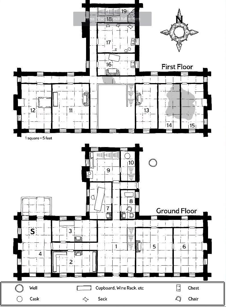
And Dyson Logos, one of the cartographers for the book, has shared some of his work which will be appearing!


D1WNe3OWsAU8xwR.jpg


D1WNe3NWoAIjD-j.jpg
 

log in or register to remove this ad

G

Guest 6801328

Guest
Is this thread seriously still debating the map orientation question?

Is it slightly more difficult to interpret? Sure. By about the same amount as, say, putting a parchment background behind text, or using flavorful typefaces.

Maybe RPGs should all be published exclusively in black Times on white backgrounds so that no extra neurons will be required to utilize them.

I like the sideways map. Reminds me of the Erebor map in the Hobbit. If every now and then I say, "Oh, right, that's East, not North" that ranks 3,478th on my list of problems.

And a Lich ain't one.
 

log in or register to remove this ad

Remathilis

Legend
Are we also forgetting that this map is in a book and most D&D manuals are printed with vertical orientation, so that printing a horizontally-aligned map would require either being a smaller 1/2 page map or a larger two page spread?

I'll take an East oriented map over losing a page to a double spread city map or a half-sized harder to read one.
 

I was reading an article on Aphantasia the other day https://www.bbc.co.uk/news/health-47830256 and I have just realised I do something that I hadn't really been aware of. I create a mental image of a map and can rotate it in my minds eye to any orientation. Thus changing the direction of north doesn't even cause me to hesitate. However, if someone had Aphantasia (and it's apparently not all that uncommon, affecting about one in 50) they would be unable to have a mental image of the map, and so would be unable to mentally reorient it.
 

WaterRabbit

Explorer
So, you have to rotate your 200 page (ish) book every time you want to use a map properly and that's "bowing to blind convention"?

Again, NEARLY EVERY print map you've ever used in your entire life has put north on the top of the map. And, note, sure, I can just reorient the map, but, in the print product, that's a bit more difficult.

You must not use a lot of 45 degree bends if you only give directions like left and right.

DM: The corridor T's ahead of you, left and right.

Player: So, East and West?

DM: No, remember, North is to the left of your map.

Player, Ok, so, North and South.

DM: No, it's not quite a right turn. It's a soft turn in each direction.

Player: So, Northwest... or, sorry, right, north is to the left, so, northeast and southeast?

DM: Yes, that's right.

Player: Ok, we head down the northwe... I mean northea... I mean left corridor.

Again, no thanks. Draw the map properly in the first place and there's no problem. You can call it "blind convention" all you like, but, well, it's been that way for about five hundred years. At that point, it's not just convention, it's how it's supposed to be done. And, it's done that way so that everyone who looks at the map immediately knows how to orient it, even maps without a compass rose on them. My paper provincial map of Ontario doesn't have a compass rose on it, yet, I automatically know how to orient the map. My google map searches automatically orient north to the top, so, that I don't have to hunt down which way that map is oriented. I can assume, because maps are drawn north to the top, that north is, in fact, on the top of the map.

There's a word for "blind convention" that I'm not sure you're aware of. It's called standardization. Heck, a meter is just a "blind convention" too, and so is a yard or a pound or a kilogram or virtually any other measurement. Yet, funnily enough, a kilogram is the same everywhere in the world.

I guess we should not follow standards and have to learn new ones every time. :erm:

-------- Edit to add

Oh, yeah, let's not forget, when we rotate the map 90 degrees, all the text on the map rotates as well. Meaning that the map now looks like crap because everything written on the map is oriented wrong. So much for all that work making a beautiful map. In actual use, your map looks bad and everyone reading your map is cocking their head to one side, looking like a confused Labrador.

Draw it right the first time and all these problems go away.
You must write copy for infomercials! Lol. Take something trivial to do make make it seem really really difficult.

If you have a paper map -- you know the most common form of map in the last 500 years, there is no "top". Google maps has created this expectation more than anything.

Blind convention is doing something without thought because everyone else does it. Again, you are being pedantic. Your are trying to create absurd scenarios to try and proved your silly point. A map's usefulness does not require it to be orientated in a particular fashion. The information on the map is what is important.

Your argument about the map in Saltmarsh focuses on the trivial and the shallow. You apparently aren't concerned if the map conveys the information necessary to run the module effectively -- just that it is in the wrong orientation. It is the same trivial and shallow argument about whether the map is in color or not.

I want a map that conveys the information I need as a DM to run the game effectively. The map helps me understand the spatial/temporal relationship between objects. Literally the least important information to me is the arbitrary location of the compass directions. For the Saltmarsh maps you could just pick any side of the map you like and label it north as it is totally irrelevant to running the module. It is especially relevant if you home the city into your own campaign where its orientation may or may not coincide with its new location.

The point you are trying to make is absurd precisely because it is so irrelevant. Apparently this is a religious matter for you or something.

For important maps, orientation is important. As a geologist it is important to have maps provide precise orientation -- not just of the magnetic north but also magnetic declination so one can adjust their compass.

However, for D&D, such precision is not needed. In fact most of my D&D maps don't even bother with compass directions as they just aren't relevant -- especially if the campaign is set before Renaissance level technology.

As a side note: Your 500 year timescale is not correct. It was the invention of the marine chronometer (1761) that brought about the beginning of map standardization. The convention that you so ardently adhere was not so ingrained into people when I was growing up, so we are really only taking about a 50 year period where people started publishing maps consistently with north towards the top of the page. However, you could also say the same for the mercator projection. It is useful for a large number of applications, but if that is the only projection you are willing to work with it is inherently self-limiting.
 

MNblockhead

A Title Much Cooler Than Anything on the Old Site
I is weird for me to read folks actually arguing that most people in a pre-modern era wouldn't know which way north is. I would think that the opposite is true, especially for a time when roads were less uniform and where you would often have to travel off road.

In any event, this goes into my "pet peeve" bucket. As long as there is a compass rose to indicate directions, I can live with north being down or wherever.

But I have to push back at those saying that expecting and preferring adherence to some standards in a gaming product is somehow blind adherence to unnecessary rules that harm art. Yes, I like beautiful adventure books and beautiful maps, but not at the expense of usefulness at the table.

In a large adventure book that I mostly like, I'll overlook the occasional difficult to use map. But I might pass up on a map pack or individual map purchase that sacrifices usability in the name of novelty or the creators artistic vision.

And, since someone mentioned fonts, yes, there are some beautiful fonts that I would not want used because they make the material more difficult to read.
 

Hussar

Legend
Is this thread seriously still debating the map orientation question?

Is it slightly more difficult to interpret? Sure. By about the same amount as, say, putting a parchment background behind text, or using flavorful typefaces.

Maybe RPGs should all be published exclusively in black Times on white backgrounds so that no extra neurons will be required to utilize them.

I like the sideways map. Reminds me of the Erebor map in the Hobbit. If every now and then I say, "Oh, right, that's East, not North" that ranks 3,478th on my list of problems.

And a Lich ain't one.

Heh, Times is an ugly font that would turn me off of any map. :D

And, yeah, you want to use those fancy squirrely fonts? Make it hard to read? Next map please.

The point of a map is to be used. Particularly a map for D&D. It's not an art piece only. It has to be functional. Which means anything that makes it harder to use is bad. Thus, randomly choosing a compass rose to point to the left, using hard to read fonts, using odd parchment colors that bleed into the map itself, are all examples of poor map design.

[MENTION=2445]WaterRabbit[/MENTION], I'm frankly rather surprised that you are arguing so vehemently on this to be honest. Yes, there is a top of a map. Because maps often have writing on them and the writing is oriented to the top of the paper. Which, virtually always, is north (or close enough to north anyway). Which has been done for virtually all maps for the past 500 years. Heck a quick Google search of 16th century maps proves that. Maps are a pet thing for me. I love maps. I spend far too much time perusing old map collections because it's a bit of a hobby.

You know what I don't see in all those collections? Maps with north to the left of the page. :D In all the years I was in the army, never saw that either. We used grid coordinate maps, down to a 100 meter square, and yet, the maps were always oriented north to the top (or close enough). When using a paper map when orienteering, you orient your map so that the map follows the compass, not the direction of travel, which means the top of your map will almost always point north. When using a chart on a ship, you don't rotate your map in the direction of travel.

True, car navigation does do that, mostly because you're limited to a very small screen and partially for convenience. And, yup, my navi says, Turn left or Turn Right, and, guess what? When you live in a country which has spaghetti for roads, it's incredibly confusing. When you have five or six roads coming into the same intersection, and the navi says, "turn right", it's pretty hard to know what to do without looking at the map. Sure, Americans and Canadians have it easy. Your cities are square. Virtually all intersections are at 90 degrees. No problems. In countries without gridded cities, navies get a whole lot more difficult to use.

-----

HOLY CRAP!. I have read the Hobbit I don't know how many times. Lots. I never, ever realized that the map was screwed up. It never occurred to me that north wasn't to the top of the page. Yeah, I know it says, "West blah blah blah" and so on, but, it never actually registered in my head. Yikes. Welp. Learn something new every day.
 
Last edited by a moderator:

SkidAce

Legend
Supporter
Are we also forgetting that this map is in a book and most D&D manuals are printed with vertical orientation, so that printing a horizontally-aligned map would require either being a smaller 1/2 page map or a larger two page spread?

I'll take an East oriented map over losing a page to a double spread city map or a half-sized harder to read one.

Quoted for truth.
 

Hussar

Legend
We'll have to see. Likely, since the adventure isn't in the town, and the town never actually really mattered in the adventure, it's a half page map. That would be my bet.

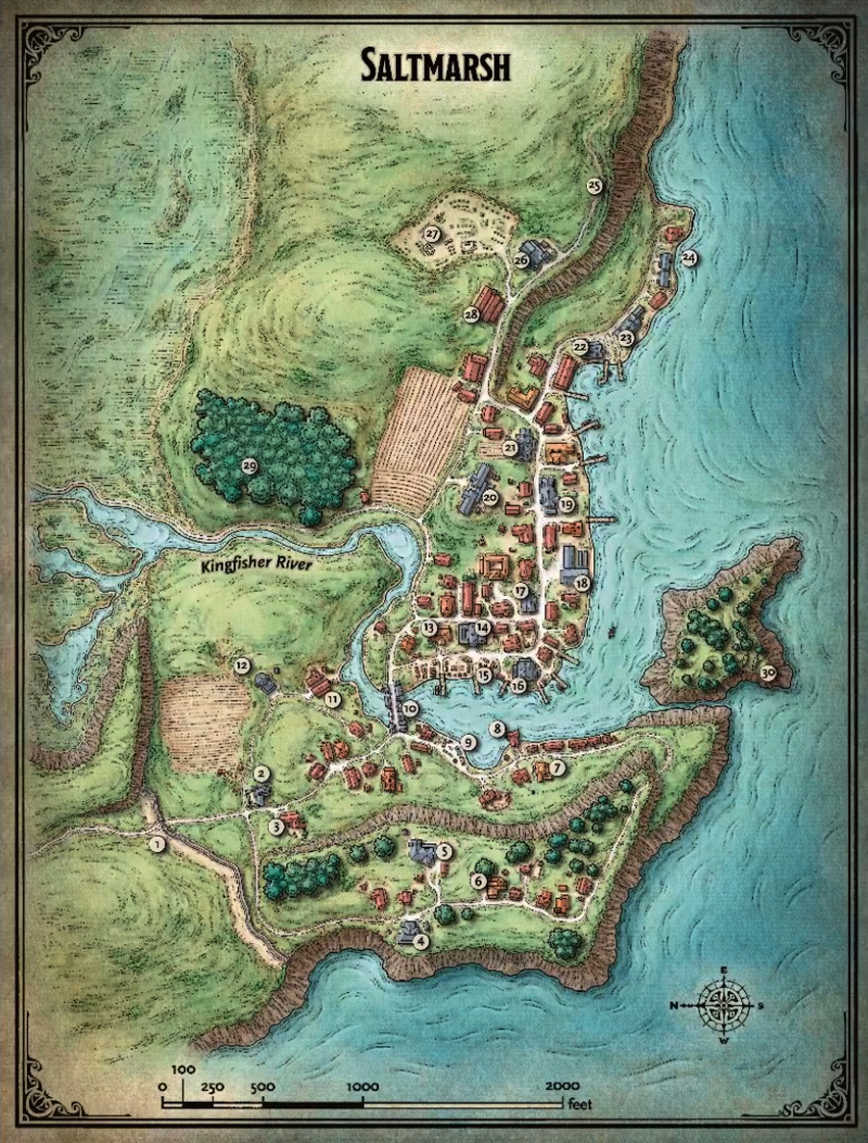
However, look at the image. The image is sized to be on a single page. It's tall and skinny, not wide. There's no way that's a two page spread. That's a single page spread map with a wonky compass rose.

Just to remind folks, here's the image:

attachment.php


There's no way that's a 2 page spread map. It simply can't be. Unless they then turn the map 90 degrees to put north at the top and make all the text the wrong way. :D
 

It's absolutely fine for me like that (although I would also want a player map without numbers). If you find it difficult relocate it to an east coast and ignore the rose.

If you wanted to locate it on a west coast (e.g. Sword Coast) you could rote it 180 degrees or reflect it (easy enough to do on a computer).

I can read sideways, backwards or upside down - probably because I'm dyslexic, but assuming there is an unlabelled player map you can always write on the key in the orientation of your choice.
 

Hussar

Legend
It's absolutely fine for me like that (although I would also want a player map without numbers). If you find it difficult relocate it to an east coast and ignore the rose.

If you wanted to locate it on a west coast (e.g. Sword Coast) you could rote it 180 degrees or reflect it (easy enough to do on a computer).

I can read sideways, backwards or upside down - probably because I'm dyslexic, but assuming there is an unlabelled player map you can always write on the key in the orientation of your choice.

Heh. Missing the point. Every single boxed text description in the town will be oriented with that map. Presuming there is. Which means that I'll have to rewrite all of that as well.

Look, sure, it's not the end of the world. It really isn't. But, it's such a pointless thing to do. That map is oriented north to the top. There is no reason for that map to to be that shape and not be oriented that way. The only reason the artist did this was to be "artsy". It's not. It's a pointlessly annoying thing to do that makes the product harder to use.
 

Remove ads

Remove ads

Top