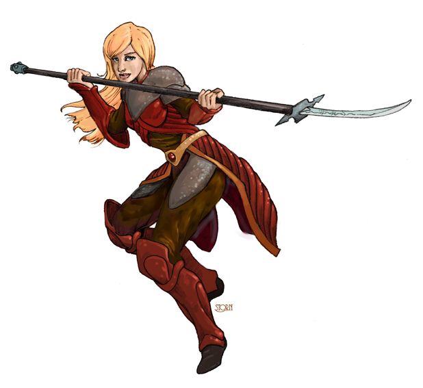
First off, lets get the marketing/business thing out of the way first. Its been some time, but I just released another clipart Portfolio from LPJ Designs, the 24th! And this is a big one, 8 pics of art!!! I really appreciate all the commissions that I get, to continue to be able to provide this reasonable priced art for indie and small publishers. So thank you all who give me your character concepts to bring to visual life.
The link to the the portfolio is here:
http://lpjdesign.rpgnow.com/product/113898/Image-Portfolio-Platinum-Edition-24:-Storn-Cook
and remember, you can preview the entire portfolio (or any of them) before buying, so you know exactly what you are getting.
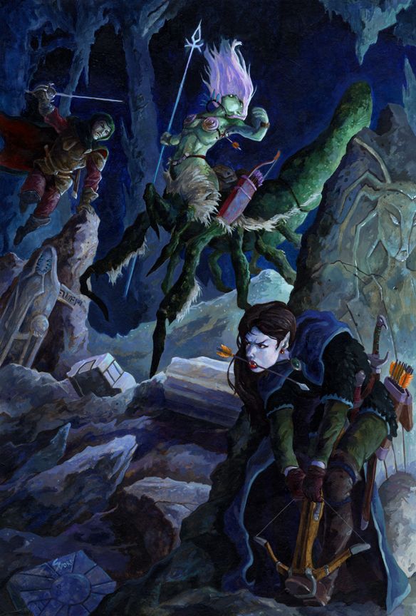
Next up, Paul C. has me take concepts I've already illustrated, from his games, and put them into actual scenes. It is a ton of fun and Paul's descriptions are excellent and I think I've really gotten better at painting from the practice.
First up, Vampire and Tiefling vs. Dryder. This is my first all-acrylic pic I've painted in quite some time. I use acrylic often as an under painting, but after talking to fellow artists, Jeff Szuc and Steve Ellis, I decided to use clear matte medium as my glazing medium, instead of water. I tend to like to sneak up on color with glazes and tints. With water, I always got this kinda blotchy glazes and tints and wasn't happy with it. With matte medium, I got a nice even distribution and it handled like oil paint. Score!!!
And I decided to not really go for a cover format, allowing myself to use all the space, especially at the top for action.
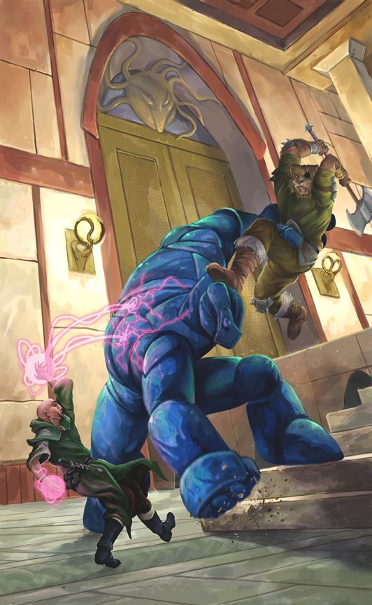
Commissions are my experiment time. And this next one was a real experiment for me. I did the WHOLE thing digital. Now, I tend to do somewhat tight pencils for paintings. Here are the pencils for VnT vs D above.
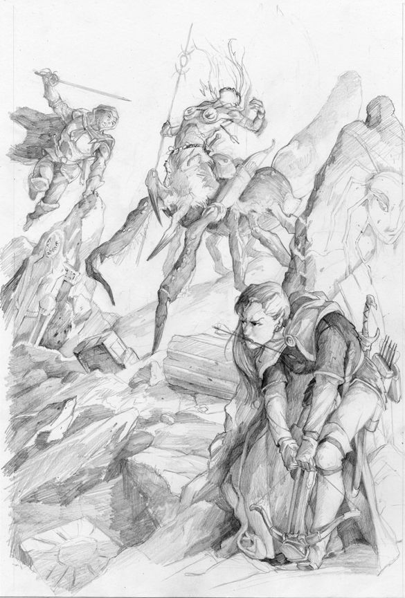
V n T vs D sketch
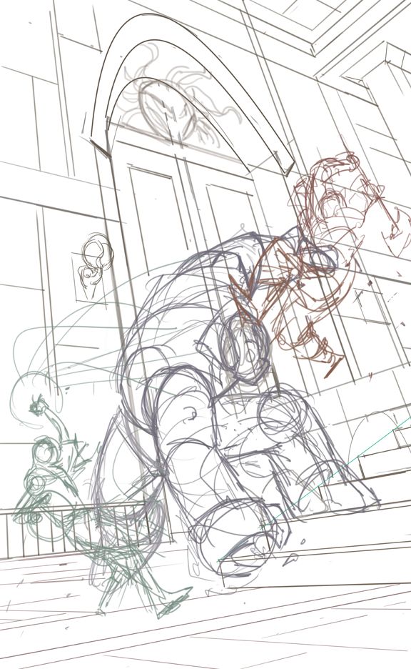
Then I went in on that and did a fairly tight underpainting. But here is my digital sketch, which, was made possible by my cintiq and Manga Studio 5 made the perspective stuff really quick. So, really sketchy and loose. Paul asked for a stone golem, which I slipped sideways in concept to a stone marble golem.
This painting is "designed" to be a cover, even though there is no actual product for it to be on. But after the Dryder painting, I didn't want to get lazy in thinking about that.
And here is the finish. I really like Manga Studio 5 more and more. I used it for about 70% of this digital piece, bouncing to Painter and Photoshop for specific functions. Manga Studio's pencil and oil tools are few, but I really dig their them. And the blending tool is as good as Painters, which I love...and far superior to Photoshop's.
So. There you have it. A peek behind some recent experiments. And by the way, these are both available as prints at:
http://fineartamerica.com/profiles/storn-cook.html?tab=artwork&deleteartworkid=3825803&page=
Also, if there are any publishers who want 1st print rights at a reasonable rate for either (or both), drop me a line at
storn.cook@gmail.com. These won't ever be in a clipart portfolio, as too much time went into them as well as the specificity of their narrative.

")