Weapon Illustration Sketches

Howdy there! I think I'll forego the praise comments, but don't think you don't deserve 'em :). I've been messing around with coloring a few more of these things, and I did one I really liked. This is the knife from way back on the 5th post of this thread.

--Lotsa respect for ya, man. These are great resources for any gamer, and great to look at for anyone else.
 

Attachments

  • knife15COLOR2.jpg
    knife15COLOR2.jpg
    26.3 KB · Views: 143

log in or register to remove this ad

orbitalfreak said:
Howdy there! I think I'll forego the praise comments, but don't think you don't deserve 'em :). I've been messing around with coloring a few more of these things, and I did one I really liked. This is the knife from way back on the 5th post of this thread.

--Lotsa respect for ya, man. These are great resources for any gamer, and great to look at for anyone else.

Excellent work orbitalfreak! Thank you. :)

And thank you for the compliment as well. :)
 

orbitalfreak said:
Howdy there! I think I'll forego the praise comments, but don't think you don't deserve 'em :). I've been messing around with coloring a few more of these things, and I did one I really liked. This is the knife from way back on the 5th post of this thread.

--Lotsa respect for ya, man. These are great resources for any gamer, and great to look at for anyone else.

Wow, that's a really nice job.

Just to clarify on my request Tetsubo, I was thinking of something sort of like a roman scorpion except that it would shoot crossbow bolts instead of ballista bolts. It should be portable by a single person (maybe 40-50 pounds) but you would need to set it up to use it. Maybe it should have 2 bows so that while one is firing the other can be resetting. It should have a big crank on either side so that it can be operated by to people. I guess it would make sense for it to have a Dwarven or Gnomish look to it but feel free to do something else if you feel like it.
 
Last edited:

Minimalist Great Sword...

Recently I posted a sketch of a simple two-handed sword. I was trying for a very clean, basic, absolutely spare design. I mentioned that I thought I had failed at achieving my goal. Well I think I may have succeeded with this sketch.
This design is just the bare essentials of a great sword, blade and grip. Nothing added, nothing not needed. It did end up looking very Asian in style. But when you try for a minimalist look it is hard not to see that Asian influence.
It occurred to me as I worked on this sketch in my head that I spend a lot of time contemplating weapons design theory. I wonder what a mental health professional would say... :)
 

Attachments

  • sword120.jpg
    sword120.jpg
    30.8 KB · Views: 154

orbitalfreak said:
Howdy there! I think I'll forego the praise comments, but don't think you don't deserve 'em :). I've been messing around with coloring a few more of these things, and I did one I really liked. This is the knife from way back on the 5th post of this thread.

--Lotsa respect for ya, man. These are great resources for any gamer, and great to look at for anyone else.

orbitalfreak, what are you using for coloring? I really like the metal shading/highlighting.
 

Tetsubo said:
orbitalfreak, what are you using for coloring? I really like the metal shading/highlighting.
Photoshop. Here's the process that I used for this picture, and one that I think I'll use from now on, since the results are pleasing to me (and others! woot :))

1) Image -> Adjustments -> Levels.... Mess around with the sliders at the bottom to get rid of most of the grid lines. Go in with a white color brush and paint over any lines that remain that I want to erase.

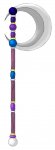
2) Make a bunch of new layers, labeled by part of the weapon. For this piece, I did:
a) Pommel
b) Handle
c) Studs (in the handle)
d) Crossguard
e-g) Three gems, each one separate
h) Sharp edge of the blade (light area)
i) Body of the blade (dark area)

3) Pick a layer, say "pommel," and a color (i use the Swatches in Photoshop, the continuous palette gives me trouble due to color-blindness), then paint a blob on that layer to cover the piece. This makes a layer with color on a certain area, without touching the background outline of the piece. In the Layers navigation pane, switch Opacity to 50% or so to see the outline behind the paint. Touch up with an eraser tool, using the now-visible lines for a guide (brush style eraser, not the pencil or block). Repeat with each piece you want to do.

Helpful hint: Doing things like the gems, where they overlap the Blade Body, it helps to turn off visibility of layers to make sure colors won't overlap later.

4) After coloring all the layers you want, make sure they are all at 100% opacity, and set their "Blend Style" to "Multiply" in the Layers pane. Then select all the colored layers, and merge them, so you end up with a full colored piece, and the outline as well (2 separate layers).

5) Grab the Dodge tool, set to highlights, set Exposure to around 3%-5%, and pick a brush; I prefer the ones with softer edges, it gives a more continuous and flowing look to the highlights. Pick a direction for the light to come from; I usually use top-left corner or so. Start playing around with the Dodge brush until you get the results you want. I suggest moving the brush in a full, filled-in circle pattern, lowering the radius of the circle each pass, to give a barely-there look at the edges of the highlight and a bright spot at the center of the highlight. Not very complicated, just swish the brush around till you get what looks right.

6) Look for areas that are in shadow. Bottom of the pommel, handle, and crossguard, and some curves here and there. Use the Burn tool, I usually keep it set to highlights, the other settings get too dark for me. Also, again use about 3%-5% exposure. Grab a brush and Burn in the shadowed areas till it looks right; just like the Dodge tool from step 5.

For this piece, I also used the Burn tool to shade in some fingers at the bottom of the handle, going up vertically, and a little bit up top where the palm and thumb would be. I pictured myself holding the weapon, and Burned a little where flesh met wood; this gives what I think looks like an oil-stained appearance collected from use. Inspired by the dark spot on my door where I grab it to close it all the time :).

7) After all the highlighting/shading is done, make sure the colored-and-highlighted layer is set to "Multiply," then do Layer -> Flatten Image, to give a single layer to the piece, and save.

Total time for the Knife was about 2½ hours, counting goofing off and experimenting with different tool settings.

[edit]
Colors:
Pommel and Crossguard -- Medium Warm Brown
Handle -- Light warm brown
Gems -- some random green, pure blue, pure red.
Blade back -- 40% grey
Blade edge -- 20% grey

I use a 19 pixel default brush for most of the work, switching to 9, 5, 3 for the smaller details. And lots and lots of Undo/Redo action.
[/edit]
 
Last edited:

And here's another one I did. This crescent just screamed "Moon" to me, so I attacked it with a Stellar/Solar theme. The main haft is some wierd color that I'm indifferent to... was trying for something, but forgot what halfway through, hehe. The balls and nubs follow a Twilight -> Dusk -> Midday color shceme as you move down. The rings are alternating silver/gold for the Moon and Sun, with the moon taking precedence, evidenced by it being the color of the endcap, and having more silver than gold.

Layers used:
Haft, all the balls and nubs, outer blade, inner blade, rings, rivets. Fairly few, considering how I was going to do a separate layer for each division of the staff and individual balls and rings.

Little tidbit on the balls. I couldn't get the lines to disappear inside of them, and didn't want to just white out the insides, since I wanted to keep some sort of texture there. Instead, I used the Blur tool and smudged the lines out of existance, and things worked out pretty well. 1¼ hours.
 

Attachments

  • axe85COLOR2.jpg
    axe85COLOR2.jpg
    38.4 KB · Views: 131
Last edited:

orbitalfreak said:
And here's another one I did. This crescent just screamed "Moon" to me, so I attacked it with a Stellar/Solar theme. The main haft is some wierd color that I'm indifferent to... was trying for something, but forgot what halfway through, hehe. The balls and nubs follow a Twilight -> Dusk -> Midday color shceme as you move down. The rings are alternating silver/gold for the Moon and Sun, with the moon taking precedence, evidenced by it being the color of the endcap, and having more silver than gold.

Layers used:
Haft, all the balls and nubs, outer blade, inner blade, rings, rivets. Fairly few, considering how I was going to do a separate layer for each division of the staff and individual balls and rings.

Little tidbit on the balls. I couldn't get the lines to disappear inside of them, and didn't want to just white out the insides, since I wanted to keep some sort of texture there. Instead, I used the Blur tool and smudged the lines out of existance, and things worked out pretty well. 1¼ hours.

Another well done piece, my thanks. I also appreciate the breakdown of the coloring process. Knowing the artistsic process is always handy. Mine just involves a pencil, eraser and a pad... :)
 

Tetsubo, I just wanted to give you a big thanks. That nagamaki you did for BardStephenFox was for my PC. Awesome work! My PC received it last night, and it made a huge impression. Thanks.


Remove ads

Top