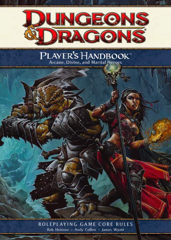
Can we at least agree that the woman on the new cover has a more reasonable pose than this?
I really like the 4e game, but looking at that cover, it occurs to me just how much is wrong with it! You make an excellent point about the portrayal of the lady in the artwork. Compared to this, the lady on the 5e Player's Handbook is a significant step forward in portraying a female fantasy character in a reasonable, non-sexualized manner. On the 4e cover, she is wearing totally unreasonable attire made to expose skin and cleavage, she is posed in that arched back boobs-and-butt-on-display fashion which just makes no sense. I am sitting here at my desk looking at this and curiously decided to try contorting myself into such a stance... it is wildly uncomfortable, and would never be done while trying to fight, as these characters seem to be about to engage in. There may be slight nods to femininity in the Elf on the 5e book's cover, but it's subtle and still reasonable that her gear & attire represents real adventuring gear, and that her stance is curved ever so slightly backward in an attempt to ... you know, not be leaning in close to get a big whiff of that smelly fire giant breath (and, hmm, dodging backwards, perhaps, so as not to get splattered).
Beyond that, and this isn't really related to the artwork anymore, the subtitle "Arcane, Divine, and Martial Heroes" is kind of weird, because if you didn't have any experience with the game before, and you were trying to buy into it for the first time, that subtitle would mean nothing to you, and would possibly even confuse you into thinking this wasn't just the standard, first rulebook you should get, but maybe instead it's a special Player's Handbook supplement to introduce new features or ideas or hero types into the game that weren't in the original rulebook.
And my last quibble is just a nitpick from my own personal tastes and has no objective merits as a criticism, but I personally don't like seeing the authors names on the cover for a D&D core rulebook. It kind of takes the mystique out of it a little. Not sure if I could explain why...
I like the 5e cover by far the best out of every cover since the first AD&D1e Player's Handbook. I like the art, I like the move towards a plain "D&D" branding. I like the placement of the text, I like how it doesn't contain any information we don't NEED to know. The little subtext on the bottom makes it quite clear what this is for: "Everything a player needs to create heroic characters for the world's greatest roleplaying game."
OK, so I could have done without the "world's greatest roleplaying game" part, but I thought about how I'd rephrase it, and my first instinct is to just say "... for the Dungeons & Dragons roleplaying game." But now we've got "Dungeons & Dragons" on the cover twice, so we remove the red banner on the lower left side, but now we don't have a very clear indicator that "D&D" is "Dungeons & Dragons", unless you read the entire two-line subtext to get the idea. So I like the red banner, and I'd keep it there. So I'm not going to include the words "Dungeons & Dragons" in the subtext, so I'm perfectly fine with what they've written there in its place. It gets the point across, and while it may seem presumptuous and a tad hyperbolic to say right on the cover that's it's the world's greatest, it also serves its purpose of making whoever picks this book up look at that cover and say "If I want to get into roleplaying, THIS is the book I need!"
All in all, they've done a fantastic job with the cover.

")


