D&D 5E Good art and Really bad art in the 5e PHB


log in or register to remove this ad


Anyone else think the female warrior on the page across from the weapons table looks like Shae from Game of Thrones?

Regardless, she has a real Arabian Nights look. I'm also glad to see a more diverse array of humans in the artwork.
 

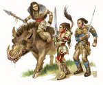
Why all the hate for the 5e halflings? I personally like the way the halflings are done in 5e. Disproportionate? Of course! But, that's what makes them look distinct. I hated what 3e and 4e did with halflings. I could never tell if a 3.5/4e halfling was a halfling or a human unless there was another character in the picture for size reference. Even to this day, I still envision Lidda, the iconic halfling rogue, as a full sized human every time I flip through the 3.5 PHB.

What you don't like about it is actually the way they are supposed to be. They are supposed to look like miniature thin built human. They aren't supposed to be plump with big feet and massive heads.
 

Dunno what's up with the midget ninja/samurai on page 110. Dunno if that's supposed to be an Asain dwarf, gnome or just some really badly proportioned human.

I really like the item art. It all looks very believable. I like the gnome teaching the volmunetric spells on 201, that's adorable.

Are there two different versions of the PHB? There is no art on page 110, but there is art on 105, 112, 116 and 120. Also, the gnome teaching is on page 204 in my book.
 

When I imagine halflings, this is what I see.

Halflings_-_Steve_Prescott.jpg
 

I generally like the art. 3E tried to be edgy and gave us the "bucket of belts" sorceror and porcupine fighters. I prefer my fantasy characters to dress more like real people.

The art for character classes is really well done for the most part. One of my favorite pieces is the dredlock-bearded wizard.

The halflings were designed to be anatomically distinct from humans, and while their feet are indeed tiny I tihnk I can get used to seeing them depicted that way.
 

The Halfling art is definitely a let down for me. The Halfling Bard on page 26 of the PHB looks like he decreases in scale as you go down his body. The size of his head compared to his hands and then his feet is just silly. I'm definitely no artist, but it just doesn't look anatomically correct.
I look at that piece and I clearly see the artist going for a sort of photographic exaggeration of the halfling's proportions, as if he (she? can't remember without my book) is being snapped with a fish-eye lens.
 

I generally LOVE the art in the PHB. It's...warm, I guess is the closest word I can conjure. You turn the page, your eye slides over another beautiful piece, and from there into the text. It's just the way it should be.
 

I'm still reading through the book, but I looked at all the art first. I must say I'm disappointed overall. The halfling and gnome art is horrible, and a lot of the rest of it is just muddy looking. I just can't get over the halfling art, though - it's absolutely hideous. I can't imagine what they were thinking.
 

Remove ads

Top