• The VOIDRUNNER'S CODEX is coming! Explore new worlds, fight oppressive empires, fend off fearsome aliens, and wield deadly psionics with this comprehensive boxed set expansion for 5E and A5E!

Site supporter 'avatars' to big.

cougent

First Post
I actually like them for now, but can see where eventually they will get old.

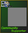
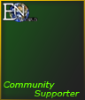
I have noticed that Mark and Nift (and others in other threads) have a 'Community Supporter' link under their titles. Currently none of them seem to work (404 errors), but is this something they have done themselves in their title boxes or is it a board feature? If nothing else, it would be nice to have that link to the community supporter sign up page [my guess as to where it is intended to link] even without the badges. Smaller badges with muted colors would still be nice though, kind of nice to be noticed.:cool:
 

log in or register to remove this ad

Pbartender

First Post
I agree with both of these.

If you must highlight mods & community supporters, and I don't think it's universally good to do so, there are many less visually intrusive ways to do so.

On the previous boards, mods were distinguished simply by bolded usenames.


I tend to agree, though... The badges are too large, and in general don't fit the visual style of the default skin. Something a little more discreet would be nice. To use Mark's analogy, nudging as a reminder is fine, but shouting in my ear is a bit much.

In addition, not everyone who has a Community Supporter account seems to have a badge -- I don't -- which reduces their effectiveness.
 

MUCH TOO BIG.

Jesus, are you people being paid off by widescreen monitor manufacturers?

It seems like every change so far has decreased my ability to view EN World in anything less than 1024-wide window. I have other uses for my screen real estate, you know.

Even Gleemax isn't this bad anymore.

-- N

I agree with Nifft, though I still think the site is way better than gleemax!

But on a scale of Craigslist to Gleemax, your site just moved way closer to Gleemax. And in my opinion, that's a bad thing.

I also completely agree with the comment regarding the neon colors, and the size of the community supporter badge. To me, the size of that bade is actually a disincentive to become one.

Ken
 

Umbran

Mod Squad
Staff member
Supporter
But on a scale of Craigslist to Gleemax, your site just moved way closer to Gleemax. And in my opinion, that's a bad thing.

In terms of "has graphics" I would have to agree with you.

In terms of "usability", we may have to agree to disagree. Craigslist is hardly a poster child for good web design. Craigslist is analogous to a warehouse-store: sure, the thing you need is there, but actually being there and wandering around is not a pleasant experience.

This is not to say that EN2 is perfect, of course, but I think you'd find that if we were like Craigslist, we'd lose posters in droves, and the things you wanted wouldn't be here any more.
 

Michael Morris

First Post
The badges were designed for another stylesheet that was abandoned back in November. They aren't perfect, but there are issues that adversely affect usability to take care of and frankly this isn't one of them.

If any of you can design a better set of badges do so and I'll upload them. Otherwise you'll just have to wait.
 

WhatGravitas

Explorer
TIf any of you can design a better set of badges do so and I'll upload them. Otherwise you'll just have to wait.
Well... done. I tried to keep as close as possible to the current colour scheme, but also tried to incorporate the current badges' colour, as well as the ENWorld logo and, of course, the text.

Judge for yourself - I've got the PSD, if needed - and can do changes, obviously.

I've attached the badges with a grey placeholder, since I'm hitting the attachments-per-post limit, I'm doing the badges without placeholder in the next post.
 

Attachments

  • Administrator.png
    Administrator.png
    4.8 KB · Views: 65
  • CommunitySupporter.png
    CommunitySupporter.png
    5.4 KB · Views: 65
  • Moderator.png
    Moderator.png
    5.3 KB · Views: 63
  • Staff.png
    Staff.png
    4.8 KB · Views: 62

WhatGravitas

Explorer
And here the next ones, without placeholders. Please note that the strange greyish colour is due to the fact that I've used the background colour of the postbit - it only looks strange on pure black (as here as attachment) - in the postbit, it will look better.

I wanted to avoid a full transparency PNG, as older IEs cannot deal with it properly, plus the boards don't support PNGs as avatars, so I don't know what it will do about such badges.

Cheers, LT.
 

Attachments

  • AdminNo.png
    AdminNo.png
    4.8 KB · Views: 64
  • CSNo.png
    CSNo.png
    5.4 KB · Views: 75
  • ModNo.png
    ModNo.png
    5.3 KB · Views: 61
  • StaffNo.png
    StaffNo.png
    4.7 KB · Views: 62

Mark

CreativeMountainGames.com
Those are nice, too. Also, not as wide, I guess. If I use one as my avatar will it shrink down and fit inside my Community Supporter Badge?


;)


Michael Morris

First Post
And here the next ones, without placeholders. Please note that the strange greyish colour is due to the fact that I've used the background colour of the postbit - it only looks strange on pure black (as here as attachment) - in the postbit, it will look better.

I wanted to avoid a full transparency PNG, as older IEs cannot deal with it properly, plus the boards don't support PNGs as avatars, so I don't know what it will do about such badges.

Cheers, LT.

The boards include an adjustment css stylesheet for IE < 7 to deal with this - those browsers are fed gif images.

Also png images can be avatars - my avatar is a png. The board includes a correction javascript for IE 6 and 5.5 that allows them to show png's correctly.

If you could reupload the backgrounds without the ENWorld logo or words - the word "world" in that logo is too small and might as well be dropped. I'd also like to experiment with other fonts position.
 
Last edited:

Remove ads

Top