Conlan
First Post
Hey everyone its been a while, I've given up working with colored pencils in favor of digital art, because I just could not get the level of detail that I wanted with the pencils. So I taught myself the bare bones of the program back in February (and thank God because I was getting laid off at the meat packing plant I worked at, and this helped me get a new fancy job working with the program, upgrade!  ) and I am just now finally getting my technique to where I want it. I was very inspired by the style of the concept art for the video game Assassins Creed (somewhat sloppy yet still detailed), so that is the direction that I wanted to take my art.
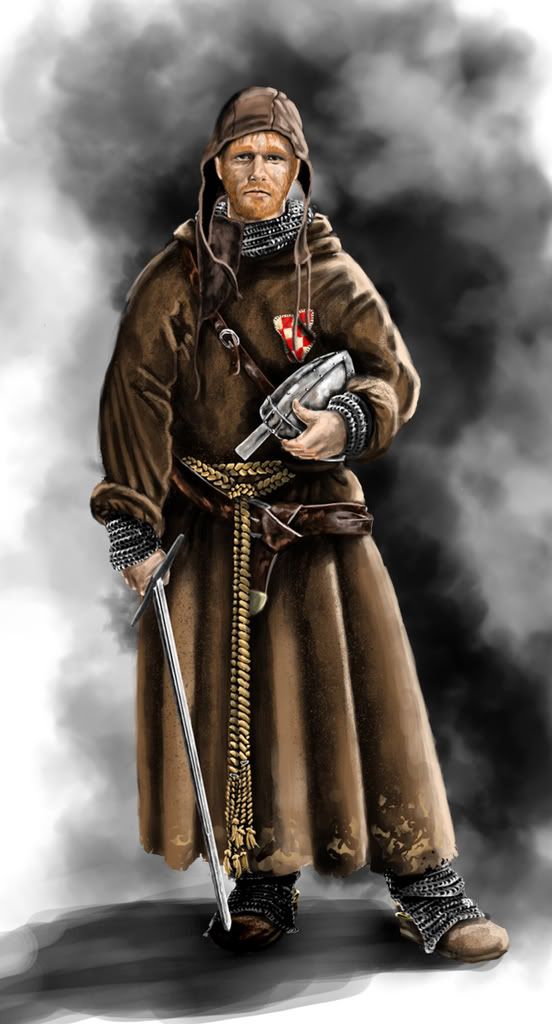
I started doing character concepts for my favorite campaign setting HârnWorld (I've actually also gotten the chance to work with them a little bit creating some artworks here and there!).
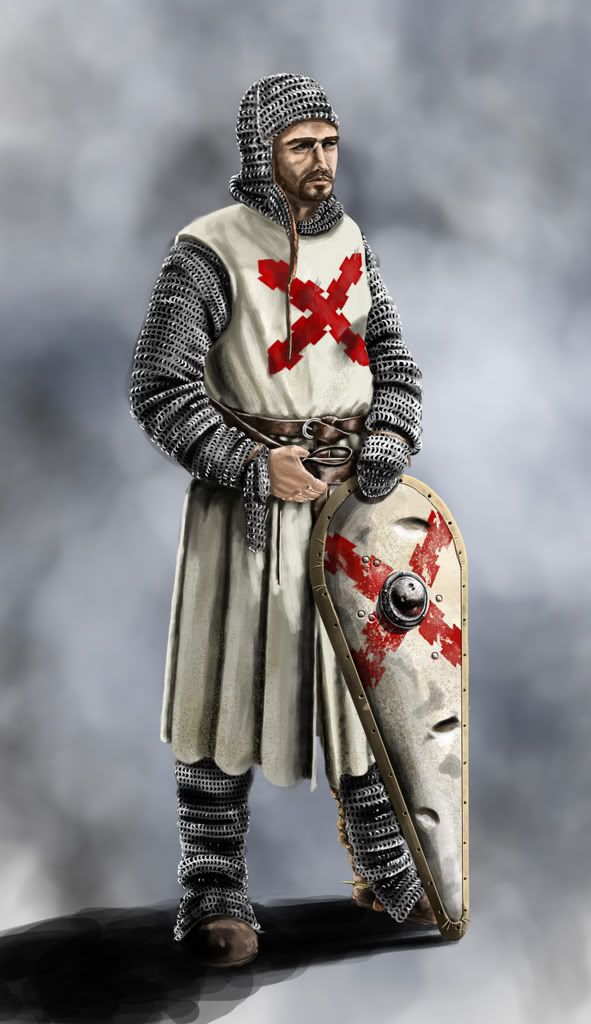
These character concepts are purely for my own entertainment and are completely unofficial (unless Robin wants to use any of them") ) So to start, here is my interpretation of a knight of the Order of the Checkered Shield. I have a few more in the works right now, and plan on doing a TON of these, because they are just too much fun for me! I'll post those as I finish them.
) So to start, here is my interpretation of a knight of the Order of the Checkered Shield. I have a few more in the works right now, and plan on doing a TON of these, because they are just too much fun for me! I'll post those as I finish them.
And please any crits or comments are most appreciated

) and I am just now finally getting my technique to where I want it. I was very inspired by the style of the concept art for the video game Assassins Creed (somewhat sloppy yet still detailed), so that is the direction that I wanted to take my art.I started doing character concepts for my favorite campaign setting HârnWorld (I've actually also gotten the chance to work with them a little bit creating some artworks here and there!).
These character concepts are purely for my own entertainment and are completely unofficial (unless Robin wants to use any of them
) So to start, here is my interpretation of a knight of the Order of the Checkered Shield. I have a few more in the works right now, and plan on doing a TON of these, because they are just too much fun for me! I'll post those as I finish them.And please any crits or comments are most appreciated
")