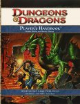
I generally dig Reynolds work a lot, but that PHB cover is pretty weak. I'd rather see a whole five-character party (human, elf, dwarf, halfling, and tiefling?) venturing into the unknown, and with less obnoxious female character design than this cover displays.
Damnit, the rogues armour has cleavage... why? WHY!? I really liked that picture before I saw that larger version... Is sensible armour to much to ask for
Edit: On an unrelated note, is that a gnome or a halfling? The rogue that is..
Personally, given the tidbit from Brazil and the fact the reaction to the PHB cover release has been profoundly and almost unanimously negative, I assume we'll be seeing a new cover in the works.
Maybe more people should create faux covers. When GURPS 4th Ed was announced, a huge number of people said 'Looking forward to it, but day-um them's some ugly covers'. So SJG said 'You think you can do better, show us'. Several did, and they used one of the user-submitted designs, or heavily based the trade dress on his design.
Still prefer the devil-themed cover---but on the off chance WotC heeds the 'outcry' and goes with "ol' predictable" here, I can only hope they don't slap a fig leaf on that poor rogues chest.
(But then again, I work in graphic arts---I see enough 'art by committee' as it is).
I really like the green dragon. I generally favor the older art styles, but for some reason, I don't mind WAR at all, esp. with an old-school theme like this. I don't see any rainbow mohawks for face-piercings in this picture, so I have no complaints.
Damnit, the rogues armour has cleavage... why? WHY!? I really liked that picture before I saw that larger version... Is sensible armour to much to ask for
Oh man, you're right. I was just about to say that I really like that picture until I saw your post and looked at it more closely. Damn.
Well, aside from the gratuitous cleavage and the nose-spike, I still really like it. Predictability notwithstanding, it's just a much better piece of art than that horrible armored-streetwalker-and-horned-wizard one.


 Holy crap! I'll say so. Are the covers of the Core Books that big? It'll be tough finding a D&D logo big enough now...


