D&D 5E D&D Next weekly art column!

Status
Not open for further replies.

Libramarian

Adventurer
While I respect Sweet's skill, and I think he'd be great at drawing the Shadowfell or equivalent, his art looks extreeeeemely muddy, like it was painted with clay, and that has limited applications outside of gloom-oriented scenes.

Check out his New tab, he has pieces there with brighter palettes.

e.g.
New, New, New, New, New

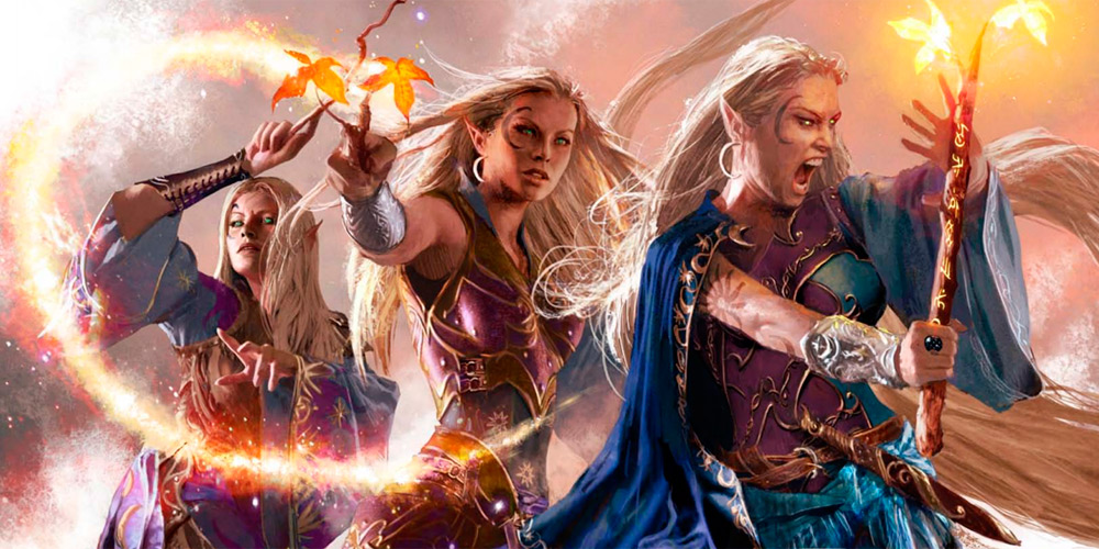
I really like his style because it feels like a great cross between modern and classic fantasy art, which I think would be perfect for D&D Next.

Although I'd be happy if he just did the covers. His style is a little intense.

Inside, I would like to see more variety, and some weirdness and whimsy. That's a nice "palette cleanser" between uberawesome heroic fantasy spreads. If it's all dramatic action all the time, it kind of wears on you and approaches an uncanny valley-like effect where it's just weird how seriously the artist is taking something that is inherently silly.

An example

It's like...you're taking the idea of sharks swimming in sand a little too seriously here.
 

log in or register to remove this ad

Libramarian

Adventurer
A few more thoughts.

I'm really sick of Wayne Reynolds and his neotonous pouty-lipped girl-women.

Less art is better than bad art. There are some little pieces in the 4e DMG that look much cheaper and crappier than others (e.g. p. 123). Just don't bother including those. In fact, I would be fine if the only art in a DMG or PHB were a dozen high quality full page spreads. I really don't need little "cubby hole" art every 3 pages.

The illustration of Mind Flayers in the 4e MM. They're posing like Power Rangers or Team Rocket or something. It is wrong for many reasons. Don't do that ever again.

If you must include Dragonborn, make them look cooler. More sharp and alien and reptilian. Like the Argonians in Skyrim. Cold-blooded reptiles that look you in the eye with the spark of intelligence. That could be cool. Dragonborn in 4e look like Rodney Dangerfield.

I will echo those asking for more realistic-looking weapons and armor. I want fluted gothic plate, warhammers (not mallets), and single-bitted battleaxes. I want to take on a f***** crazy D&D monster like a beholder with an actual mundane-looking medieval weapon. I like that contrast! It's fun.

Looking at the 4e art credits, I suspect William O'Connor is mostly responsible for the "4e look" (blocky Dwarven armor, snub-nosed Dragonborn). I don't want to see him or Wayne Reynolds involved with Next art. That would definitely be turning over a new leaf and would really impress me.
 

JoeGKushner

First Post
Michael Komarck's website is here: Michael Komarck Illustration.

I would recommend this Claudio Pozas guy's artwork, but I think he's mostly a freelance writer for WotC now.

[sblock];)[/sblock]

I was thinking Michale was the guy who did the new Glen Cook covers for his books but I think it's actually Raymond Swanland, Raymond Swanland Gallery .

the funny thing is a lot of these artist have worked with WoTC via Magic and novel book covers. So I think the best thing that D&D can do is kill Magic the Gathering and take its stuff.


Klaus

First Post
I was thinking Michale was the guy who did the new Glen Cook covers for his books but I think it's actually Raymond Swanland, Raymond Swanland Gallery .

the funny thing is a lot of these artist have worked with WoTC via Magic and novel book covers. So I think the best thing that D&D can do is kill Magic the Gathering and take its stuff.
Michael has done work for D&D. He did the cover to the 4e FRCS and even Dragon Magazine:

[sblock]
10-eladrin.jpg

[/sblock]
 

Dausuul

Legend
Reynolds does women? Try as I might, I can't think of any picture with women in it.

The 4E PHB cover comes to mind. I like Reynolds's women better than his men, but that isn't saying much.

While I respect Sweet's skill, and I think he'd be great at drawing the Shadowfell or equivalent, his art looks extreeeeemely muddy, like it was painted with clay, and that has limited applications outside of gloom-oriented scenes.

As Libramarian says, Sweet seems to do an excellent job of channeling Frank Frazetta. It's a style I really like--less crisply defined, more barbaric, like a cave painting by an incredibly skilled caveman--but I can see not wanting every piece done in that style. Still, I would love to see Sweet's art have a prominent place in 5E.
 
Last edited:

Yora

Legend
I looked some up, and there's indeed a considerable number of them. It's just easy to forget about them with all the super-buff men.But yes, it's true. He can draw only a single mouth on all female characters.

51145d1330446968-d-d-next-weekly-art-column-war.png
 

Attachments

  • WAR.png
    WAR.png
    111.9 KB · Views: 365

I looked some up, and there's indeed a considerable number of them. It's just easy to forget about them with all the super-buff men.But yes, it's true. He can draw only a single mouth on all female characters.

51145d1330446968-d-d-next-weekly-art-column-war.png

Interesting. Clearly he should date more.


Dausuul

Legend
It's not just the mouth, it's the entire facial expression. Lowered brows, narrowed eyes, pouty snarl, always the same. Men get two options; they can be snarling, or yelling. As far as I can tell, nobody ever smiles in Reynolds-land.
 

Status
Not open for further replies.
Remove ads

Top