Disable the blog bar to the Left of the screen?

Some screenshots might be useful; I have a 22" screen, admittidly, but with both sidebars running I have acres of space. The sidebars between them take up maybe 15% of the screen at most.

As requested, this is on a 13 inch screen on a laptop.

It's a bit cramped, but I wouldn't go so far as say unusable.

On a possibly related note, I've found the forums a bit more sluggish sicne you've put in this change.

Regards
 

Attachments

  • enworld.JPG
    enworld.JPG
    233.6 KB · Views: 119

log in or register to remove this ad

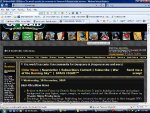
Here's what I see logged in as a CS. As you can see, on my 17" ViewSonic 1024 x 768 flatscreen, the rightmost navigation icons trail off the screen. The left sidebar remnant is not terrible, but it makes the screen that much fatter to scroll over.
 

Attachments

  • screenshot ENW.jpg
    screenshot ENW.jpg
    66.9 KB · Views: 121

Here's what I see logged in as a CS. As you can see, on my 17" ViewSonic 1024 x 768 flatscreen, the rightmost navigation icons trail off the screen. The left sidebar remnant is not terrible, but it makes the screen that much fatter to scroll over.

I could see that being a problem - if I needed to click on that obscured RPGNow store button every five minutes! :)
 

Some screenshots might be useful; I have a 22" screen, admittidly, but with both sidebars running I have acres of space. The sidebars between them take up maybe 15% of the screen at most.

I'm on a 19" screen and it's not terrible so long as I don't have any sidebars open (I usually browse with my bookmarks bar open). I'd estimate the bars take up roughly 30% of the horizontal space space.

Now that I've gotten used to it, I'm going to say my reaction is that it's a little annoying, but perhaps I over-reacted when I first saw them. If I were on a smaller screen I'd be more upset. Also, if it's netting the site an extra $500 per month, that's something I can support.

My complaints about subscription models still stand though. I'm guessing it's old hat by now. :p


Here's mine. 14" laptop screen, but I'm jumping between applications a lot, so I am not running my browser maximized. You'll note that I cannot see all the links to jump to later pages in the thread? I didn't picture them here, but the moderation quick tools down at the bottom of the page are likewise obscured.

The situation is improved if I am running my browser maximized, but my UXD friends tell me that's a bad assumption to make.
 

Attachments

  • ENWorldwithsidebars.jpg
    ENWorldwithsidebars.jpg
    165.2 KB · Views: 118

Well, yes. Everyone prefers sites to have no advertising and hand out free candy with every click! It's about getting a realistic balance.

Of course, no objections there.

As I said, I can fully understand where you are coming from. :)

Bye
Thanee


I am still requesting a way to remove or minimize the blog/review bar on the side. Keep the ad if you must, but those other side bars are annoying.
 

Remove ads

Top