Dungeon 114 Cover

I like it. I especially like the cover art. Wayne Reynolds, Scott Wood, Todd Lockwood - for me these guys define the 'best of' in terms of 3rd edition art.

Great interview as well - the direction the magazine is heading sounds awesome. I did have a question - X1 Isle of Dread is listed as being the 3rd-best selling adventure module. I'm curious - is there somewhere that has the information as to the ranking of published adventure modules in terms of most sold? What were the best and second best selling adventures?
 

log in or register to remove this ad

Logo: Don't love it, don't hate it. It's a logo. It's not flashy, but it's easier to read, and I do kinda like the whole "retro" thing.

Text at the bottom: Beautiful. Perfect. Why'd it take so long?

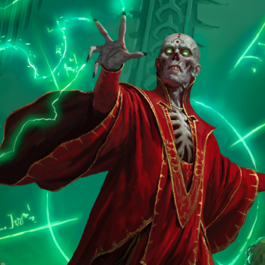
Cover art: I love the fact that it's a scene, rather than a character portrait. I hope Dragon's going the same way.

Overall feeling of the whole situation? Thumbs up. I'd already resubscribed, but if I hadn't, I would be.
 

Logo: looks retro, so I don't like it that much. But it is clearer to read. The logo isn't that important to me, though.

Cover art: I don't like comic book art, so I'm not a fan of WAR's renditions. Something about every drawing of his with gaping mouths and over-the-top action really turns me off. But I do like the fact that it's a scene and not yet another "in your face" character portrait.

Text on the bottom: Nice. Don't clutter the front page. I like it.

Content: This is what really matters. So far, it sounds good....
 

The first taste of DnD I ever had was seeing the Dragon magazine at a bookstore. I think I was 9 or 10. there was a Dragon on the cover. I wasnt aware of DnD at all then but every time I went to the bookstore after that I was searching for the magazine. I hope the new covers inspire new kids to pick up and enjoy these great magazines.

I like the cover. The retro will most certainly make the mag stand out (less so then the already fantastic art) on the news stand. I dont think anyone is going to pick the magazine up unless they already get a thrill from dragons, dwarfs and swords anyway. The logo isnt going to make much of a diff.

Also I think I'll really enjoy the content split. I am a true fan of these mags. I can find very little to complain about (my subscriptions had been late so many times I didnt resubscribe. I can now get them quicker on the newstands).

Thanks Pazio for improving your allready great magazines.
 

It looks like a comic book from the early 1990s. Complete with supergroup. Substitute the X-Men and you've got what looks like a perfect example of a typically oversaturated retread trying to impress new readers by repackaging "new versions" of the same tired mutants.

Can Paizo actually believe that point-of-purchase sales will increase because people can read the logo better? Gimme a break. Most D&D players already know about both Dungeon and Dragon, and picking up an average issue of either mag will only inundate potential new players with waves of product they need to purchase in order to play... A new logo won't help that.

Surely they realize they're marketing to pre-existing players that don't give a hoot what the mag looks like--it's obviously the content that's going to drive sales (case in point--this thread).

Isn't it time Paizo realized their market is a relatively closed group with little recently demonstrated potential for growth? It's okay to cater to a fringe market--one needs to set one's goals and expectations appropriately so. I fear Paizo may be trying to tread a path that leads to disappointment.

My two cents.

Coreyartus

--No wait, it's not the X-Men at all. It's the New Mutants. Look, there's Danielle Moonstar in her Valkyrie phase, Wolfsbane as a weretiger, Cypher playing with daggers, some Sunspot-variation, and the leader is a Cable ripoff. Hmmm... Looks like we are goin' a bit retro, ain't we? ;)
 
Last edited:

My biggest problems are the color of the font (dark orange is HIDEOUS) and the, um, centering of the image. Notice how on the left side it has maybe two inches of nothing but a stone column, while on the left side, that womans cloak is cut off at the edge. Looks horrible. It looks like thay had planned to have text down the left side of the cover but changed thier mind, but didn't bother to go back and recenter the image.

As for the actual content change of the magazine, I look forward to it in Dragon, but I couldn't care less about Dungeon.
 
Last edited:

Something in me likes the new logo, but the rest doesn't. O.o

The other changes sound good. I just wonder if Dragon is going to suffer now that some of the best features are moving to Dungeon.

The cover art is awesome (as tiny as it is, hard to see), WAR is one of my fav D&D artists
 

I do not like the new logo. I don't care for its retro look, nor the fact that it's flat colour. I do accept that it's likely to stand out a little more on the newsstand but, as another poster has pointed out, I think that's irrelevant. (I'll be delighted to be proved wrong in six months, if Erik cares to pop by then and share circulation figures.)

It won't stop me from buying the magazine, of course.

I applaud the refinement of both Dungeon's and Dragon's editorial policy and look forward to forthcoming issues.
 

I like the new logo, love the cover image, and I am interested in Dungeon for the first time ever with the new direction.

So, I'm good.


Remove ads

Top