WotC's Mike Mearls took to Twitter yesterday to offer some thoughts on art in tabletop RPGs, specifically aimed at small creators and publishers.

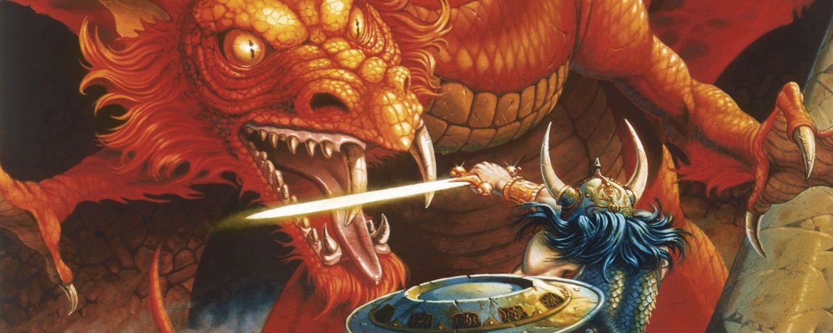
Cover art by Larry Elmore from D&D Red Box
"If you’re looking to get into self-publishing RPG material in 2019, here’s my advice - your art is the most important part of your product. A lot of designers have a writer’s skill set, and see art as the last thing they consider. Don’t fall into that trap.
Art is the entry point into your work. In the best case, work with an artist as co-creator. Talk about the emotion, impact, and resonance you’re aiming for. Work as equals. Draft off of each other’s strengths and ideas.
If you can’t co-create, then keep track of that emotional level and hold on to it when comissioning art. Let the artist paint the picture, rather than dictate it to them. Find artists with new takes on things. Find someone with a distinct style that complements your own.
If you don’t have a vision for the look of your work, you don’t have a vision for it period. Even a short adventure needs tone and atmosphere.
FINALLY! My biggest pet peeve in game art is bad interaction. If a piece has two things that should interact, make sure the action is framed correctly and the relationship actually functional. Easy test. Let’s say you have a warrior jumping off a cliff to plunge down on a dragon.
Cover up the dragon. Looking only at the warrior, where does it look like they’ll land? What’s their state of mind? Where is the target of their attack? Picture that and then uncover the dragon. Do they match? Now do the reverse.
You’ll be surprised at how many very expensive cover art pieces fail this basic test. You’ll find warriors belly-flopping 2 meters in front of their foe. Two enemies locked in mortal combat... with opponents seemingly out of the image’s frame.
My favorite is the arrow/bolt of arcane energy/random projectile that is firing from our hero at a 45 degree angle to barrel its way from the foreground, where our hero shown in profile, to the background that is literally behind them.
Seriously, this drives me nuts. Please stop doing it. Use my test or invent a better one. Once I noticed this issue, it’s now a reflex and a lot of cover art just drives me batty.
It typically comes up because you want to show a character’s face, but also want a scene where logic and physics dictate you should show our hero’s back. IME it’s a good sign that a writer isn’t giving the artist enough creative space to make the image work.
Another piece of art advice because for whatever reason it’s on my mind - the purpose of game art is to communicate a game’s emotion and tone, rather than factual presentations of the game’s world. That’s what words are for.
And since RPGs are a spoken medium, if you can’t easily describe something in words neither can the DM. Don’t do that to them."
And in response to a few questions:
Any advice on balancing an art budget? How do you decide between art for everything and not enough art? (@wildrosemage)
From my POV, if your budget is tight better to go with fewer pieces that have a better chance of setting the tone you want. For DMs Guild, though, I wouldn’t make art a priority since you’re using D&D. My advice is aimed at working on IP/games you own.
Paying an artist what they are worth (which people should) means a lot of art is out of reach for a self-publisher on a budget. (@technoir)
Yeah, it’s not easy on a budget and a partnership with an artist is not always practical. I would say that if you do have a strong vision, that might help get that one piece that really delivers what you’re looking for.
For both artists and those commissioning art, I'd recommend my own article, What's An Artist Worth? It gives an idea of how much art costs, where you can get affordable art, and discusses some of the ethics of underpaying artists.


