You are using an out of date browser. It may not display this or other websites correctly.
You should upgrade or use an alternative browser.
You should upgrade or use an alternative browser.
D&D 5E (2024) This Dragon Art Is From The 2024 Player's Handbook
- Category Dungeons & Dragons
- Thread starter Morrus
- Start date
As shown at GaryCon.

Morrus is the owner of EN World and EN Publishing, creator of the ENnies, creator of the What's OLD is NEW (WOIN), Simply6, and Awfully Cheerful Engine game systems, publisher of Level Up: Advanced 5th Edition, and co-host of the weekly Morrus' Unofficial Tabletop RPG Talk podcast. He has been a game publisher and RPG community administrator for over 20 years, and has been reporting on TTRPG and D&D news for over two decades.
FitzTheRuke
Legend
Yes, I know that. They don't have to be actually silver to be metal! They're dragons! They're magic!Silver makes terrible armor because it is malleable.
But this has gone way too far into the weeds over a little joke about polishing silver dragons for their parade!
Last edited:
MonsterEnvy
Legend
We already know it’s not AII don't think it's AI art it's just to clean and crisp.
Not even uncanny valley more that feeling you get watching a movie with to much CGI.
Just lacks something it's technically fine just like the fighter and wizard.
To clean and crisp probably.
Jahydin
Hero
I've spent way too much time looking this thing over because I'm honestly baffled at how odd it is to me...
Some fun observations :
:
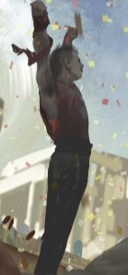
Freddie Mercury! (Wife spotted that one)
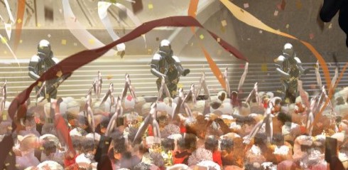
These knights totally look like they're playing guitars to an audience.

This building is a good example of what I meant by "noisy". Such an odd jumble of columns, smoke?, rock?, and... not even sure what that is bottom right, left of the king's head. Falling column maybe?
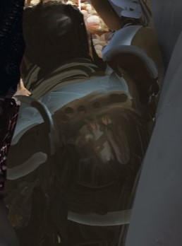
This was cool. Noticed the reflection of these people on his plate mail.
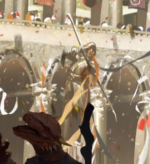
I think this is a statue of an archer? Part of me wants to think it's an archer ghost!
Edit: I see the pillar underneath now, but not his legs, so still going to go with ghost.
Some fun observations
Freddie Mercury! (Wife spotted that one)
These knights totally look like they're playing guitars to an audience.
This building is a good example of what I meant by "noisy". Such an odd jumble of columns, smoke?, rock?, and... not even sure what that is bottom right, left of the king's head. Falling column maybe?
This was cool. Noticed the reflection of these people on his plate mail.
I think this is a statue of an archer? Part of me wants to think it's an archer ghost!
Edit: I see the pillar underneath now, but not his legs, so still going to go with ghost.
Last edited:
Zardnaar
Legend
We already know it’s not AI
I know just sharing my 2 cp. I can see why people think it is though.
To clean, to crisp and similar to AI art.
Tonguez
A suffusion of yellow
I've spent way too much time looking this thing over because I'm honestly baffled at how odd it is to me...
Some fun observations:
View attachment 353822
Freddie Mercury! (Wife spotted that one)
Heh, good spotting from your wife - and kudos to the Artist if it is
View attachment 353824
This building is a good example of what I meant by "noisy". Such an odd jumble of columns, smoke?, rock?, and... not even sure what that is bottom right, left of the king's head. Falling column maybe?
Its kind of like the Parthenon and a Brazilian Favela, birthed a love child, so many columns,stacked levels and diverging angles!
I can certainly see why people might think AI, the little details and flourishes are eclectic, but if genuine do showcase some degree of talent if not restraint
G
Guest 7037866
Guest
Was this a European release or something? I don't recall seeing it in the U.S.Campaign Option - Council of Wyrms. p 12. Silver dragons have a Charisma of 6 to 20.
G
Guest 7037866
Guest
This section is the kind of stuff that to me screams AI:
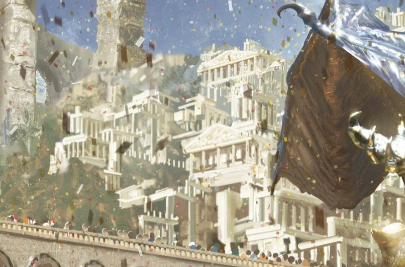
The mishmash of columns and repeated patterns is very AI-like.
The mishmash of columns and repeated patterns is very AI-like.
Crimson Longinus
Legend
I, personally, think the issue is one of rather severely varying style. The figures closest to the viewer are crisp, perhaps even excessively "realistic," with fairly fine detail put into them. The middle-distance figures are all very impressionistic, and the far-distance figures are like a realistic image was put through some Gaussian blur. In particular, the dragon has details fuzzed--except at the edges of the image, where "dragon" vs "not dragon" is quite sharp.
I think this is where the "uncanny" feeling comes from for folks--the image doesn't really stick to a single way of doing things, but blends together three or even four different ways of presenting depth and detail.
I genuinely have no idea if this was the work of a single person or many people cooperating, but it kinda comes across as collaborative art where the collaborators didn't start talking until each person's piece was nearly finished. So the dragon and the crowd are semi-impressionist, blobs of color vaguely shaped like people, the middle-distance figures are low-detail as though out of focus (as one might expect), and the foreground characters are rendered in almost excessive detail--but every figure (except the crowd) has sharp, well-defined edges, rather than blurring with their surroundings.
It's just a really odd composition choice. It doesn't harm my enjoyment of the dragon at the center, personally, but I can totally see how it would have some uncanny feels for others.
Yeah, that is very good analysis; this is exactly what's going on. I liked the original cropped picture (I mean I don't like metallic dragons, but it still is a very good picture of one) but I don't like the whole picture. It is not that any of the individual elements are bad (perhaps aside the haregon head) but it just doesn't come together as a whole.
DarkCrisis
Bad to the bone
But why does the dragon have glasses on?

Similar Threads
- Replies
- 28
- Views
- 2K
- Event post
D&D 5E (2024)
Steel & Skill: The Complete Fighter's Field Guide
- Replies
- 64
- Views
- 11K
D&D 5E (2024)
One Store's Sales (D&D 2014 & 2024)
- Replies
- 104
- Views
- 15K
D&D 5E (2024)
D&D 2024 Is Now OFFICIALLY Called "5.5e"
- Replies
- 333
- Views
- 56K
Recent & Upcoming Releases
-
June 16 2026 -
June 16 2026 -
September 16 2026 
Arcana Unleashed(Dungeons & Dragons)
Rulebook featuring "high magic" options, including a host of new spells.
Replies (250) -
September 16 2026 -
October 1 2026 -
October 6 2026 -
January 1 2027 -
January 1 2027
Related Articles
-
D&D General The 10th level 2024 Monk can do 3 attacks with a BA, but only 2 with an AA
- Started by Silam
- Replies: 28
-
-
D&D 5E (2024) Steel & Skill: The Complete Fighter's Field Guide
- Started by Morrus
- Replies: 64
-
D&D 5E (2024) One Store's Sales (D&D 2014 & 2024)
- Started by FitzTheRuke
- Replies: 104
-
D&D 5E (2024) D&D 2024 Is Now OFFICIALLY Called "5.5e"
- Started by Morrus
- Replies: 333
Recent & Upcoming Releases
-
June 16 2026 -
June 16 2026 -
September 16 2026 
Arcana Unleashed(Dungeons & Dragons)
Rulebook featuring "high magic" options, including a host of new spells.
Replies (250) -
September 16 2026 -
October 1 2026 -
October 6 2026 -
January 1 2027 -
January 1 2027


