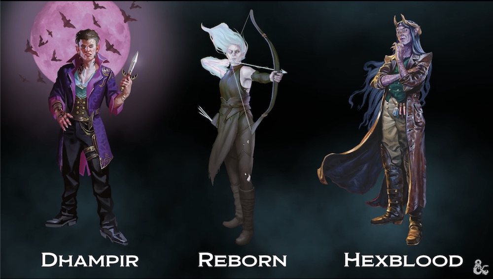
SageAdvice.eu has compiled a bunch of art shots from the upcoming Ravenloft setting book. I've featured a handful below, but click through to the link for the full set of nearly 30 pieces.


(Dungeons & Dragons)
Rulebook featuring "high magic" options, including a host of new spells.(Dungeons & Dragons)
Rulebook featuring "high magic" options, including a host of new spells.


