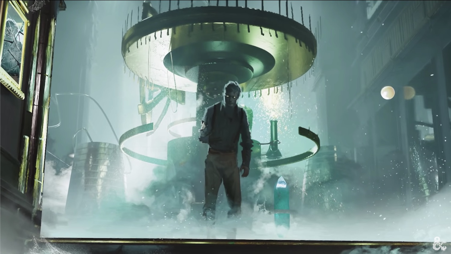
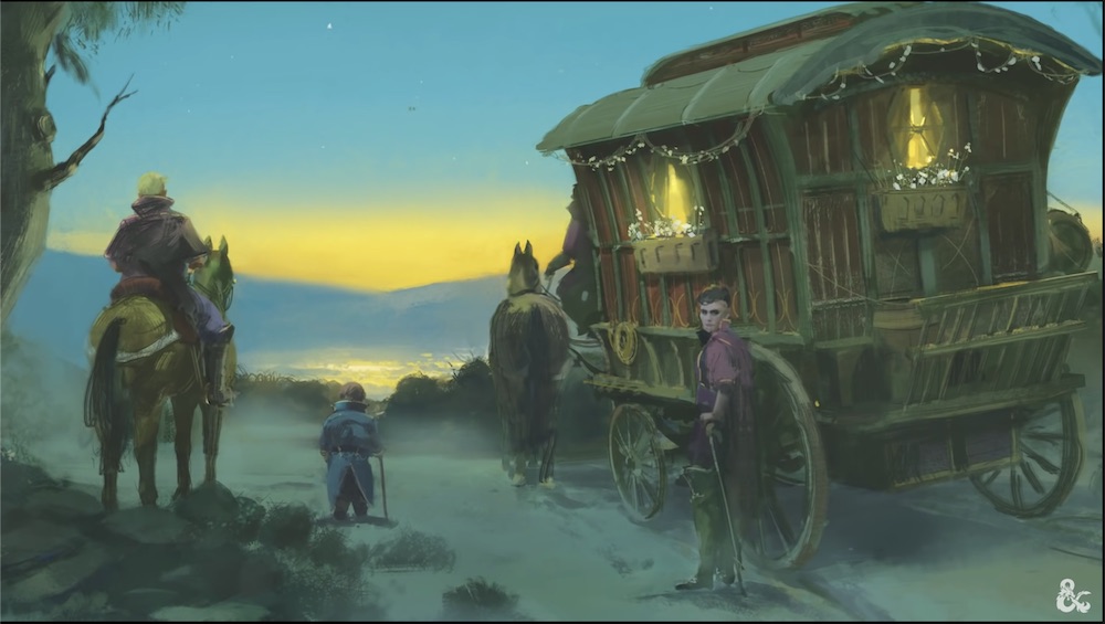
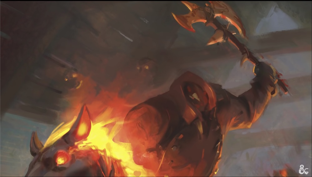
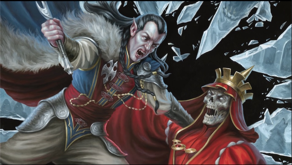
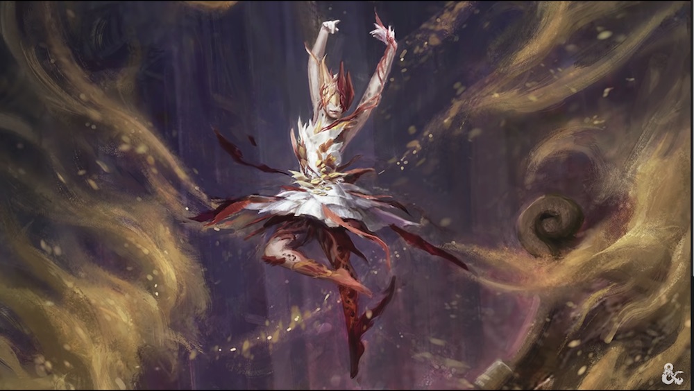
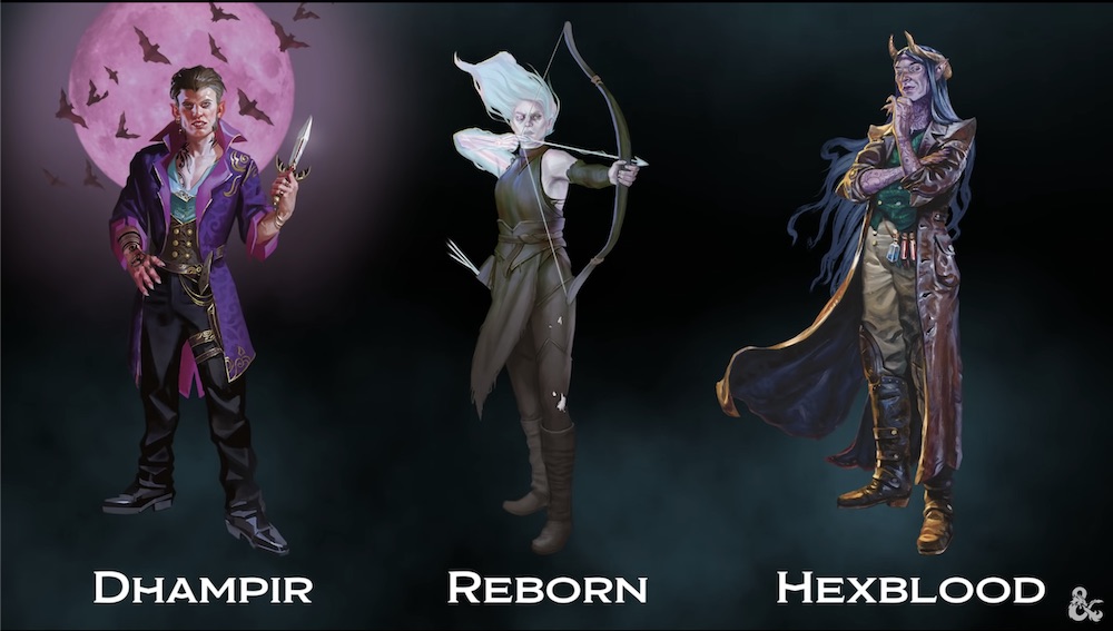
SageAdvice.eu has compiled a bunch of art shots from the upcoming Ravenloft setting book. I've featured a handful below, but click through to the link for the full set of nearly 30 pieces.


You are a great person!Sorry. I realize I'm being an insufferable git about this. I'm coming at it from completely the wrong angle. I've been playing D&D for 37 years and Call of Cthulhu for 34 years. Where I'm at in regards to horror gaming is wildly different than a lot of people here and I'm likely not quite the target audience. I'm glad Ravenloft is getting a full setting book. Curse of Strahd was amazing. Here's to the world's most popular RPG doing more horror-themed stuff. Here's to more horror gaming and here's to hopefully some spill over of players to more horror-focused gaming and games.
First, I wouldn't say there is much Victorian about the Forgotten Realms in 5E art.Problem isn't the art the problem is the theme. Ravenloft is an amalgam setting, taking numerous locations and turning them into private prisons for all the dark Lords. This art doesn't seem to reflect the variety that made the setting so good. You get to feed the vampire lord of Transylvania walk through the mist and find yourself in the bayous of Louisiana or the Blasted desert of Egypt. The art keeps the Victorian look of forgotten Realms, complete with most characters clothed head to toe in every scene. Just feels formulaic.
Yeah, they aren't going for Call of Cthulu, that's for sure: this is a horror-themed add on for a heroic fantasy game. A toolkit to add a flavor, not a different game.Sorry. I realize I'm being an insufferable git about this. I'm coming at it from completely the wrong angle. I've been playing D&D for 37 years and Call of Cthulhu for 34 years. Where I'm at in regards to horror gaming is wildly different than a lot of people here and I'm likely not quite the target audience. I'm glad Ravenloft is getting a full setting book. Curse of Strahd was amazing. Here's to the world's most popular RPG doing more horror-themed stuff. Here's to more horror gaming and here's to hopefully some spill over of players to more horror-focused gaming and games.
View attachment 136342 this is what I had in mind for ravenloft art for 5th edition. This art is purely G-rated there is nothing offensive about it. But there's something off with it. It's done with a blue tint so it makes you think that it's image at dusk, but there's something about the people that falls into uncanny valley.
A lot of them have animal motifs. They're staring straight at you in a predatory manner. They either have very angular features or very rounded features. Their clothing is impractical, but very stylish like they're trying too hard to look normal. It's unsettling but in a subtle way. It perfectly captures the feel of the setting. Bleak, off-putting and mysterious. Even if you don't like the art you have to admire it.
I will say for that style, it made for great tokens for VTT play.As much as I like this piece (Richard Witters I believe, who is I think D&D's art director), this style is a bit overused in Curse of Strahd, Out of the Abyss, and Princes of the Apocalypse. I would say 50% of all the NPCs in those books are drawn in that style, and though it is technically impressive, the style is so distinct (full symmetrical profile pic, looking directly at reader) it jars weirdly with every other artist's NPC depictions. Out of the Abyss below, for example. I am not surprised they have moved away from this style, even though Witters is of course a very talented artist.
View attachment 136359
Witters works in the Franchise Studio, so not on the RPG at this time.As much as I like this piece (Richard Witters I believe, who is I think D&D's art director), this style is a bit overused in Curse of Strahd, Out of the Abyss, and Princes of the Apocalypse. I would say 50% of all the NPCs in those books are drawn in that style, and though it is technically impressive, the style is so distinct (full symmetrical profile pic, looking directly at reader) it jars weirdly with every other artist's NPC depictions. Out of the Abyss below, for example. I am not surprised they have moved away from this style, even though Witters is of course a very talented artist.
View attachment 136359
You could, but it has to work with the rest of the art in the book.To be fair, you can easily make Bleutspur into a Geiger-esque domain.
It's fine. But it's a bit specifically gothic, and rather static. I can't see it working in not-gothic settings like Bluetspur, or when you want to depict action. They have chosen to go with an art style which can represent a wide range of different things.what I had in mind for ravenloft art for 5th edition.
You are a great person!

(Dungeons & Dragons)
Rulebook featuring "high magic" options, including a host of new spells.
(Dungeons & Dragons)
Rulebook featuring "high magic" options, including a host of new spells.