• The VOIDRUNNER'S CODEX is coming! Explore new worlds, fight oppressive empires, fend off fearsome aliens, and wield deadly psionics with this comprehensive boxed set expansion for 5E and A5E!

WotC's Irwin, Tanji, and Crawford on Tales from the Yawning Portal's Art Direction

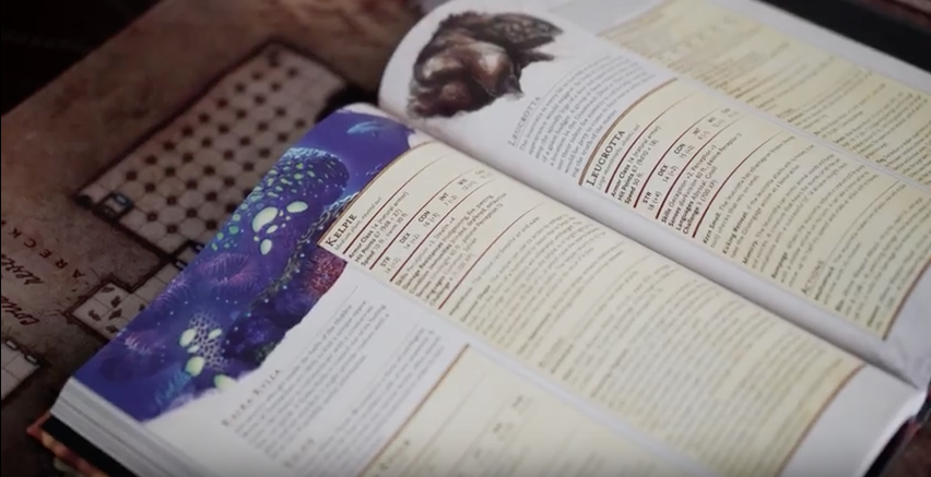
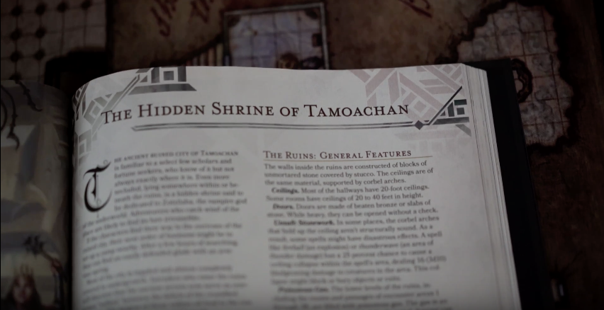
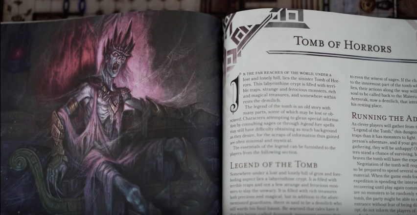
The YouTube channel Dungeon Life has posted a video featuring WotC's Kate Irwin (senior art director), Emi Tanji (senior graphic designer), and Jeremy Crawford (managing editor). It talks about designing Tales from the Yawning Portal. One of the themes discussed it how the adventures in the book were kept the same at the core, updating the stats and wording to make them feel like 5th Edition - "What would you do if you redesigned the adventures to be more like a modern D&D design? And the answer is, we didn't. What we did is we took Tomb of Horrors, and it's still Tomb of Horrors that Gary Gygax wrote..." Tales from the Yawning Portal hits preferred game stores tomorrow (ask your local store!) and everywhere else 11 days later.

The YouTube channel Dungeon Life has posted a video featuring WotC's Kate Irwin (senior art director), Emi Tanji (senior graphic designer), and Jeremy Crawford (managing editor). It talks about designing Tales from the Yawning Portal. One of the themes discussed it how the adventures in the book were kept the same at the core, updating the stats and wording to make them feel like 5th Edition - "What would you do if you redesigned the adventures to be more like a modern D&D design? And the answer is, we didn't. What we did is we took Tomb of Horrors, and it's still Tomb of Horrors that Gary Gygax wrote..." Tales from the Yawning Portal hits preferred game stores tomorrow (ask your local store!) and everywhere else 11 days later.

[video=youtube;6-rif5ag9bY]https://www.youtube.com/watch?v=6-rif5ag9bY[/video]

Screen Shot 2017-03-23 at 17.11.47.png


Screen Shot 2017-03-23 at 17.11.56.png


Screen Shot 2017-03-23 at 17.13.48.png


Screen Shot 2017-03-23 at 17.14.01.png


Screen Shot 2017-03-23 at 17.14.15.png


Screen Shot 2017-03-23 at 17.15.31.png


Screen Shot 2017-03-23 at 17.14.38.png

SaveSave
 

log in or register to remove this ad

EthanSental

Legend
Supporter
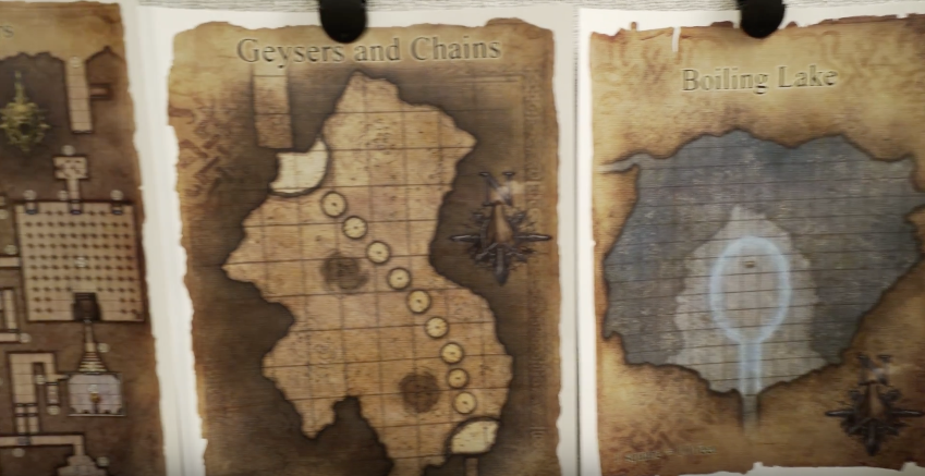
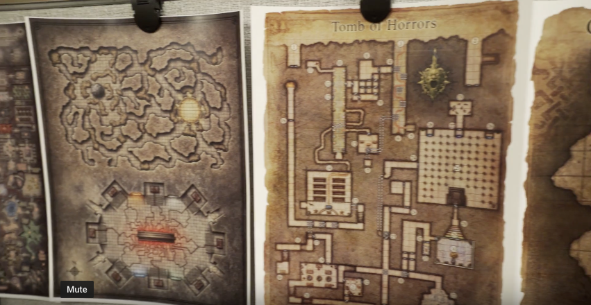
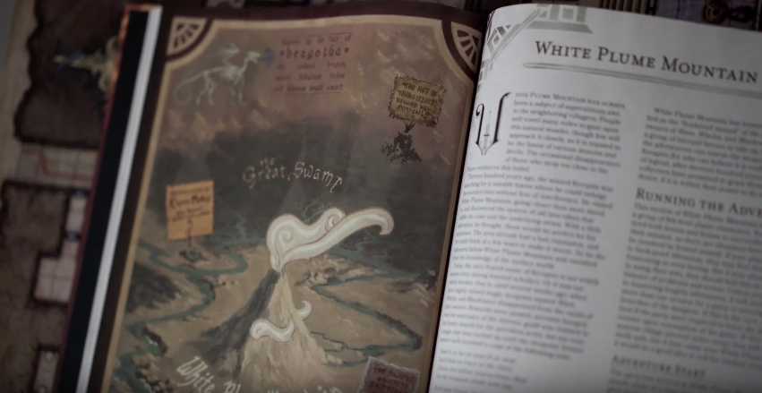
Probably a special piece of enlarged art they were working with in the office. It looked to me like it was a special material, like a fabric map.

I'm not big on full-sized dungeon maps anyway, since the players aren't supposed to see the whole map at once. They seem almost useless, unless you are using digital tools to display it and hide the parts they haven't discovered, as well as hiding secret doors.

The cloth map was a special promo that a person could buy from meltcomics.com from their site during the Friday live event...alas a found out Saturday and the map is sold out.
 

log in or register to remove this ad


The Old Crow

Explorer
Sorry for speaking up, but asking for old school b/w maps is unrealistic. No modern publisher will want to not use all the advances in printing technology that has happened these past 40 years or so.

Many of the maps they produce are gorgeous, and evocative. Those are good qualities. But they are not necessarily practical to use (for me at least). My desire for black and white maps might be unrealistic in this day and age, but I still have an unrealistic desire that they add printer friendly maps as optional downloads.


I realize that with a username like that, you won't like my answer, but here goes anyway:

Put them up on your big-ass flat-screen, or hand out a tablet, or message everybody the map onto their phablets.

Plenty of solutions. None involve the stuff you call "paper" ;)

Heh, my name does give away my old school preferences. I do like paper, and pencils.

I have taken my laptop to the table a few times for 5e, but mostly find using it while gaming to be clunky and awkward.
 

The Old Crow

Explorer
Do you DM's have your players map out the dungeon? I remember this from my 1e days.

Often, but it depend on the dungeon. I have used poster maps and covered up bits with paper, a large wet erase mat, dungeon tiles. Really depends on how complex, whether it has secret features, and whether they will need a map of the place for future sessions.
 
Last edited by a moderator:


Corpsetaker

First Post
Often, but it depend on the dungeon. I have used poster maps and covered up bits with paper, a large wet erase mat, dungeon tiles. Really depends on how complex, whether it has secret features, and whether they will need a map of the place for future sessions.

We always have graph paper at the ready when we game.
 

machineelf

Explorer
Put them up on your big-ass flat-screen, or hand out a tablet, or message everybody the map onto their phablets.

Plenty of solutions. None involve the stuff you call "paper" ;)

I'm also older (39), but I work in programming and web development. One of the other players in our group is a javascript developer. The others are in their 20s. We use apps, chat messenging, tablets, and all sorts of tech as tools in our game.

But there's nothing like unfurling a magnificent paper map onto a hard wood table to peer over it. Almost like we are planning our next move from a table inside a tavern.

Sent from my VS990 using Tapatalk
 

WackyAnne

First Post
I think both of them are amazing artists. Have you seen Blando's book on cartography and adventure maps? It's pretty great.

Having said that, I don't like the art style from either of them when it comes to D&D maps and dungeon layouts.

I loved the old Deasel maps. Schleys' maps are beautiful to look at, but I use maps as tools to help my players easily understand the area. All the swirls that Schley puts everywhere distract from things and make it difficult for new people to quickly find a location.

Diesel's maps were clean, simple, and useful, and I love them. If Mike got rid of all his swirls they would be many times better in my opinion.

The old blue dungeon maps were also great. Again I use them as a tool to help me DM. If you make them too pretty and intricate, it makes them a bit more clunky to use as a tool. Those old maps were clean and simple and easy too understand. Again, just one person's opinion.

There are no swirls or flourishes in Mike Schley's maps, they are direct translations of the terrain, with light-colour-saturation (almost watercolour appearance) which aren't all that hard on ink or toner. I think you are confusing his with Blando's opposite-of-bland style, which is full of stylistic add-ons which just increase ink/toner use and decrease readability.
 

machineelf

Explorer
There are no swirls or flourishes in Mike Schley's maps, they are direct translations of the terrain, with light-colour-saturation (almost watercolour appearance) which aren't all that hard on ink or toner. I think you are confusing his with Blando's opposite-of-bland style, which is full of stylistic add-ons which just increase ink/toner use and decrease readability.

No, I am not confusing him with Blando. I know of each's works. I particularly have in mind Schley's large map of the Sword Coast and the northwestern part of Faerun. Look at the ocean. See all those swirls throughout the water? Swirls may not be the most accurate word. They are lines here and there, and encircling the islands. (And yes I know, they are supposed to represent the waves.) But now look at the land, where there are moors or plains, they are all filled with that same style of lines and circles everywhere cluttering things up. There are no waves on land, so this is just a line style he uses everywhere. It's in the Great Glacier. It's in Anauroch. It's everywhere.

http://dnd.wizards.com/articles/features/map-faerün

I personally don't like it. That's my personal opinion, and I don't expect many people to agree with me. I prefer maps with a plainer color scheme, that can serve a more utilitarian role, since I use maps as tools. With a plainer color scheme, names and locations of cities stand out. With all those lines everywhere, the brain has to take a half-second longer to locate a city name. That half-second may not seem like much, but when you are using a map a lot to locate place-names, it adds up.

I do like lines to represent certain geographic areas like swamps or fens. But when he puts lines everywhere, it becomes difficult to understand where a swamp or fen is located, vs. a moor or a grassy plain. That's another problem with his style, in my mind.

I do think his art style is beautiful, but if he gave me that same map without all those lines covering every part of the map, it would look much less cluttered and serve a better purpose. All those lines sort of give me a headache. Again, he's a great artist, it's just too much flourish for no benefit.
 
Last edited by a moderator:

Remove ads

Remove ads

Top