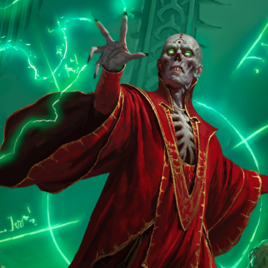
LOVE the New Covers!

bording said:
It has a different look than even the other adventures. I highly suspect that we are still seeing mockups on a lot of these pictures, and the final look is still being worked on.
And it's becoming better and better. I really like that new version! And hope (and think) that the other books will also get that treatment.

I approve of this direction!

Cheers, LT.
 

log in or register to remove this ad

Frostmarrow said:
I want more characters in each picture. I like them all but Character Record Sheets is the only one that depicts a complete party working hard for loot.

Yeah, that is what I want as well. I'd like what seems to be a complete adventuring party on the cover of the PH.
 

Lord Tirian said:
And it's becoming better and better. I really like that new version! And hope (and think) that the other books will also get that treatment.

I approve of this direction!

Cheers, LT.

Yeah, I like that one, art's good, doesn't have horns, and the logo looks quite good too.
 

I like most of them well enough, but the PHB cover is made of ass and fail. If I weren't lazy I'd dig up a post I wrote about it a while back dissecting all the crap to be found in it if one looks even a little closely...

edit: Guess I'm not so lazy after all. Here it is.
I really hope they change the PHB cover. The one with the fighter chick and horned wizard dude is miserably awful. I don't mind the basic layout, and I'm not even going to talk about the stripper-plate issue in this thread. But the actual art itself is almost Liefeldian in its badness.

...ok, that was unfair. It's not nearly that bad. But it's got the same sort of issues if you look at it for a few moments.

Like, check out that dagger dangling at her waist. Look at where it is and which way it's pointed. Now think about whether she can walk forward without stabbing herself right in that unarmored thigh. Then think about how she'd go about drawing that dagger - it doesn't matter whether she wants to draw it with her left or her right hand; either way she'd have to do some awkward twisting to get it out.

How about that bow behind her? Is it attached to her belt or something? Then why is it so vertical when she's crouched at an angle? Speaking of her being crouched at an angle, how is she managing to stay at all upright with her feet where they are? Or maybe she's in the process of falling over. That might explain the odd pose.

And hey, look at her sword. Notice how it's entirely out of proportion to her? I don't mean that it's an unrealistically large sword, like you might see in a Final Fantasy game. It's actually built like a fairly short sword, only in a totally different scale to the rest of the picture. And the way she's awkwardly holding it to present a nice flat perspective to the viewer... I kinda wonder if the artist started with a picture of a sword and then filled in a girl and a wizard around it. Sure looks that way.

Speaking of the wizard, try figuring out where exactly the staff is in relation to the rest of him. Perspective much?

This is all just from memory, since I'm at work and don't have the picture handy to consult. I could probably come up with more if I spent a while looking at it.
 
Last edited:


Gloombunny said:
the PHB cover is made of ass and fail.
:)
You know, I have to admit I really don't like the new PHB cover, but I've tried.
On the relative scale, it is a vast improvement over the 3E cover.
But on the absolute scale, it's the worst of the bunch of 4E art we've seen.

I think the cover of Races and Classes would be perfect for the PHB.

I also understand why many like the Character Sheet cover as a PHB cover, but I think it looks too much like old D&D art to grace the cover of the flagship product. That being said, I think it would be a better cover than the current selection.

I would love to have the Character Sheet cover as a poster!
 

TerraDave said:
I also like the record sheet (party figthing dragon) and dm screen (fire giant with big dogs). Which makes me wonder why they are on second tier products.
A DM screen is not at all what I would consider a second tier product, for art.
 

bording said:
Wizards' page for Keep on the Shadowfell now has an even newer picture than the one on ENWorld's front page:

http://www.wizards.com/default.asp?...ndacc/217187400
:D Oooooo, this is much better!
products_dndacc_217187400_lgpic.jpg


Now, if we could only convince them to change the PHB cover (the DM screen would be the best of the bunch, IMO). It's Dungeons & Dragons, not Hallways & Horns. :\
The DMG cover is fantastic, though.
 

I liked the abstract 3E Core Rulebook covers better than those, but they work.
The logo is slightly better than the 3E logo. :)

For the FR books it's a huge step down the ladder, IMHO. The 3E design was great!

Bye
Thanee
 

Remove ads

Top