I'm someone who in another life might have been an artist. I had the natural gift growing up, went and did advanced placement art, etc. I just never went down that path. Still, what armature work I did has helped me to be able to appreciate what professionals do. One thing that really strikes me in the contrast between old school art and modern art are two major features.
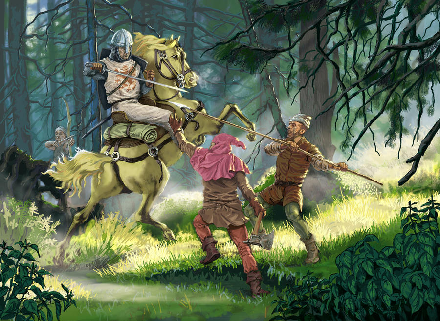
First, old school artists brought a lot more attention to telling a story in their pieces. What was being portrayed was a real scene with action going on that often anticipated something about to happen, or that had already happened. With modern art so much of it is dominated by posing, or depicting what amounts to a snapshot of a brief moment in battle. Wayne Reynolds in particular has built his portfolio on repeating poses or combat snapshots.
Second, and this ties a bit into the first, is that a lot of modern art lacks detail. The bulk of art today seems to be generated digitally and in what I've studied, and even done playing around with art software and a tablet computer, is that there is a digital skill set that can allow an artist to deliver an effective piece of art, but at the expense of a lot of fine detail. I think the best way to describe this is that if you look at a lot of art today you might notice that compositions are created that are intended for the eye to fall towards a central element, normally this is the face, or faces of a few central characters. The artist puts a lot more effort into that "node" of the picture. However if you go towards the outside of the picture the detail lessens, sometimes to a point that you could classify the outer edges of the picture to look more like the initial draft the artist did for the project. Now, for the half-glass full view you could argue that the less detail around the edges actually is intentional because it helps the eye zero in on the emotional focus of the picture. The half-glass empty argument is that the artists is skimping on detail because with the modern tools you can deliver a full color painting that is "good enough" and at a cost that people will buy it.
It's not that people back in the day didn't also use these kinds of composition techniques, but it doesn't seem to be as nearly as pervasive, and the fact that so much of RPG artwork were black and white pen and ink pieces it lent towards providing crisp detail throughout the painting to properly fill up the space.
The end result of the these two factors is that with older art I'm more prone to dwell on a piece, allow the eyes to wander and enjoy the mini-narrative and little details to be found in the work. With a great deal of the modern digital work I'm pulled to the grimacing face of the hero (plus boobs if it's a woman) at the center in a dramatic pose, and that's about it. The emotional moment passes, I scan the rest of the image to see that there is a lot of less defined detail radiating outwards and just move on.
The sad thing for me is that there are zillions of younger gamers who aren't ever going to be aware of this shift, how style a composition can have an effect on the viewer, because the art today is kind of a well constructed and distilled to deliver one specific effect, which is over so quickly that it doesn't stick with the viewer.
Since a picture speaks a thousand words, here are a couple of pieces of art that are an example of what I'm thinking about:
http://paizo.com/image/content/PathfinderRPG/PZO1115-RacesOpener.jpg
http://paizo.com/image/content/SerpentsSkull/PZO9039-Froghemoth.jpg
The first image does a good job of showing how around the edges of the frame the art has "diffused" to the point that it almost looks like the initial blocking the artist does when mapping out the pieces.
The second image also has that diffusion of detail around the edges, but one could argue the whole piece isn't as rendered as it could be. Still, it's "good enough" because it is in full color and has some detailing, though if this was 30 years ago this would have been an initial draft that an oil paint artist would do to present to the client before doing the final fully rendered piece.
In contrast, you could look at the cover of 1st edition
Dungeoneer's Survival Guide where all of the main action is "in focus" and there is a lot of stuff going on in the picture, plus a level of rendered detail that you don't see all that often today.
And just to note, I'm not trying to set up a straw man by contrasting book cover art with interior art. The first two images wouldn't pass as book cover art even today, at least from a serious publisher. The contrast I'm trying to make is the difference between color art from yesterday and today. The digital medium lets artists create in a time frame color art that is good enough and can use this diffusion method of detail to deliver a specific emotional effect. Color art decades ago was all done with analog paints and had a level of "resolution" that was expected out of a quality color print.

") .
.