I don't like the cover. I also wonder why they only have the new races on the cover [dragonborn and tiefling] and why there are only two in the party when WotC has said that 4e presumes 4 or 5 PCs in a party? On the plus side, the cover does focus on the role of roles in combat (note how the warlock [striker] is protected by the fighter [defender] ).
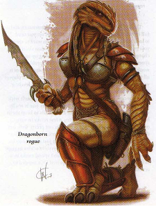
The dragonborn warlock is not too bad. It seems an odd fit for a race whose strengths are presumably suited more for direct (physical) combat, but as we have not seen the actual final stats for the race yet perhaps I am incorrect in my assumption.
The tiefling fighter, however, is just odd. The pose seems a bit off somehow. It just looks unbalanced. Also, the armor is odd, having holes where one would expect protection (over the heart, the sides of the neck, around the thighs and armpits (locations of major arteries), and so forth). This is not even taking into account that the out-thrust edges around the elbows, knees, and neck will actually guide the attacking blade into the flesh, rather than away from it. But that is a problem with many fantasy armor images. Lastly, the shield is supposed to protect the fighter, right? So why is it held to the side? I presume it was for artistic reasons, as the threat is supposedly outside the front of the cover, but it would work far better if the threat was shown to the side, with the PCs (more than two) also viewed from the side.
As for the image being cheesecake - I don't really think it qualifies as such. It shows virtually nothing, and what it does show is shown so awkwardly and so unemphasized as to have no worth as cheesecake - presuming any could actually consider it to have the possibility to be cheesecake in the first place (which is so unlikely I tend to think that it was not the intent of the artist for it to be considered such).
")