The "iconic" characters -- time to for them to die?

Kill the iconics?

  • Oh yeah! Burn, Ember, Burn!

    Votes: 92 38.5%
  • But, but .... I *love* Lidda.

    Votes: 123 51.5%
  • Ironics?

    Votes: 24 10.0%

Berandor said:
Yeah, well, who doesn't? Even Mialee is partial to her charms.
I would pay to see that.
Vadania said:
...but lay a finger on my Alhandra...
And that.


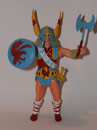
And you know... maybe I'm the only person seeing this...
NorthlordLoose1a.jpg


Take a peek under that helmet. Looks like Prince Adam's been doing a little moonlighting away from Eternia.
 

log in or register to remove this ad

Overall, I have to give the nod to AD%D 2nd Edition for Best Art.

Perhaps not in the interiors of all the books (although some of the B&W illustrations in those were excellent), but with the quality of the book covers and Dragon/Dungeon cover illustrations, 2e pushed ahead by, IMO, a wide margin.

3e has had some very good interior art, and none of the 3e art is as bad as the worst 2e (much less 1e/OD&D) stuff, but the best just doesn't come close.

Personally, since the 'realistic' art is of a much lower caliber than it used to be, I would rather see a more anime or comic style. d20 Modern did a good job with many of its illustrations - clean lines, bold colors, a very distinctive feel. Moondog as the bodyguard especially leaps to mind as a cool illustration in a non-realistic style. Something about most of the D&D 3e art just feels bland, IMO.

Also, d20 Modern's iconics > D&D's iconics in form and function. They actually improve, illustrating the game system in the process. Seeing how Russel looks as a Strong Hero, a Soldier or a Shadow Slayer shows new players how characters can develop in d20 Modern.
 
Last edited:

I like having iconics in the rulebooks. They provide a nice sense of continuity. I'm concerned that there are too many iconics and thus their faces aren't adequately familiar in the books. But that may be a sign that I own too many books.

My favorite uses of the iconics is on the fronts of The Sunless Citadel and The Forge of Fury. My least favorites would be Hennet's BDSM outfit that has no arcane spell failure penalty and the paladin girl's hastily donned scale mail that makes her lawful-goodness look like a leftover 80's party girl. Some good points, some bad points.

What I absolutely and completely detest is the proliferation of Iconic Minis. My players don't play iconics. I don't send iconics against my players. Why in the nine flaming hells would I ever want Lidda is a new pose for every set of minis that WotC is releasing? As a smegging uncommon, no less! But I'm not entirely happy about randomized minis, anyway -- I like having monsters that make sense. Randomized minis would only consistently help me if I were still playing Return to the Temple of Elemental Evil... <duck! />

::Kaze
 

They're good to illustrate points regarding a certain class. To put a face to the class kinda helps. It'd help more if the artwork is more consistent. Some of it's great and other times it sucks sour apples.

I'm one of those who really likes the iconics, even if it's to pick on them like Piratecat did..... ;)
 

Testament said:
:mad: grrrr. I'm still trying to work out where the old schoolers are pulling this cartoony/anime/comic styling idea from. I look at Lockwood, Spencer and Wood's artwork and I'm not seeing it. And I'm trying!
...

Look a little harder. ;)

In any case, even if the pictures don't seem cartoonish to you, surely you must notice the absurdly unrealistic armour (avec beaucoup de spikes), ridiculous clothing, endless piercings and tattoos, and the general non-Medieval tone of the illustrations.

Dave Trampier, where are you now? :(


mhacdebhandia said:
Personally, I prefer a non-medieval look. D&D's not just medieval Europe, and I'm glad the art in the books recognises that.

Well, even if you prefer a non-medieval look, how about some variety?

The current art fails utterly to recognize that DnD's not just cartoonish people with absurd spikey armour and unrealistic clothing. :D

A little medieval every so often would be nice (I mean, we ARE talking about knights, paladins, etc. here). ;)
 

Akrasia said:
In any case, even if the pictures don't seem cartoonish to you, surely you must notice the absurdly unrealistic armour (avec beaucoup de spikes), ridiculous clothing, endless piercings and tattoos, and the general non-Medieval tone of the illustrations.

That was intentional.

When Wizards of the Coast was brainstorming the artwork for 3rd Edition, they decided that that they wanted to escape from the generic medieval Europe style of previous editions and give 3e a visual style that was distinctly its own. Here are some comments by Dawn Muren, who was the Art Director for 3rd Edition...

"Much of what we did in Planescape actually influenced the look of 3.0. Planescape gave us the opportunity to reach out, to move past the Medieval European straitjacket that traditional D&D had placed us in."

and

"We went very functional with the new look of D&D. We made a conscious decision to make armor and weapons and the look of characters as functional and culturally neutral as we could."

So there you have it. The 3e artwork was never intended to look medieval in the first place.
 
Last edited:

Dark Jezter said:
... So there you have it. The 3e artwork was never intended to look medieval in the first place.

Of course it was intentional! I would never have thought otherwise (it couldn't have been a coincidence that the art was so consistently silly).

Just because it was an intentional decision doesn't mean that it was a wise decision. ;)
 

Akrasia said:
Just because it was an intentional decision doesn't mean that it was a wise decision. ;)

I don't agree. I find the art much better and more appealing than in previous editions. ;)

But that is just my personal taste, which differ from yours, which is perfectly fine. When it comes to art, it is almost nearly subjective. For every person that you find that hates 3e art, there is a person who loves it, like me. :cool:
 

Remove ads

Top