D&D 5E Which Is Better: Regular or Alternate Cover Art For Theros?

Here's a look at the full art pieces for the covers of Mythic Odysseys of Theros. The first is the regular, and the second is the alternate cover. Which is better?
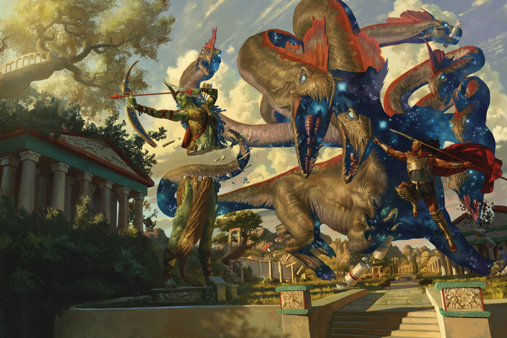
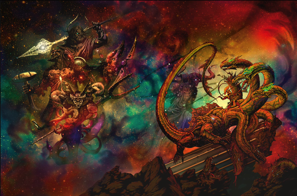
Which is better?

  • Regular

    Votes: 90 54.9%
  • Alternate

    Votes: 74 45.1%

Here's a look at the full art pieces for the covers of Mythic Odysseys of Theros. The first is the regular, and the second is the alternate cover. Which is better?

Screen Shot 2020-03-02 at 11.22.13 PM.png
Screen Shot 2020-03-02 at 11.22.32 PM.png


log in or register to remove this ad

Harzel

Adventurer
Artistically I find both hard to parse. Maybe they look better in print? Very busy and without a lot of contrast in the figures to set things more apart. Hard to get a sense of scale in the first one but it is promising (though the figures feel a little weightless).

The alternate one would make a killer van paint for sure but... why are the gods fighting a hydra with glowing eyes? I guess it makes sense if you play Magic?

The standard cover looks like it’s composed of four or five different photoshop layers that don’t quite work together. The hero seems to be throwing his spear at something in the tree, and the hydra seems to suffer from the same ailment that makes my senior dog wipe out if she takes a corner too quickly. Lovely work otherwise.

I think the spear is supposed to be aimed at the head in the center of the picture; that head just doesn't 'pop out' enough to make it obvious.

And then there's the severe perspective weirdness with the short pillars flanking the steps in the foreground. In general, it sort of looks like the artist changed their mind about perspective between stuff on the right side of the sidewalk vs. stuff on the left.

Not to mention the mystery of what, exactly, is that material draped between the legs of the statue of the archer? Cloth? Feathers? Wood? In any case, ceremonial dress, I hope, as it certainly isn't going to be very practical.

I will say I like the temple in the tree, though. I think that might be my favorite part of the piece.

Too much of the art for D&D and similar products seems to have a don't-look-at-this-too-closely problem. It's cool if you glance at it, but if you look at it... As other examples, I found the covers for the Tal'Dorei Campaign Guide and the Explorers Guide to Wildemount quite disappointing.

IDK, maybe folks are being pushed to crank this stuff out fast?

The alternate cover has fewer realism problems because it's ... less realistic. But as others have noted, it seems more fit for some context other than a book cover. So I voted for the regular cover.
 

log in or register to remove this ad

Umbran

Mod Squad
Staff member
Supporter
I have this one nitpick...

On the regular cover they have a blunt tail that cleanly cuts a statue in two, with a very flat plane surface resulting on the stone.

That bugs me. Sorry.


Iry

Hero
The second one. Mostly because the hero in the first one is visually messed up. His back is to the hydra, and he's posing heroically while jumping and throwing his spear at nothing.


teitan

Legend
SO, I voted regular but that alternate cover I like more and more as I look at it. I am not a magic player but this book could be right up my alley. I wonder how it would work for a classic Clash of the Titans style game or heck, even the new ones.


ssvegeta555

Explorer
Hmmm.... One is a jackass hero photobombing a hydra's action shot (perspectives on this one is weird) and the other is overly busy color vomit soup. I guess the first one, since it better conveys what the setting is about.
 

Related Articles

Remove ads

Remove ads

Top