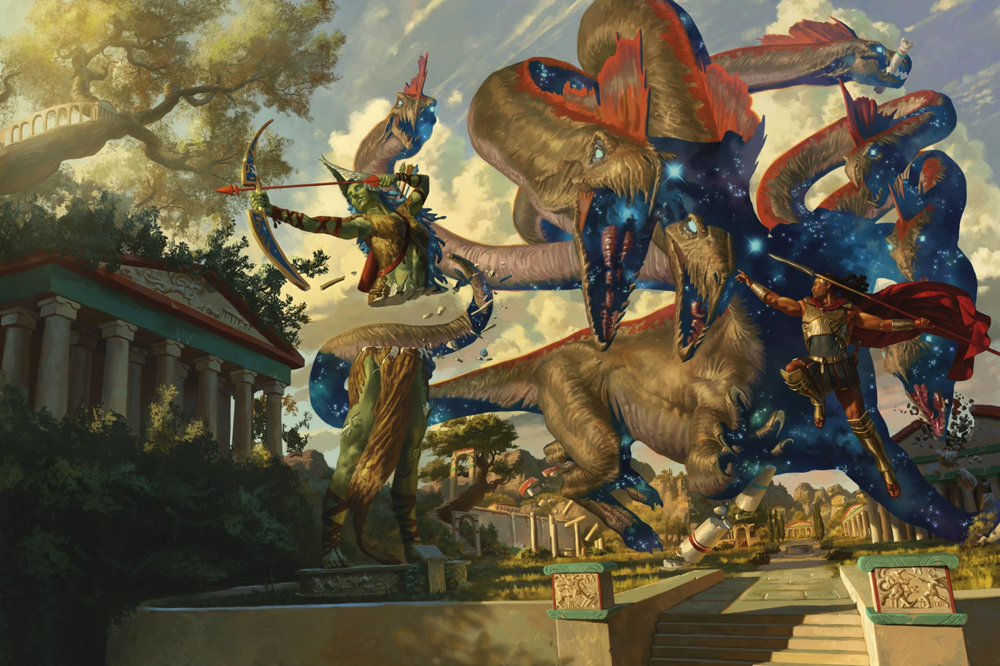
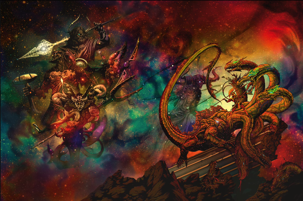
Here's a look at the full art pieces for the covers of Mythic Odysseys of Theros. The first is the regular, and the second is the alternate cover. Which is better?


That would be fine, but he's facing away from the hydra and throwing his spear at nothing."I leap in the air and pose heroically whilst throwing my spear at the hydra" [rolls a 1]
I had a similar thought. I actually like the image of the alternate cover better, but I prefer the art style in the original cover - so that is the one I picked.I like both covers, actually. If hard pressed, I'd pick the regular cover. Hoever, it only wins by a milimeter.
He's getting ready to torque his body to add the rotation momentum to his throw (not as effective in the air though)That would be fine, but he's facing away from the hydra and throwing his spear at nothing.
Just somewhere off to his left
If you look at the illustration carefully, the hydra is drawn with exaggerated perspective, one of it's heads is a lot closer to the viewpoint. The hero could be aiming directly at the side of that head, but without scale reference points it's impossible to tell.He's getting ready to torque is body to add the rotation momentum to his throw (not as effective in the air though)
It actually looks like his looking right that head. So that makes sense. They flying spear man didn't bother me when I first glanced at it, and it doesn't bother me now that I have "looked" at it.If you look at the illustration carefully, the hydra is drawn with exaggerated perspective, one of it's heads is a lot closer to the viewpoint. The hero could be aiming directly at the side of that head, but without scale reference points it's impossible to tell.

(Dungeons & Dragons)
Rulebook featuring "high magic" options, including a host of new spells.
(Dungeons & Dragons)
Rulebook featuring "high magic" options, including a host of new spells.