D&D 5E Which Is Better: Regular or Alternate Cover Art For Theros?

Here's a look at the full art pieces for the covers of Mythic Odysseys of Theros. The first is the regular, and the second is the alternate cover. Which is better?
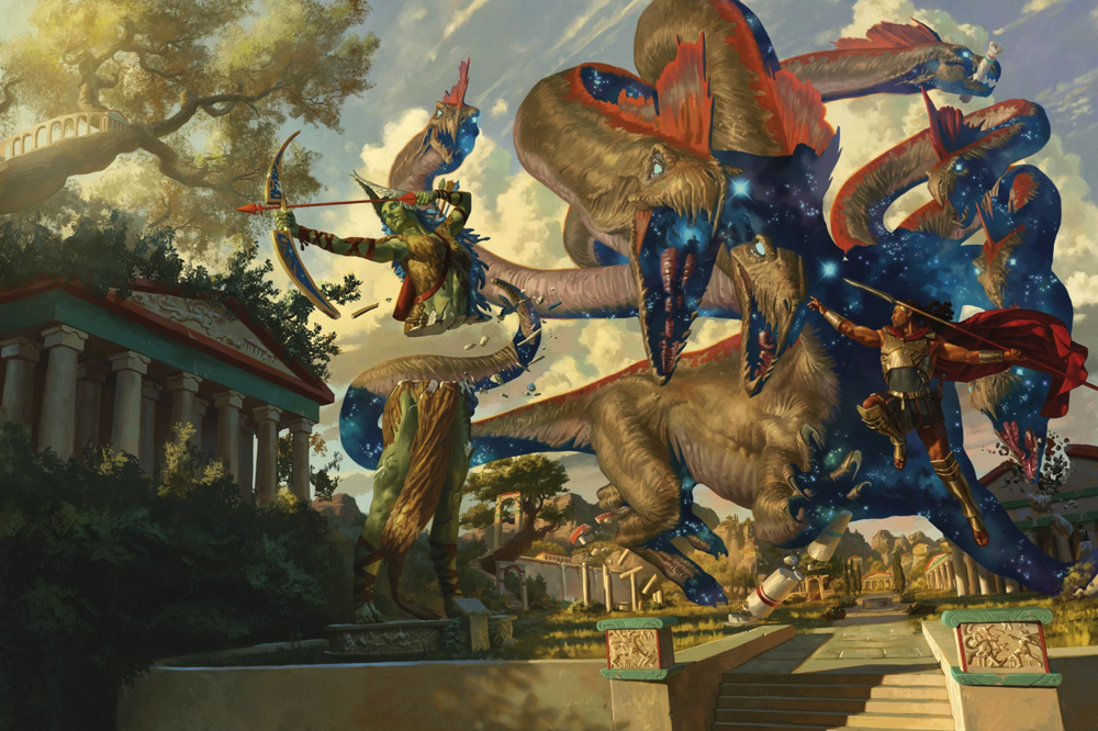
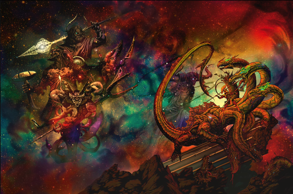
Which is better?

  • Regular

    Votes: 90 54.9%
  • Alternate

    Votes: 74 45.1%

Here's a look at the full art pieces for the covers of Mythic Odysseys of Theros. The first is the regular, and the second is the alternate cover. Which is better?

Screen Shot 2020-03-02 at 11.22.13 PM.png
Screen Shot 2020-03-02 at 11.22.32 PM.png


log in or register to remove this ad

Yeah, I think the alternate will pop more with the metallic ink, like Ghosts of Saltmarsh and Eberron.

Though, the color scheme reminds me of the old holograms that were all the rage in the 80s and 90s. A hologram cover D&D book is probably too much to ask for (and probably not financially viable).

The pic may be misleading as one which was displayed earlier has some sort of foiling effect.
 

log in or register to remove this ad


jayoungr

Legend
Supporter
I still want someone to explain the perspective on the short pillars flanking the steps in the foreground. Just looking at them makes me dizzy.
I assume the viewer is supposed to be standing nearer to the one at the right side of the picture, looking diagonally at the scene.

This is the first time I actually like an alternate cover.
You didn't like the Eberron alternate cover? I thought that one was gorgeous!


Cleon

Legend
Hmm… am I right in thinking this is a wraparound cover - front cover art on the right, back cover art on the left?

Layout wise the alternate cover works a lot better for that - the hydra on the front, the Supernatural-Whoever-They-Ares floating in the void on the back (gods? titans? high level NPCs cosplaying?). There's a sizeable space above the hydra for the book title and below the S-W-T-As for some credits/teaser text. If the regular cover was a wraparound the book title would likely obscure some of the hydra's heads and I'd find the back cover a bit uninteresting - it's mostly vegetation and a building.

Artwork wise, the regular cover is better executed in some ways (it's more detailed and the various anatomies on display look very "real") but the perspective and shadows are perplexing. I'm unable to decide how big the hydra is or how far it's standing away. Its shadow on the temple-like building in the background (plus the chunk the beast's just taken out of its roof) suggests its fairly far away level with the gap between the buildings on the left, while the triangulation of the five heads staring at the warrior suggest it's not back there but more in the midground, which explains why its tail (or one of the heads) was simultaneously able to shatter what is presumably an example of the new medusa PC races in half. The angle of their gaze suggests its brachiosaur-enormous while the building roof-chomping indicates its kaiju-colossal scale. I guess if the warrior was several times taller than an ordinary human it'd make sense.

Not sure why both the medusa archer and warrior have their backs to the monster and are aiming their weapons away from it. That seems inefficient.

The warrior in the alternative cover also has his back to the hydra while apparently standing on one of its necks. His pose seems rather too casual for such a precarious position and he's either lost his right foot or somehow has warped space (or his hip) to somehow put it on the far side of that hydra neck. I'll give him kudos for having the good sense to wear a helmet though, unlike his counterpart on the regular cover.

Maybe the alternative-cover warrior is a demigod with the ability to float in the air and fight as if he had secure footing? It'd explain the ease with which he's just standing there. The regular-cover warrior appears to have just jumped into the air to throw a spear. He's not doing a 180-degree spin to hurl it at the hydra though, since his hair and cloak are billowing straight behind him. So he must be throwing his main weapon at something off to the left.

Hmm, overall I like the regular cover better as to how "good looking" the artwork is, and would likely prefer it as an illustration in a book, I would likely pick the alternative art for a wraparound cover.
 

darjr

I crit!
I have this one nitpick...

On the regular cover they have a blunt tail that cleanly cuts a statue in two, with a very flat plane surface resulting on the stone.

That bugs me. Sorry.
The way I saw it was the statue was already broken just not toppled yet and the tail nocked out the middle piece like a jenga puzzle.
 

Eyes of Nine

Everything's Fine
Since I always buy the alternate cover if it's available (Ravnica not having one is a bummer) I know which one I'll buy. That said, they are both really cool. The Alternate cover is a lot more... representational than the ones in the past.
 

Zabalorf

Villager
Only thread I found with the back art as well. Going to have to get the Alternate cover, close tie but I love the colors of space.
 

I hadn't picked up an alternate cover until Eberron, but it was just too pretty to pass on.
This will be the second alternate cover I get, I think, I actually really like the colourful psychedelic version here.

It's a shame there wasn't an alt-version of Ravnica (although I love the cover of that) and Wildemount, so that all my setting books could have a bit of consistency to them, but it's no biggy.

I like the normal cover too, don't get me wrong. I actually came across a thread on Twitter where the artist showed the artwork at various stages, even posted the written brief which was interesting to read.
 

Related Articles

Remove ads

Remove ads

Top