WotC WotC Gets A New Logo?

According to the Wall Street Journal's David Ewalt, Wizards of the Coast has a new logo. His article was the piece where we learned how Hasbro was restructuring.

Update - WotC just updated the logo on its social media accounts, so it's official!
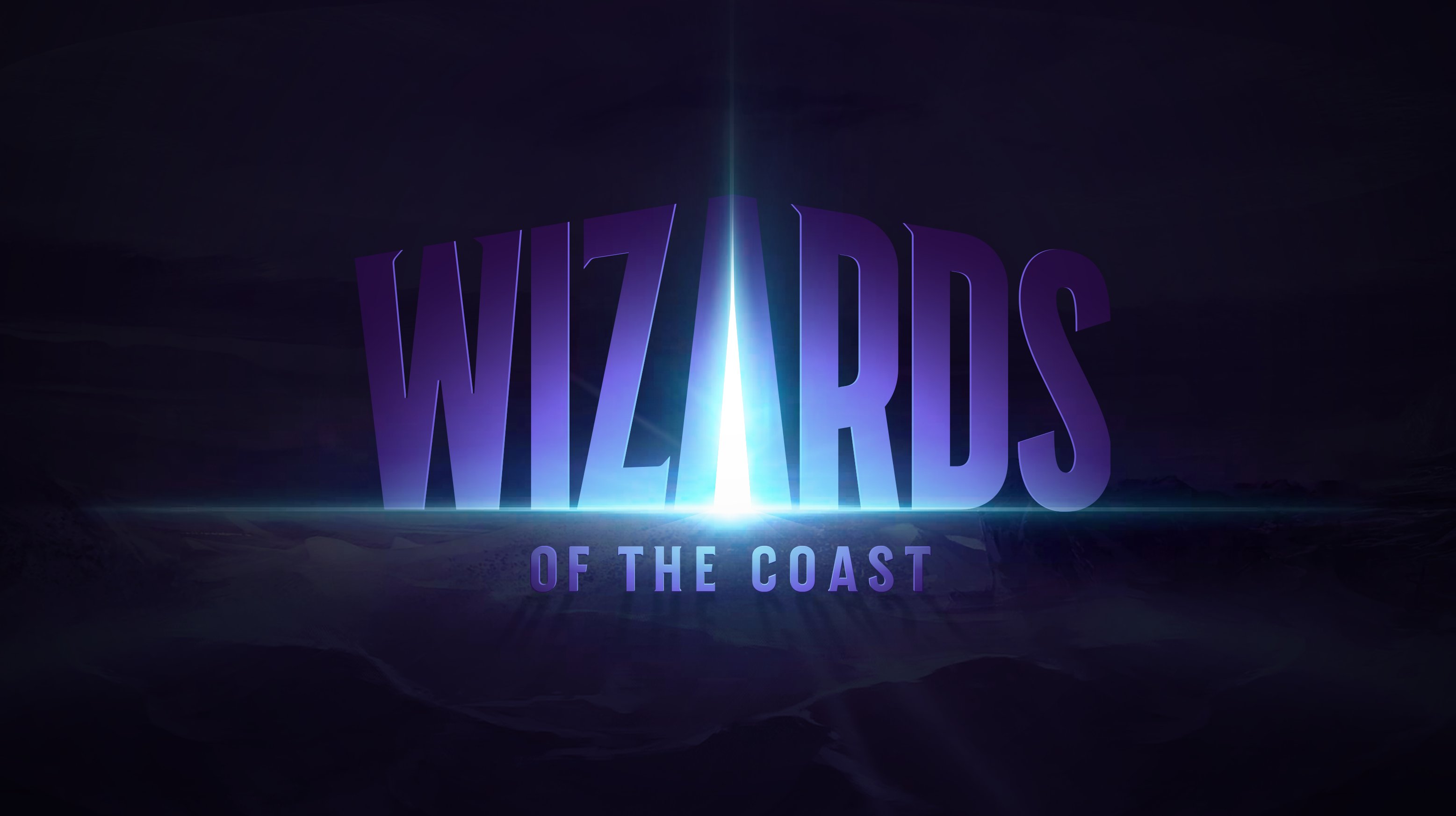
wotc.jpeg


5C3273BE-77ED-4EC0-B93E-9B3A16CB889D.jpeg


Here's the old logo for comparison.

old_wotc.png


Last edited:

log in or register to remove this ad

Cool the logo looks like a first year graphics design student turned it in.
Yeah I don't want to agree and I think it'd be a good first year graphic design student that turned that in, because it's quite polished in some ways that are tricky to do when you're new, but... basically? Yeah. It looks like something a graphic design student who is still at university came up with, in maybe 2004? It's very like, very late '90s/early '00s in vibe. There's a hint of modernity to it, but only a hint.

I don't hate it, but it's weird-ass choice in 2021. Especially when Wizards have a very distinctive logo, which is in no way related to this logo.
 
Last edited:

log in or register to remove this ad

TheBanjoNerd

Gelatinous Dungeon Master
I don't hate it, but it's weird-ass choice in 2021. Especially when Wizards have a very distinctive logo, which is in no way related to this logo.
I get what you're saying. This logo doesn't appear to be an evolution of their first two logos. I suppose one could argue that the light emanating from the center of the word "Wizards" could be an homage to the starburst over the W in the previous two logos. Yet as it is, it looks like it's intended to be a clean break from their previous logo, rather than a modern refresh of it. Which is an odd choice, as it seems the current trend is to take recognized, existing logos and simplify them down as much as possible.


Charlaquin

Goblin Queen (She/Her/Hers)
Yeah I don't want to agree and I think it'd be a good first year graphic design student that turned that in, because it's quite polished in some ways that are tricky to do when you're new, but... basically? Yeah. It looks like something a graphic design student who is still at university came up with, in maybe 2004? It's very like, very late '90s/early '00s in vibe. There's a hint of modernity to it, but only a hint.

I don't hate it, but it's weird-ass choice in 2021. Especially when Wizards have a very distinctive logo, which is in no way related to this logo.
It definitely looks kind of dated... Like it was designed by someone who was trying to modernize the logo, but is out of touch with what modern visual design looks like. Though I suppose that is kind of a fitting representation of WotC 🤣
 

I get what you're saying. This logo doesn't appear to be an evolution of their first two logos. I suppose one could argue that the light emanating from the center of the word "Wizards" could be an homage to the starburst over the W in the previous two logos. Yet as it is, it looks like it's intended to be a clean break from their previous logo, rather than a modern refresh of it. Which is an odd choice, as it seems the current trend is to take recognized, existing logos and simplify them down as much as possible.
I mean that trend has been going on for what, nearly 20 years, maybe even longer, so maybe they thought, let's get ahead of the curve, do the "new thing", and instead of just simplifying our distinctive and yeah somewhat beloved logo, we'll just replace it with this weird-ass 2004 deal! The law firm I work at totally redid it's logo a few years back, but that was part of a major rebrand of our entire vibe, so it made sense.

I guess maybe they want something that looks a bit more... Disney? The old logo didn't look like the logo of a particularly massive business, but this one looks more like it might be... though not in a great way.


Azzy

ᚳᚣᚾᛖᚹᚢᛚᚠ
Not a fan. It just looks too generic, and the "of the Coast" part is too overshadowed by the ginormous "Wizards".
 

Nice change of pace. The old logo was getting to be just that: old. And boring.

But what I want to know is why the Twitterverse is not in an uproar over the name of the company being so gender-exclusive. I mean, wizards are typically male. And what about all the people who do not live on a coast? ;)
 

Paragon Lost

Terminally Lost
View attachment 133330
My first take on seeing it.
Thank you. I was wracking my mind when I looked at the new logo. I knew it reminded me of some evil and a movie poster from the 80's. As an aside I used to have the game module for "The Keep". Just like the movie it kinda odd. If I recall it done by the same people who did the Role Aids line of AD&D game supplements.

Edit: Lol,, found it.


Remove ads

Remove ads

AD6_gamerati_skyscraper

Remove ads

Recent & Upcoming Releases

Top