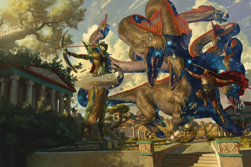
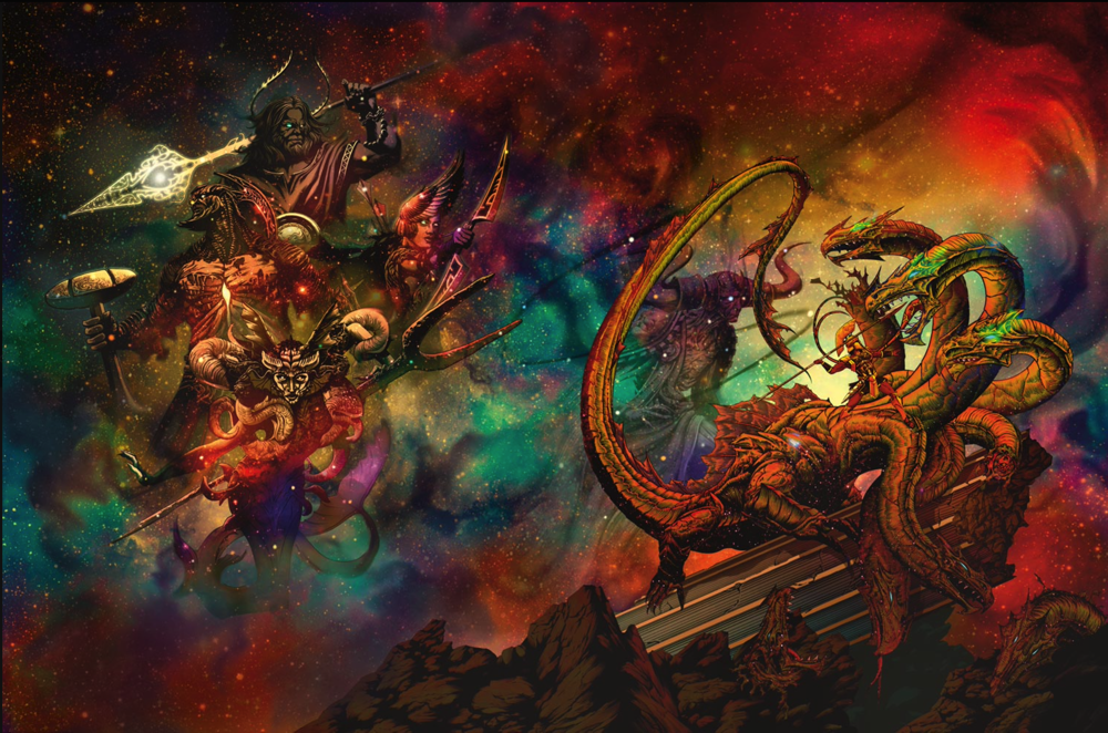
Here's a look at the full art pieces for the covers of Mythic Odysseys of Theros. The first is the regular, and the second is the alternate cover. Which is better?


If you look at the illustration carefully, the hydra is drawn with exaggerated perspective, one of it's heads is a lot closer to the viewpoint. The hero could be aiming directly at the side of that head, but without scale reference points it's impossible to tell.
If the left head is looking at the hero then it would be behind the hero (just closer than it's other heads). If the left head is parallel to the hero, then its attacking the air for no visible reason. Since all the other heads are looking at the hero, except the two furthest back (eating a column, etc), I don't think the left head is parallel to the hero.On the original cover-The spear lines up just fine with the Hydra head second to the left (the head "closest" to the viewer") Lines up with it's cheek/start of neck.
I love the alt Eberron cover, it was the first alt cover I purchased. The wildemount cover is in the CR style, so that makes sense to me, and I like both of these. They are not great, but I would enjoy having either one.The background on the alt cover is too saturated in color. Details are lost.
The first one doesn't drive me crazy either, but the book cover has the image cropped too tight for the actual cover.
I don't know what's happening over at WotC but they're really missing the mark for covers lately.
Wildemount looks terrible and cartoony.
Eberron was not good at all.
Hopefully it's just a phase.
But think about it in motion. The scene makes sense to me, except you would get more force in the through if you are on the ground and not leaping. Of course that is not as epic, or should I say "mythic!"If the left head is looking at the hero then it would be behind the hero (just closer than it's other heads). If the left head is parallel to the hero, then its attacking the air for no visible reason. Since all the other heads are looking at the hero, except the two furthest back (eating a column, etc), I don't think the left head is parallel to the hero.
Thinking about it in motion doesn't make the perspective issues any better to me.But think about it in motion.
Motion changes the perspective relationship though - that is my pointThinking about it in motion doesn't make the perspective issues any better to me.

(Dungeons & Dragons)
Rulebook featuring "high magic" options, including a host of new spells.
(Dungeons & Dragons)
Rulebook featuring "high magic" options, including a host of new spells.