• NOW LIVE! Into the Woods--new character species, eerie monsters, and haunting villains to populate the woodlands of your D&D games.

D&D (2024) You Can Now Pre-order Eberron: Forge of the Artificer

Pre-orders for the upcoming setting book have gone live. Eberron: Forge of the Artificer comes out on August 19th. The book contains the new 2024/5 edition Artificer class with 5 subclasses, the Warforged species, a ton of backgrounds and feats, and 20 new monsters.
eberron-forge-of-the-artificer-physical-02.webp

Forge wonders in the world of Eberron, where magic meets marvelous inventions.

Play as the Artificer: the ultimate creative class. You’re not just an inventor or spellcaster. You're an innovator, a bold-hearted visionary, fusing together magic and technology to craft extraordinary creations.

Fuel your adventures with this rules expansion for Dungeons & Dragons:
  • 4 revised Artificer subclasses and 1 new subclass: the Cartographer
  • 5 revised species, 17 backgrounds, and 28 feats
  • New spells, bastions, and magic items
  • 3 distinct, genre-based campaign templates for building fantasy noir, political thriller, and pulp adventure campaigns in the world of Eberron
  • Over 20 new monsters, each inspired by a campaign model

eberron-forge-of-the-artificer-physical-05.webp
eberron-forge-of-the-artificer-physical-04.webp

eberron-forge-of-the-artificer-physical-06.webp

eberron-forge-of-the-artificer-digital-01.webp


log in or register to remove this ad


log in or register to remove this ad

The new artwork for the supplement is substandard. This continues a trend set in the new PHB and DMG, that FOR ME, the art is much less evocative and feels "cheap" in some respects.

I find the art in the DMG to be absolutely top-notch. The PHB I would agree it's a bit on the meh-side. Each individual piece is good, sometimes really good, but never very distinctive in style, as if their subject was the only thing mattering and "generic fantasy art" a good-enough style. But the DMG (and the MM, by the way), my goodness, there are some master pieces in there.

As for Eberron, I don't think we've seen enough to form an opinion yet, considering that, even if you were to love Wayne Reynolds (even if I really don't, I can understand why one would love his work ; it's distinctive, personal, stylish), the Eberron books from third ed. were atrocious on the whole, completly heterogenous, hapazardly directed. For this new one, we can see there's some thought put into that, it feels like the DA was at least trying to do something, and maybe they did good? We'll see.
I'll take another look at the DMG.

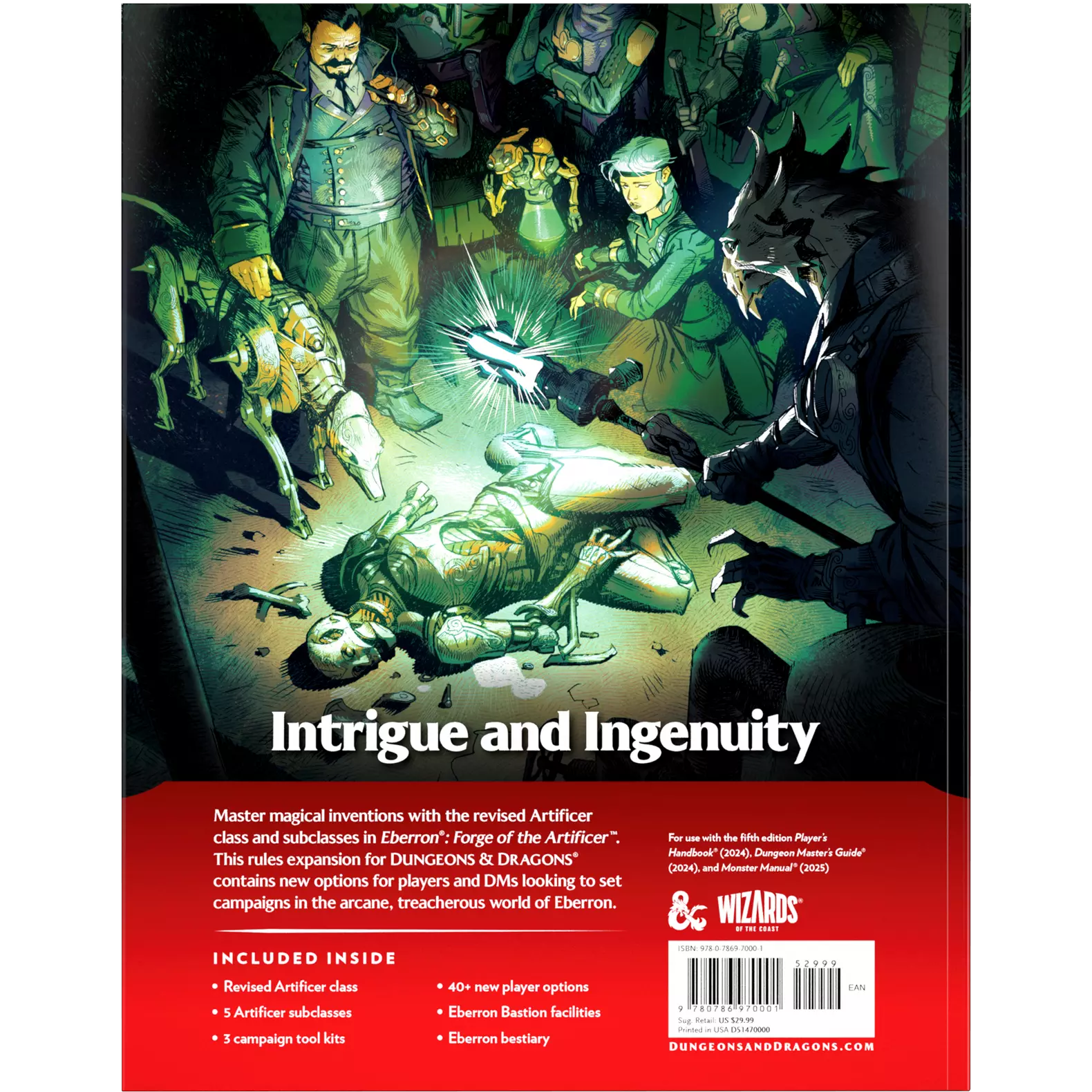
I think it's more of an overall feel. I'm not saying there are no good works of art in either book. Just that I think, on the whole, they did a better job creating a cohesive artistic feel for the line in past editions. The Eberron book, at least, is going with a cohesive theme (I applaud that). I just don't like the style they chose. The only images that I find interesting of all that we have seen are the ones that feature a dead? warforged and the investigator with the mage-tech dog. Since two images use essentially the same characters and scene (one in a group, one on his own), I wonder if that will be a recurring character for the book? Since two images are already dedicated to it, maybe?

Regardless, those images are the only ones that are telling an interesting story. A story I could be invested in. So I like those two pieces, regardless of the style.

I agree, we haven't seen the book, and maybe the art direction is better as a whole there. All the above being said, I'm excited for the content. I would love to play an Artificer again.
 

Just that I think, on the whole, they did a better job creating a cohesive artistic feel for the line in past editions
That was a deliberate decision to move away from creating a single look, on the basis of the core of D&D being creating your own game with your own look. So they used a range of different artists to give players a range of different inspirations.
 

Understood, and I get that. But , in the end, I think there is an issue with the quality of some images, and some just feel off. Again, this is just my opinion and how I feel. I think they could have done better.

Some of the images actually take me out of my head rather than getting me inspired and imagining my own scenes. They could have done a lot with the money they have but I think they went with lesser known ( and again IMO, less talented) artists. And to me, it shows.
 

I personally loved Wayne Reynolds art and style. To me, that set the bar pretty high
Personally, I always kind of reacted negatively to Wayne Reynolds style, and I do not feel time has been kind to it. Feels very 90s, in an unfortunate way. For me, that is the lowest of bars and honestly always held Eberron back as it did the rest of 3E.
The new artwork for the supplement is substandard. This continues a trend set in the new PHB and DMG, that FOR ME, the art is much less evocative and feels "cheap" in some respects.
The new books, on the other hand, represent a new high after the previous highs of 2E and 2014 5E.


Personally, I always kind of reacted negatively to Wayne Reynolds style, and I do not feel time has been kind to it. Feels very 90s, in an unfortunate way. For me, that is the lowest of bars and honestly always held Eberron back as it did the rest of 3E.

The new books, on the other hand, represent a new high after the previous highs of 2E and 2014 5E.
It's always about taste in the end. He is still contemporary and unlike what I am seeing in the 2024 books, his work has style.

He's a working artist today, and whether you love or hate PF2e he is their current cover artist. So obviously, plenty of people love his work and feel he is relevant. I like that there is a cohesive look, even if I don't really play that game.


It makes zero sense for books about the multi verse to have one look, imo. We don't have one art style on earth.
Agreed. We don't. But we have things called artistic movements, like the bauhaus school, post impressionism, etc. They were interesting because they had a point of view and that's what's missing from the core books. It's generic to a fault.

Which of the two covers do you like for the core books, the standard or special editions?
 

Into the Woods

Related Articles

Remove ads

Into the Woods

Remove ads

Top