So, I'm going to rant a bit about two pieces I particularly didn't like. And it's not that they are deficient in any sort of technical way, but because they get the whole concept of the creatures in question wrong.
These are the crystal and emerald dragon illustrations in the Bestiary.
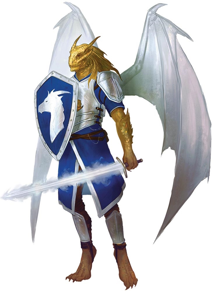
Now, they look perfectly fine from a technique standpoint (although I have seem some complaints about them, but the issues brought up there don't bother me so much). But the problem is how they are depicted isn't much in the way of them being gem dragons. They look like weirdly shaped white and green dragons respectively. Gem dragons need to have some sort of gem-ness or crystalline nature to them, and these two just don't have that. A gem dragon can be translucent and look like it was formed from a giant gemstone, like the sapphire dragon illustration, or the illustrations of the gem dragonborn or the amethyst dragon egg. Or, they can look angular, like a bunch of crystals that have come together or have grown together into a draconic shape, like the amethyst and topaz dragon illustrations (although the topaz could have done this a bit better), or any of the various gem dragon adjacent creatures in the bestiary. But there's nothing translucent or crystalline about the crystal or emerald dragons - they just look like boring old dragons, and even the floating crystal bits don't look much like gems (for the crystal dragon, they could easily be mistake for bone). The crystal dragon on both versions of the cover rectifies this to a point (especially on the regular cover where it being backlit really helps bring out some translucence), but the illustrations of it and the emerald dragon in the bestiary - well, I'm guessing some artists didn't quite get the memo of what they were illustrating...