You are using an out of date browser. It may not display this or other websites correctly.
You should upgrade or use an alternative browser.
You should upgrade or use an alternative browser.
D&D 5E (2014) Toward a new D&D aesthetics
- Thread starter Stefano Rinaldelli
- Start date
- Status
- Not open for further replies.
G
Guest 7034872
Guest
Still some oversaturation, but not nearly as much. Another thing I noticed when going through Tasha's itself was how the plainness of the text played against the heavy coloration of the images: it resulted in the pictures looking a lot less severe than the pastiche yielded. I mean, you go through three or four pages of black text on white paper, and then you see one of these paintings, right? It jumps right out at you, sure, but it doesn't overload the eyes as if we were looking at Looney Tunes on Acid. So I now suspect some of the saturation choice had to do with putting the images in a book of otherwise-straightforward text.
The artist is named Nikki Dawes. Here is her website:
She seems to have done a lot of the recent dnd art. Here is her work on the characters for RotFM

She seems to have done a lot of the recent dnd art. Here is her work on the characters for RotFM
Yaarel
🇮🇱 🇺🇦 He-Mage
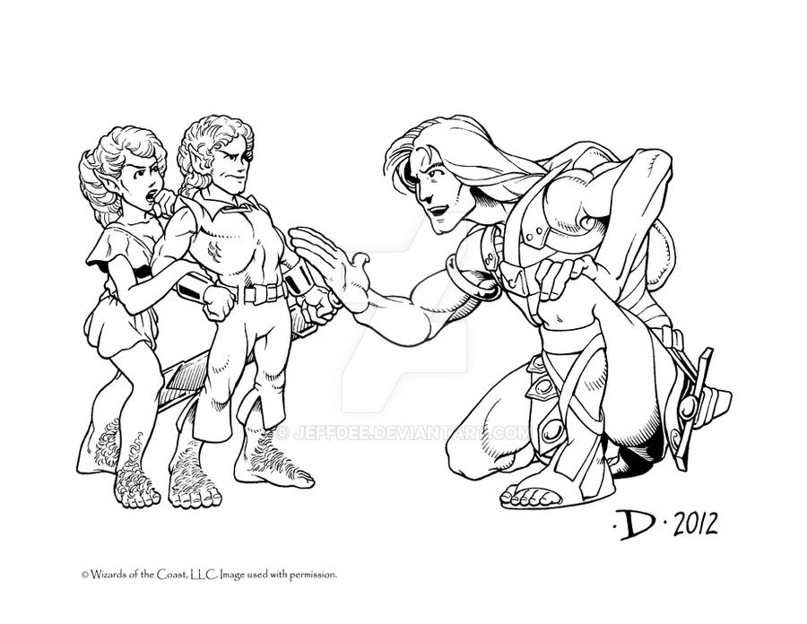
- A weaponized aesthetic of softness, wholesomeness, or cuteness.

billd91
Not your screen monkey (he/him) 🇺🇦🇵🇸🏳️⚧️
This underscores one of the real pitfalls of this debate - the look of a few things may make an impression out of proportion to their actual frequency. And impressions don't show trends - that requires broad analysis and review, not cherrypicking of examples. Now that you're reviewing Tasha's more thoroughly, you're in the process of correcting the impression given by Jahydin's post.That's exactly right, and it turns out the image was a pastiche of chosen pictures from Tasha's Cauldron. So I went and looked through the book, and sure enough there's a much more even distribution than the posted image suggests.
Vaalingrade
Legend
Is the blue lady an orc or a horc? She looks awesome.
G
Guest 7034872
Guest
Yep.This underscores one of the real pitfalls of this debate - the look of a few things may make an impression out of proportion to their actual frequency. And impressions don't show trends - that requires broad analysis and review, not cherrypicking of examples.
To an extent, yeah, but I do still think there's a lot less menace in current art than thirty and forty years ago, plus I'm also convinced the use of digital art introduces inescapable aesthetic changes. The cartoon Yaarel posted is a old favorite of mine, and it's clear to me that hand-drawing just works differently from digital art. Some will prefer one, some will prefer the other, some will be happy with both, and I'm sure some curmudgeonly nay-sayers will think it all sucks because everything always does.Now that you're reviewing Tasha's more thoroughly, you're in the process of correcting the impression given by Jahydin's post.
- Status
- Not open for further replies.
Similar Threads
- Replies
- 50
- Views
- 6K
- Replies
- 18
- Views
- 3K
- Replies
- 400
- Views
- 84K
- Replies
- 505
- Views
- 82K
- Replies
- 101
- Views
- 15K


