Remixing the Character Sheet

Been revamping the 5e character sheet for a couple days. Moving it landscape and rethinking the design, inspired by the circle sheet that popped up in the playtest.
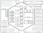
Character sheet.jpg

Still a work in progress as I do some fine tuning. I have it as a layered photoshop file, so I can also remove the lines if needed.

Thoughts?
 

log in or register to remove this ad

I really like where you are going with this! I especially like how you've lumped skills and saving throws nearby the relevant ability score. Having a separate area for Class Features is great idea too.

Oh and having the DC up front is helpful too!

I would be tempted to move Traits/Ideals/Bonds/Flaws onto the back of the page - my players tend to know those types of things about their character and don't change very frequently. This would make room for move spell slots or important treasure on the front of the sheet.
 

I really like where you are going with this! I especially like how you've lumped skills and saving throws nearby the relevant ability score.
Can't take credit for that. That's from a variant official sheet.

I would be tempted to move Traits/Ideals/Bonds/Flaws onto the back of the page - my players tend to know those types of things about their character and don't change very frequently.
I considered that but wanted it front and center, to remind people it exists.
I like the idea of being able to tuck the spells sheet away and "forget" about combat abilities.
 

Is this in the downloads section? It looks pretty cool, and I'd like to be able to save it to my computer (just saving the image doesn't seem to be a decent resolution for me).


Thanks. They look even better in pdf form. The one gripe I have about it is the same as the official one - that the personality traits box is too small - but that is a minor issue.
 

Remove ads

Top