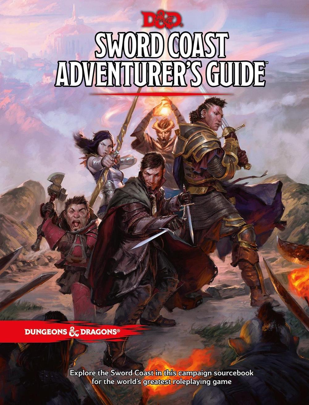
We've known for some time that in November, WotC will be releasing not one but two Forgotten Realms books--one aimed at players, the other at Dungeon Masters. Thanks to Game Informer, we now have a look at the covers of Forgotten Realms: Heroes of Faerun and Forgotten Realms: Adventures in Faerun. The article showcases more art, and is well worth checking out--and for those who want more, the print magazine has a full feature previewing the books.


D&D 5E (2024) Here's The Covers of BOTH of November's Forgotten Realms Books
- Category Dungeons & Dragons
- Thread starter Morrus
- Start date
Covers of Forgotten Realms: Heroes of Faerun and Forgotten Realms: Adventures in Faerun.

") If 5e had this number of dragon groups in it, I would be ecstatic.
If 5e had this number of dragon groups in it, I would be ecstatic.

Similar Threads
Recent & Upcoming Releases
-
December 9 2025 -
June 18 2026 -
October 1 2026


Enchanted Trinkets Complete
Related Articles
-
 D&D's Forgotten Realms Books Hit With Delays in Europe and Asia
- Started by Christian Hoffer
- Replies: 43
-
D&D Beyond Releases Free Forgotten Realms Adventure
- Started by Christian Hoffer
- Replies: 79
-
Forgotten Realms: Heroes of Faerun - First Impressions
- Started by Christian Hoffer
- Replies: 176
-
 D&D General Initial Thoughts on the Two 2025 Forgotten Realms books
- Started by SlyFlourish
- Replies: 83
-
D&D 5E (2014) Alternate Covers of Upcoming Forgotten Realms Books Revealed
- Started by GarrettKP
- Replies: 42
Enchanted Trinkets Complete
Recent & Upcoming Releases
-
December 9 2025 -
June 18 2026 -
October 1 2026