D&D 5E Toward a new D&D aesthetics

What is your feeling about the changes in aesthetics of D&D illustrations?

  • I really enjoy those changes. The illustrations resemble well my ideal setting!

  • I'm ok with those changes, even if my ideal setting has a different aesthetics.

  • I'm uncertain about those changes

  • I'm not ok with those changes because it impairs my immersion in the game.

  • I hate those changes, I do not recognize D&D anymore

  • The art doesn't really matter to me either way. I don't buy/play the game for the art.

  • Change in aesthetics? Where? What?


Results are only viewable after voting.
Status
Not open for further replies.
There is a feel evoked here though, at least for me. Both are clearly drawings, I'm not looking for photorealism, if I was I would look out my window at the overgrown trail a block away.

I can smell the forest in the first one though. The 2nd one, is just a picture.
The second one looks too manicured to be a natural forest. Pine needles are very acidic and kill pretty much any competing plant underneath, so that nice grass feel fake. But I think the art style of either cards really match the MOOD of the subject matter. The somber, foreboding, foggy forest represented with a muddy palette and not a lot of clean lines, while the hyper magical world represented by art that looks beyond reality and a little 'off' is a great match. They're both good in my eyes.

I asked a legitimate question. I've been on forums where no matter how many examples you provide, it's never enough, or not good enough.
Look, I didn't buy Strixhaven or Witchlight, (I haven't bought a book since Tasha's in fact) so why don't you post examples from those? 'cause I don't know what kind of art they have in there.
 

log in or register to remove this ad

Thats certainly part of it.

Here's an example using as basic a subject matter as possible, a Forest. Both are forests, but only the first one feels to me like what I can step out my door, walk a block, and enter. There is nothing wrong with the second one, but I prefer the first (and in fact still have those in a deck I keep.)

View attachment 154110

View attachment 154111
I prefer that first one, too! It has great atmosphere.

I'm going to start an RPG Art Appreciation thread to post people's favorite art pieces, I hope you will participate!
 

Thats what I'm talking about.

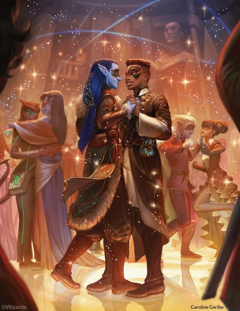
Contrast that with this? Or anything else being splashed with vast amounts of Blue/Purple/Pink digital ink?


strixhaven-dance.jpg


Take us back please.
No. lol

Sorry, but no. I absolutely hate the "we hunted us a dargon" picture. Half the faces look weirdly proportioned, it presents the heroes of the game as big game hunters (people that I find utterly despicable) which is the opposite of what I or anyone I play with wants from D&D, and the style is...fine, I guess.

While I wish more oil painting was still making it's way into modern fantasy art, the desire to "go back" to one specific style of dnd art that wasn't even the only style in the edition it was common in is a desire that would be directly detrimental to the game if pursued.

It's also largely just a digital vs analog preference. I hope you aren't going to act like more recent dnd art doesn't ever have people with "realistic" gear in small scenes that don't denote epic heroics?


This here is probably my favorite D&D illustration
View attachment 154100
Why do I like it so much? It looks real. The gear the characters are wearing and carrying is all functional and appropriately sized, and the dragon is something they could concievably kill without the help of Hollywood physics. And of course the artist's technical proficiency and attention to detail lifts it all to a new level. The realism really highlights the fantastic elements of the image and makes me want to explore this world.
That blond elf looks VERY 80's :p
It's also largely just a digital vs analog preference.
You can do a lot with the right brushes in digital.
 

I hope you aren't going to act like more recent dnd art doesn't ever have people with "realistic" gear in small scenes that don't denote epic heroics?
No, I'm not saying that. There was some art I liked in Fizbans, quite a few pieces in Rime (actually several fit exactly what I am talking about if I remember) and so on.

There is however, and its certainly amplified in this last books cover's, this weird purple/blue/pink mash up thing going on a lot, and I dislike it quite a bit.
This reads, to me, as completely unrelated on nearly every level to earlier statements by you and others about changes to the art overall.

Sure, the color palette range and clarity of images has changed from book to book. as have elements of the art direction, and the artists of course, and different books have different intended tones. It would be weird for a book about the Radiant Citadel to have the same grimey ill-lit look as some of the art from the darker-toned recent books like Rime or Avernus.

But not liking blue, purple, and pink, in fantasy art is just...not something I'm inclinded to view as important? Like I don't like a lot of red, orange, and yellow, but I don't expect anyone that isn't an artist I've commission to do a work to care at all about my preference there. Well, and my wife, when we are talking about decor, I suppose.
lol I'm not asking you to think its important, or to agree.

The thread poses a question, and my answer is that I feel like the art style/mood/direction has shifted, and I dont like it. Feel free to feel otherwise. You mention it right here "..different books have different intended tones.." and thats exactly correct and I dont care for the tone.

There is a trend, in the use of those colours (this purple/blue/pink mess), in my opinion across a number of works, not even just Wizards (because of course trends often transcend a single source more visibly these days) and I simply dont care for it.
 

D&D's aesthetics have been in constant evolution from the start - and it's not about to stop - but there seems to be a conscious artistic effort toward art that is less and less identifiable to a specific timeline, ethnicity, or culture, and art that is much more relatable to our society as it is now rather than as it used to be (or as we imagine how it used to be)

Personally, I applaud D&D's general inclusion of as many fantasy styles and aesthetics as possible, but I wish they'd stick to one when it comes to setting design, both in the sense of what the setting offers and what it does not.
 

But not liking blue, purple, and pink, in fantasy art is just...not something I'm inclinded to view as important? Like I don't like a lot of red, orange, and yellow, but I don't expect anyone that isn't an artist I've commission to do a work to care at all about my preference there. Well, and my wife, when we are talking about decor, I suppose.
Possibly related?
 

Status
Not open for further replies.
Remove ads

Top