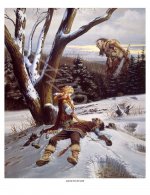
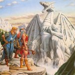
The first three are somewhat bright colors, for example, but so wildly different in style and tone. First is mildly impressionistic, second is almost like stained glass and resembles a more colorful take on Art Nouveau. Third kinda sorta resembles the first, but is aiming for a pretty high degree of "realism," not in the sense of not being fantastical (what with the butterfly pegasus and all) but in the sense of aiming for minimal stylization and presenting things with most fine details represented as though accurate to a real physical body, especially in the foreground and the central pegasus figure. (The people driving the carriage and the tree are examples of lower detail, but still overall striving for a "this is what it would really look like" vibe, particularly with the attention paid to the humans' hair and the pegasus's mane.)
The fourth and fifth though are completely different. Desaturated, relatively scruffy/rough, featuring comparatively mundane scenes and ordinary clothing. Just about the only things that unite all of them are:
1. They aren't "real is brown," as TVTropes would put it. This is a bit weak because the fourth and fifth images actually do feature some of those characteristics (desaturation, shifting toward a monochromatic or dichromatic palette) but they have at least some ways they defy that trope so l'll grant it.
2. They feature people being happy or positive that do not look like they're exhausted, dirty, or unwell. This isn't universal since image 2 doesn't have people in it at all, but again I'm willing to count it for that purpose.
3. It features a variety of (nonsapient) species and (sapient) ancestries and ethnicities.
That's...pretty damn thin in the similarity department. The first three images are certainly colorful and most of the ones with sapient beings have a high degree of non-humanoid characters...but given non-humanoid are a solid chunk of player characters now (e.g., even if you lump subraces together, the most popular races in 5e are human+variant, full elves collectively, half elf, dragonborn, and tiefling) that seems to be a mere matter of accurately reflecting what people are already choosing to play.
What would you say is the artistic throughline for these images, apart from a loose pattern colorful, positive, and diverse? Because those three alone are hardly worthy of complaint.


")


